Σάββατο 9 Ιανουαρίου 2016

Time and GIS: Ways of Representing Time on a Map


BY CAITLIN DEMPSEY MORAIS


The famous geographer Immanuel Kant maintained that geography was the study of knowledge in a location, while history was the study of knowledge in time. Since a map is a stationary object that’s meant to represent a physical location, it’s tempting to think that it wouldn’t allow you to display changes over time the way an animation or a graph would. So, if you have to compare information in a given place and over a period of time at the same time, how can you do it?
Spatialtemporal Visualization – Techniques for Representing Time on a Map

Spatialtemporal visualization are ways to illustrate changes in an area over time on a map. The challenge of showing time on interactive maps (think web mapping) is easier. Unlike printed maps, these maps can be made with built in animations that allow the user to see changes in an area over time. Some internet maps have sliders that allow the viewer to see a snapshot of the exact point in time that they want to know about, simply by sliding the slider to the appropriate date like this European history map. Others are animated, and allow the viewer to see a time lapse illustration that covers a set time period.

Applications like myHistro adds a timeline to Google Maps, which allows the user to navigate through time to see the spatial connection. Users can register to access the free application and build their own time-based spatial histories.


SPATIALTEMPORAL MAPPING IN GOOGLE MAPS USING MYHIST

Showing Time on a Static Map
Needless to say, hard copy maps don’t have this advantage, which means that cartographers need to get a little more creative with their mapping to show changes in time that occur within the same geographic space. Cartographers have to contend with showing spatial change over time, which is four-demensional, on a two-dimensional map. To incorporate time on a singular map (as opposed to showing two or more maps side by side to demonstrate temporal change) takes some imagination to visualize the time-space connectivity. Shading, border thickness, and timelines have all be used with mixed success to show changes in space over time.


THE EASIEST WAY TO SHOW SPATIAL CHANGE OVER TIME: SIDE BY SIDE MAPS EACH SHOWING A SLICE OF TIME.

One main reason why a map user would need to see a graphical representation of time on their map would be to understand how a given area has changed over the specified period. This can be to see something like how a country or state’s borders have altered over time, or how natural features in an area have changed. There are a couple of ways that map makers can demonstrate how areas change, usually by using varying borders, shading, or even arrows.

If you’re looking to see how an area’s borders have changed over time, then visually distinguishing between “before” and “after” borders is important. In situations like that, using different line weights to represent the “before” and “after” information is a commonly used tactic. The original borders f the U.S. prior to the Louisiana Purchase, for example, can be represented using a dotted line. The borders of the U.S. afterward can be represented as a solid one. This is probably the most common way of demonstrating changes in political borders from one era to the next.


Shading and coloring are other common waya of illustrating how areas change over time. It’s especially useful for demonstrating things like deforestation and habitat changes. In these situations, the original range is usually designated by one color, with the new range overlaid in another color. On black and white maps, shading or cross-hatching is usually used instead of color.

In 1944, a map showing changes to the lower Mississippi River was published by the U.S. Army Corps of Engineers. Titled “Ancient Course of the Mississippi Meander Belt”, color coding allowed the cartographer the ability to show the radically different flows of the river over time.

ANCIENT COURSE OF THE MISSISSIPPI MEANDER BELT, US ARMY CORPS OF ENGINEERS, 1944.

White showed the course of the river in 1944, green for 1880, red for 1820, and yellow for 1765.


ZOOMED IN VIEW OF ANCIENT COURSE OF THE MISSISSIPPI MEANDER BELT, US ARMY CORPS OF ENGINEERS, 1944.

Sometimes, maps are used to illustrate motion over time. In these situations, time and distance can be represented by arrows or lines showing the direction of movement, and dots showing the origin point, end point, and significant stops in between, all labeled with dates. This technique is especially useful when plotting the migration of a group, like a flock of birds or a nomadic population.

Charles Minard created one of the more famous displays of spatialtemporal visualization. In 1861, Charles Joseph Minard, a french engineer created his now famous flow map that graphed out the ill-fated march of 1812 by Napoleon’s soldiers to and from Moscow during the brutal winter months. Minard cleverly and poignantly showed the horrific morbidity of Napoleon’s soldiers over time and space as they marched to Russia and then back to Poland.


CARTE FIGURATIVE DES PERTES SUCCESSIVES EN HOMMES DE L’ARMÉE FRANÇAISE DANS LA CAMPAGNE DE RUSSIE 1812-1813 BY CHARLES MINARD, 1861. CLICK ON GRAPH FOR A LARGER IMAGE.

Labeling maps that demonstrate changes over time is important. Usually, the before and after regions will be labeled right on the map itself, space permitting. Otherwise, a map key will explain which borders, shading, or colors represent which point in time.

One of the most important things for map users to understand when they’re interpreting the data from a map of a region over time is how the data was sampled. When it comes to mapping changes to a region, data can be taken at regular intervals (for example, every ten years), or only when a change has taken place (such as before and after a war). This is important when it comes to mapping subjects like changes in ecosystems- a map of a forest shrinking over a period of fifty years might look just like a map of a forest shrinking after a sudden forest fire, but the actual pieces of sample data that those maps are based on are very different from each other.

Varying lines, different colors, cross-hatching, and arrows and points are just a few easy ways to represent changes in a geographical area. There are plenty of ways for creative cartographers to use maps to show changes in a region over time, no matter whether they’re tracking a shrinking rainforest, a growing empire, or a migrating butterfly.

Further articles and applications on the analysis of time in GIS
AirTime
The City of Philadelphia Police Department, GIS Services Group and Health Department have begun developing a set of applications using MapObjects and Spatial Analyst that enable visualization of point and GRID data from air quality and crime data. This article dicusses this project.

Apoala
The Apoala Project has been undertaken to develop an integrated spatio-temporal geographic information, visualization, and analysis system with the goal of supporting complex exploratory analysis of environmental data.

Mapping Time: An analysis of the cartographic problem of representing spatiotemporal informationDissertation by Irina Vasiliev of Syracuse University on the problem of representing time cartographically. The dissertation looked at the different categories of time used by cartographers.

Time-integrative GIS
This website is a complement to the book “Time-integrative Geographic Information Systems – Management and Analysis of Spatio-Temporal Data” written by Thomas Ott and Frank Swiaczny. The website provides additional resources on the subject, such as a collection of links and a bibliography.

Time, Point and Space
Subtitled “Towards a Better Analysis of Wildlife Data in GIS”, this is an online version of a dissertation by Stephan Imfeld. This thesis is trying to provide a new perspective on how to analyse moving point objects within GIS.

Of Todes and Worms
Depicting spatial analysis on a temporal level is an eluded but much soft after technique in GIS. This paper provides a brief overview into the history of time analysis in GIS as well as looking at spatial-temporal techniques using ArcInfo.

Article first published on March 21, 2009 and updated August 29, 2012.

New Edition of Designing Better Maps: A Guide for GIS Users


BY CAITLIN DEMPSEY MORAIS


A new edition of Designing Better Maps: A Guide for GIS Users was recently released by Esri Press. The second edition is authored by Cynthia Brewer, a professor and head of the geography department at Pennsylvania State University. If the name seems familiar, among her many achievements in this industry, Brewer is also one of the creators of ColorBrewer, an online app that provides “color advice for cartography” which is helpful for many uses including stylizingcolor-blind maps.


This map design edition focuses on “the basics of cartography, including layout design; working with basemaps, legends, scales, and projections; selecting colors and type; and customizing symbols.” (Esri Press release). Per Brewer, “This book helps you develop the graphic skills you need for mapmaking.”

If you want a first person perspective, Gretchen Peterson has a review of Designing Better Maps: A Guide for GIS Users on her site. Esri has also posted a short two minute video providing an overview of the book.

Designing Better Maps: A Guide for GIS Users is available in print (ISBN: 9781589484405, 250 pages, $59.99), or as an e-book (ISBN: 9781589484375, 250 pages, $49.99). The book is available at online retailers worldwide.


Πέμπτη 7 Ιανουαρίου 2016

First Ever Digital Geologic Map of Alaska Published


A new digital geologic map of Alaska is being released today providing land users, managers and scientists geologic information for the evaluation of land use in relation to resource extraction, conservation, natural hazards and recreation.

The map gives visual context to the abundant mineral and energy resources found throughout the state in a beautifully detailed and accessible format.

“I am pleased that Alaska now has a state-wide digital map detailing surface geologic features of this vast region of the United States that is difficult to access,” said Suzette Kimball, USGS newly-confirmed director. “This geologic map provides important information for the mineral and energy industries for exploration and remediation strategies. It will enable resource managers and land management agencies to evaluate resources and land use, and to prepare for natural hazards, such as earthquakes.”

“The data contained in this digital map will be invaluable,” said National Park Service Director Jonathan B. Jarvis. “It is a great resource and especially enhances the capacity for science-informed decision making for natural and cultural resources, interpretive programs, and visitor safety.”

“A better understanding of Alaska’s geology is vital to our state’s future. This new map makes a real contribution to our state, from the scientific work it embodies to the responsible resource production it may facilitate. Projects like this one underscore the important mission of the U.S. Geological Survey, and I’m thankful to them for completing it,” said Sen. Lisa Murkowski, R-Alaska.

This map is a completely new compilation, carrying the distinction of being the first 100 percent digital statewide geologic map of Alaska. It reflects the changes in our modern understanding of geology as it builds on the past. More than 750 references were used in creating the map, some as old as 1908 and others as new as 2015. As a digital map, it has multiple associated databases that allow creation of a variety of derivative maps and other products.

“This work is an important synthesis that will both increase public access to critical information and enhance the fundamental understanding of Alaska's history, natural resources and environment,” said Mark Myers, Commissioner of Alaska’s Department of Natural Resources. “I applaud the collaborative nature of this effort, including the input provided by the Alaska Division of Geological and Geophysical Surveys, which will be useful for natural disaster preparation, resource development, land use planning and management, infrastructure and urban planning and management, education, and scientific research.”


Geologists and resource managers alike can utilize this latest geologic map of Alaska, and a lay person can enjoy the colorful patterns on the map showing the state’s geologic past and present.

More than other areas of the United States, Alaska reflects a wide range of past and current geologic environments and processes. The map sheds light on the geologic past and present. Today, geologic processes are still very important in Alaska with many active volcanoes, frequent earthquakes, receding and advancing glaciers and visible climate impacts.

“This map is the continuation of a long line of USGS maps of Alaska, reflecting ever increasing knowledge of the geology of the state,” said Frederic Wilson, USGS research geologist and lead author of the new map. “In the past, starting in 1904, geologic maps of Alaska were revised once a generation; this latest edition reflects major new mapping efforts in Alaska by the USGS and the Alaska state survey, as well as a revolution in the science of geology through the paradigm shift to plate tectonics, and the development of digital methods. Completion of this map celebrates the 200th anniversary of world's first geologic map by William Smith of England in 1815.” 


The Alaska Geologic Map shows the generalized geology of the state, each color representing a different type or age of rock. This map detail, of the Anchorage area, shows the city spread out on a plain of loose glacial deposits shown in yellow, and the bedrock making up the hillsides of Anchorage shown in green and brown. The rocks shown in green, called the Valdez Group, are sedimentary rocks formed in a trench 65 to 75 million years ago from thousands of undersea debris flows similar to the modern Aleutian trench where oceanic crust dives under continental crust (a subduction zone). The rocks shown in brown on the map are a chaotic mix of rock types called the McHugh Complex that were also formed about the same time, adjacent to this ancient subduction zone. Some time after deposition of the Valdez Group, hot fluids formed gold-bearing quartz veins; the veins were mined starting in the 1890's. The rocks were pushed up, and attached (accreted) to North America through plate tectonic forces in the past 65 million years. The dotted line passing through the east side of Anchorage is the approximate trace of the Border Ranges Fault system, the boundary between the accreted rocks and the rest of the continent.


Contact Information:
Email Contact
Phone: 907-786-7448

Email Contact
Phone: 650-329-4046

Hexagon Geospatial Launches IGNITE "M.App of the Future" Challenge


Hexagon Geospatial today announced IGNITE -- a first of its kind competition with $260,000 in prizes for innovations that utilize the Hexagon Smart M.App® platform to build dynamic business applications combining fresh location information and powerful analysis to visualize answers to real-world dilemmas.


Open to competitors worldwide, IGNITE utilizes the HeroX crowdsourcing model designed to bring about radical business, technological and social innovation benefitting local and global communities, inspiring new industries and catalyzing markets.

"IGNITE is an opportunity to revolutionize the M.App by expanding beyond the typical geospatial marketplace to encourage mainstream development of solutions that utilize geospatial information to solve global issues," said Hexagon Geospatial President, Mladen Stojic. "Winning ideas will utilize the popular Hexagon Smart M.App platform to connect to timely geospatial information and build elegant solutions that communicate not just what was, but also what is, and what can be. The best solutions will focus on areas that are important to the future and sustainability of our planet and society such as finance, food, safety, infrastructure, health and conservation."


Preparing to Enter the Competition: IGNITE Sessions Competitors can find judging criteria and enter the competition through May 1, 2016 by submitting business plans for innovative ideas at the IGNITE challenge website. Hexagon Geospatial will help participants prepare to enter the competition with a series ofIGNITE Sessions -- one-day workshops with subject matter and Hexagon Smart M.App experts offered globally from February 15 to April 15, 2016.

Judging and Prizes
Twenty finalists will be selected and announced at HxGN LIVE Anaheim, Hexagon's annual international conference in June 2016. Finalists will then have until August 31, 2016 to build, deploy and submit complete, executable Hexagon Smart M.Apps using M.App Studio on the M.App Exchange.

The top 3 finalists will be announced in December, 2016 and awarded the following cash prizes:
  • 1st Place: $100K
  • 2nd Place: $50K
  • 3rd Place: $25K

The remaining 17 finalists will each receive $5,000 prizes for their submissions.

"The HeroX crowdsourcing methodology is ideal for bringing new levels of innovation to exciting and broadly applicable technology like the Hexagon Smart M.App platform," said HeroX CEO, Christian Cotichini. "We are very excited about the launch of the IGNITE challenge. The competition is open to anyone with a great idea for using geospatial information to solve pressing global issues, so we expect hundreds of exceptional entries from all over the world."

About the Hexagon Smart M.App ® The map of the future is not a map. It is a dynamic information experience, a Hexagon Smart M.App. These smart cloud applications employ targeted workflows to distill fresh, geospatial content into 360° business analytics and meaningful visualizations to deliver answers as an online information experience. This game-changing platform is revolutionizing the way we envision, experience and communicate geographic information.

About Hexagon Geospatial Hexagon Geospatial helps you make sense of the dynamically changing world. Hexagon Geospatial provides the software products and platforms to a large variety of customers through direct sales, channel partners and other Hexagon businesses. For more information, visitwww.hexagongeospatial.com or contact us at marketing@hexagongeospatial.com.

Hexagon Geospatial is part of Hexagon, a leading global provider of information technologies that drive quality and productivity improvements across geospatial and industrial enterprise applications. Hexagon's solutions integrate sensors, software, domain knowledge and customer workflows into intelligent information ecosystems that deliver actionable information, automate business processes and improve productivity. They are used in a broad range of vital industries. Hexagon (Nasdaq Stockholm: HEXA B) has more than 16,000 employees in 46 countries and net sales of approximately 3.1bn USD.
Learn more at hexagon.com.

About HeroX http://www.herox.com Founded in 2013, HeroX exists at the intersection of crowdsourcing, competition and collaboration, using each to drive positive change. A suite of tools and services to help spark and build awareness for new solutions to social and economic challenges, the HeroX incentive prize platform connects funding companies and individuals with problem solvers.
Twitter: @Iamherox Facebook: https://www.facebook.com/IamHeroX

Image Available:http://www.marketwire.com/library/MwGo/2016/1/6/11G077710/Images/Hex_Geo_IGNITE_Image_wire-b3e7c658bf2db154b8dadffe1172ab11.jpg


Media Contacts: 
Hexagon Geospatial 
Jay Pongonis Communications Manager 
770-776-3489

Lynda Kaye Kaye 
Public Relations for HeroX 
250-266-5293 

Bluesky thermal maps highlight heat loss from homes and businesses


A night time thermal imaging project is helping the UK’s Shropshire Council improve energy efficiency and affordable warmth levels for residents and businesses across the county. Undertaken by aerial mapping company, Bluesky, and funded by the Department of Energy and Climate Change (DECC), the thermal survey used specialist sensors to accurately record heat loss measurements from buildings at night. The resulting colour coded heat loss maps are being made available online, via the council’s website, for residents and business owners to check the performance of their homes and business premises.

Malcolm Price, Shropshire Council’s Cabinet member responsible for housing, said: “Aerial thermal imaging provides a unique opportunity to collect up to date and accurate measurements for every property within the target zone. The data allows us and our partners to identify specific properties at risk of fuel poverty, and better focus our resources and advice to vulnerable households.

“The easy to use colour coded maps are also an effective engagement tool in the promotion of energy efficiency and affordable warmth projects. Links to further energy efficiency advice, guidance and the availability of financial assistance will also be made available through our website.”


Thermal surveys, such as the one commissioned by Shropshire Council, are carried out during the winter months, in the early evening and after sunset, to capture the widest variations in temperature that can occur as a result of poor insulation or excessive energy consumption. Bluesky uses a ‘microbolometer’ thermal camera specifically designed for airborne surveying and ideal for use in aircraft flying at night. It allows measurements of heat loss from property roofs to be recorded with higher precision and more consistent results than other systems currently in use in the UK.

The resulting data was delivered to the council ready for use in their Geographic Information System and online mapping portal. By combining the Bluesky data with other sources of intelligence, such as demographic profiles, housing stock surveys and benefits claims, the council hopes to be able to better focus resources and advice to vulnerable and at risk households.

Shropshire thermal maps are also available athttp://www.shropshire.gov.uk/private-sector-housing/aerial-thermal-survey-for-shropshire/, where householders can check the performance of their own property and even compare this with similar properties nearby. Households highlighted as having excessive heat loss – shown as yellow in the map window – can then access further advice and guidance from the council’s Keep Shropshire Warm webpage ( https://www.shropshire.gov.uk/private-sector-housing/owner-occupied-housing/keep-shropshire-warm-energy-saving-advice/) where they can apply for various types of financial assistance to help them improve their property’s energy efficiency and affordable warmth.

Contacts:
Bluesky
tel +44 (0)1530 518 518
www.bluesky-world.com


Δευτέρα 4 Ιανουαρίου 2016

Terra Server - Aerial photography


Terra Server, a division of PrecisionHawk, is a website where you can browse online aerial images and maps. You can search online for satellite & aerial images. View for free and purchase digital copies, prints, and licences.

Didn't find what you were looking for? Now you can Order New Satellite Imagery!

Terra Server can capture new, high resolution imagery of any location on Earth using the world's most advanced commercial satellites. Options include visual, multispectral, and radar imagery.


The company can help you acquire new, high resolution satellite imagery of any location on Earth using the world's most advanced commercial satellites. Visual, multispectral, and radar imagery available.

Or, if you're interested, they can perform a comprehensive search to help you find and acquire recent and historical satellite and aerial photos from the 1930's to 2015.


The company's membership products and services feature:

  • Membership
  • New Imagery Acquisition
  • Recent & Historical Imagery
  • Licenses
  • Maps
  • Digital Images / Downloads
  • Prints & Posters
  • Global Basemap
  • Digital Elevation Models
  • Vegetation Data
  • Big Data Analytics
  • Consulting

For more information and querries you can visit the company's webiste by clicking here.

Satellite imagery updates for 2015


For the first half of 2015, as it has in the past, Google released imagery update maps showing outlines of newly updated imagery. However, in June, it released the Voyager layers, which include a ‘satellite imagery updates’ layer. We believe the change was made due to the deprecation of Google Maps Engine, which is what was formerly used to publish imagery update maps. However, the Voyager layer has only been updated once since June, so we have mostly been relying on the Google Earth API to find imagery updates. See here for our imagery update posts of 2015.

We have used the Google Earth API to create an approximate map of the areas in Google Earth that currently have imagery dated 2015.


To see the above map in Google Earth download this KML file.

The USA, parts of Europe, and Japan got quite a lot of aerial imagery. Most of the rest of the world got satellite imagery concentrated on areas with high population. Interestingly, the southern and eastern countries of Asia got remarkably good coverage.


Also of note, is that Syria and the Ukraine seem to have been added to the list of countries with blanket censorship. There were no satellite imagery updates with imagery dated 2015 in Syria, the Ukraine, Afghanistan, or Iraq. Both Syria and the Ukraine did receive imagery during 2015 but it was dated 2014. It is not Google carrying out the censorship but has most likely been done by buying rights to the imagery from the satellite imagery providers. The censorship in Ukraine was implemented long after the conflict there started and we have seen imagery taken after flight MH17 was shot down over the Ukraine. The most recent imagery appears to be from November 2014. At the same time, the Ukraine got Street View in October 2015, so although it is censored from above much of it is now more visible from ground level.

It must be noted that Google has not yet added any December imagery, and in general Google’s imagery updates often include imagery of various ages, so the amount of imagery dated 2015 will increase with time.


About Timothy Whitehead
Timothy has been using Google Earth since 2004 when it was still called Keyhole before it was renamed Google Earth in 2005 and has been a huge fan ever since. He is a programmer working forRed Wing Aerobatx and lives in Cape Town, South Africa.


Seeing a tornado track with Landsat imagery


We have looked at the paths of destruction caused by tornadoes in Google Earth imagery a number of times before. Nearly every one of the tornadoes we have looked at in the US occurred in the months of April or May, which appears to be peak tornado season in the US. Tornadoes can, however, occur at any time of year and due to the unseasonably warm weather the US has been having recently there were several tornadoes just before Christmas.

We came across this story, which says that one of the tornadoes had a record long track for the month of December. Google has not yet released any December imagery so we wondered if it would be visible in Landsat imagery. We used the technique described in this post to get a relatively low resolution Landsat image of the area captured on December 24th, the day after the tornado struck and found we were able to just make out the path of the tornado. We also downloaded the higher resolution version of the Landsat data and processed it with software from GeoSage as described in this post.


We were able to trace out the path of the tornado a distance of around 92 km (57 miles). News reports, however, mention damage to property quite some distance from both ends of the visible track (from Clarksdale, Mississippi to Lutts, Arkansas) reaching at least double that distance.


A section of the track as seen in Landsat 8 imagery. Can you see it?

Keep in mind that Landsat imagery has a resolution of about 30m per pixel. The visible track of the tornado is over a kilometre wide in places.

Shown above is only a part of the visible track. For the full track and two different versions of the Landsat imagery (cropped and compressed to keep the file sizes down) download this KML file. The KML also includes markers relating to some news stories and links to YouTube videos of the tornado or other tornadoes in the vicinity.


About Timothy Whitehead
Timothy has been using Google Earth since 2004 when it was still called Keyhole before it was renamed Google Earth in 2005 and has been a huge fan ever since. He is a programmer working forRed Wing Aerobatx and lives in Cape Town, South Africa.


Σάββατο 2 Ιανουαρίου 2016

Line of Sight: Track the Real Time Locations of Satellites


BY ELIZABETH BORNEMAN


Humans have had the ability to send objects into space since the beginnings of the 20th century. The first satellite was launched in 1957, the famous Russian Sputnik I was followed by the launching of satellites of American and global origin. Today there are over 2,250 satellites surrounding the Earth, orbiting this incredible planet in silent consistency.

Satellites literally surround us. Not only are they up in the sky above us, but their influence allows us to conduct our lives as usual. Satellites beam our wireless networks, allow us to communicate, and transmit important information from one place to another. We rely on information from satellites to get our phone signal, to send a picture, and to gain information about the world around us.


Despite all this, satellites don’t always have a big visual impact on how we live our lives; they are abstract, in space, silent and often invisible entities. Now, however, we have the ability to see satellites from the comfort of our own homes.

Line of Sight is an online map application that tracks where each and every satellite is above the Earth in real time. The map was created by Patricio Gonzalez who is part of the open-source mapping startup company Mapzen. Patricio Gonzalez is a resident artist and engineer at the project who wanted to bring satellites and their existence a little closer to home.


With the Line of Sight map users can track satellites that fly above their homes and cities with just the click of a button. Gonzalez used data on satellites from various tracking companies to set up his map, which can tell you where and when satellites will pass over certain places. Satellites can move at approximately 17,000 miles an hour, but they can still be seen orbiting in space with the naked eye on a clear night.


Line of Sight tracks active and dead satellites as well as sizeable bits of space junk that continue to orbit consistently around the Earth. Parts of rockets can be seen, as can other pieces of space debris caught in the Earth’s gravitational pull. If you are curious about satellites and other objects orbiting around the Earth, Line of Sight provides more information about what you can see in the night sky above you. Check it out if you have the chance and be amazed at what is just above us in the sky.


Case study: Chennai Silver Lining – A Community Sanitation Planning Using GIS


Chennai


We talked about recent flooding and using GIS for emergency relief with one of the volunteers for the Chennai Silver Lining – A Sanitation Drive project. We bring you a story about great community initiative of Chennai’s citizens who decided to reduce the health risks of flooding to Chennai’s population.


The Project
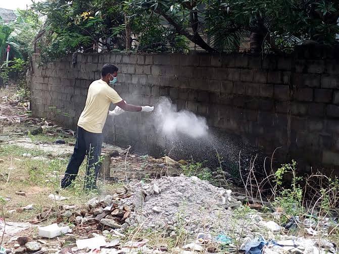
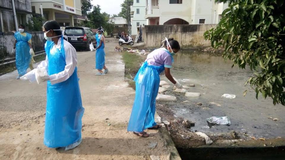
A group of volunteers led by Mr. Sai Shankar decided to initiate Chennai’s Silver Lining project after the heavy rainfalls from Nov 30 to Dec 2 2015, which caused severe flooding that poses significant health risk for the Chennai Population. They wanted to prevent the post-flooding epidemic breakout by reaching out to every corner of Chennai with a 7 days action plan, to sanitize the water deluged area with bleaching powder. Chennai Silver Lining project needed over 100 volunteers in different parts of a district. They used guidelines about post-flood emergency health precautions – community sanitation from Disaster Management Education Planning & Training (ADEPT). The idea was to prevent outbreaks of diseases like typhoid, dysentery, infectious hepatitis, and other diseases associated with floodwaters.


Cleanup Procedure

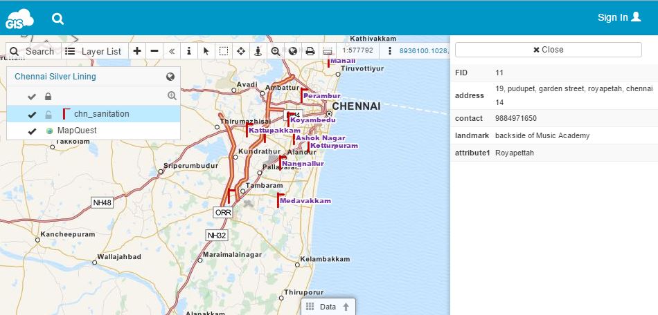
Cleanup procedures include using sanitizing agent such as hypochlorite in the form of bleaching powder or commercial household bleach, which is the most widely accepted, safe and effective sanitizing agent. Hypochlorite is used for eliminating bacteria, viruses and fungi during the cleanup process. It is important not to waste any time during a flood relief, because pathogenic organisms will not become airborne as long as the surfaces they have contaminated remain wet. They can enter the body and cause disease through water splashing into the mouth, mucous membranes, open cuts, etc. Once dried, organisms can be spread on dust particles by air movement. Therefore, it is important to “sow” bleaching powder into all wet and marshy areas and bring all contaminated surfaces into contact with bleaching powder as soon as possible. Volunteers needed to act quickly and those with experience in GIS decided to use cloud based mapping solution for the sake of fast and effective team coordination. They used GIS Cloud’s Map Editor to create HUB points with location name, address and contact number in the map. Later, this map was published with GIS Cloud’s Map Portal so that it would be accessible to wider public and volunteers.


Chennai volunteers were motivated to create Silver Lining project after they have studied the after-effects of flooding and decided to help their community by organizing themselves to help with the flood relief. They have organized 13 HUB stations, marked on a map, for different areas of Chennai and conducted the project with the help of Chennai’s community. The full number of volunteers and percentage of area sanitized still isn’t available, but project participants claim that Chennai Silver Lining achieved a community based success that proved the strength of a unity in extreme circumstances.

Importance of Good Preparedness for the Future

This project offers a good example of a community-based initiative that highlights the importance of spatial thinking in disease prevention. Roots of using spatial thinking in risk management in the case of disease date to 19th century when Dr. Snow used a map to find the source of cholera outbreak. In the 21th century, we have various web mapping tools which can do the same, and more. Chennai Silver Lining project volunteers agreed on importance of education for encouraging the spatial thinking of students, policy-makers, government and NGOs, because “prevention is better than cure.” In this case, GIS proves to be a great decision-making tool that can be used for any risk and mitigation plan.

They believe that GIS can be extensively used to re-survey the complete LU/LC of Chennai district and make it as a digital copy. Volunteers would like the Metropolitan authorities to have this map for future decision-making and coordination activities, initiating research and development in the National Disaster Management. This map should be available to the public, being a good start in encouraging spatial thinking for all the people.

Chennai Silver Lining project serves as an exemplar case for both GIS and non-GIS experts that want to do something for their community by applying spatial thinking and spatial knowledge to a concrete project or a cause. Cloud-based GIS tools are a great way for the volunteers in different initiatives to organize themselves, collaborate and improve their decision-making with the help of technology. You can see Chennai volunteer’s map here.