Εμφάνιση αναρτήσεων με ετικέτα GIS. Εμφάνιση όλων των αναρτήσεων

Σάββατο 9 Ιανουαρίου 2016

Time and GIS: Ways of Representing Time on a Map


BY CAITLIN DEMPSEY MORAIS


The famous geographer Immanuel Kant maintained that geography was the study of knowledge in a location, while history was the study of knowledge in time. Since a map is a stationary object that’s meant to represent a physical location, it’s tempting to think that it wouldn’t allow you to display changes over time the way an animation or a graph would. So, if you have to compare information in a given place and over a period of time at the same time, how can you do it?
Spatialtemporal Visualization – Techniques for Representing Time on a Map

Spatialtemporal visualization are ways to illustrate changes in an area over time on a map. The challenge of showing time on interactive maps (think web mapping) is easier. Unlike printed maps, these maps can be made with built in animations that allow the user to see changes in an area over time. Some internet maps have sliders that allow the viewer to see a snapshot of the exact point in time that they want to know about, simply by sliding the slider to the appropriate date like this European history map. Others are animated, and allow the viewer to see a time lapse illustration that covers a set time period.

Applications like myHistro adds a timeline to Google Maps, which allows the user to navigate through time to see the spatial connection. Users can register to access the free application and build their own time-based spatial histories.


SPATIALTEMPORAL MAPPING IN GOOGLE MAPS USING MYHIST

Showing Time on a Static Map
Needless to say, hard copy maps don’t have this advantage, which means that cartographers need to get a little more creative with their mapping to show changes in time that occur within the same geographic space. Cartographers have to contend with showing spatial change over time, which is four-demensional, on a two-dimensional map. To incorporate time on a singular map (as opposed to showing two or more maps side by side to demonstrate temporal change) takes some imagination to visualize the time-space connectivity. Shading, border thickness, and timelines have all be used with mixed success to show changes in space over time.


THE EASIEST WAY TO SHOW SPATIAL CHANGE OVER TIME: SIDE BY SIDE MAPS EACH SHOWING A SLICE OF TIME.

One main reason why a map user would need to see a graphical representation of time on their map would be to understand how a given area has changed over the specified period. This can be to see something like how a country or state’s borders have altered over time, or how natural features in an area have changed. There are a couple of ways that map makers can demonstrate how areas change, usually by using varying borders, shading, or even arrows.

If you’re looking to see how an area’s borders have changed over time, then visually distinguishing between “before” and “after” borders is important. In situations like that, using different line weights to represent the “before” and “after” information is a commonly used tactic. The original borders f the U.S. prior to the Louisiana Purchase, for example, can be represented using a dotted line. The borders of the U.S. afterward can be represented as a solid one. This is probably the most common way of demonstrating changes in political borders from one era to the next.


Shading and coloring are other common waya of illustrating how areas change over time. It’s especially useful for demonstrating things like deforestation and habitat changes. In these situations, the original range is usually designated by one color, with the new range overlaid in another color. On black and white maps, shading or cross-hatching is usually used instead of color.

In 1944, a map showing changes to the lower Mississippi River was published by the U.S. Army Corps of Engineers. Titled “Ancient Course of the Mississippi Meander Belt”, color coding allowed the cartographer the ability to show the radically different flows of the river over time.

ANCIENT COURSE OF THE MISSISSIPPI MEANDER BELT, US ARMY CORPS OF ENGINEERS, 1944.

White showed the course of the river in 1944, green for 1880, red for 1820, and yellow for 1765.


ZOOMED IN VIEW OF ANCIENT COURSE OF THE MISSISSIPPI MEANDER BELT, US ARMY CORPS OF ENGINEERS, 1944.

Sometimes, maps are used to illustrate motion over time. In these situations, time and distance can be represented by arrows or lines showing the direction of movement, and dots showing the origin point, end point, and significant stops in between, all labeled with dates. This technique is especially useful when plotting the migration of a group, like a flock of birds or a nomadic population.

Charles Minard created one of the more famous displays of spatialtemporal visualization. In 1861, Charles Joseph Minard, a french engineer created his now famous flow map that graphed out the ill-fated march of 1812 by Napoleon’s soldiers to and from Moscow during the brutal winter months. Minard cleverly and poignantly showed the horrific morbidity of Napoleon’s soldiers over time and space as they marched to Russia and then back to Poland.


CARTE FIGURATIVE DES PERTES SUCCESSIVES EN HOMMES DE L’ARMÉE FRANÇAISE DANS LA CAMPAGNE DE RUSSIE 1812-1813 BY CHARLES MINARD, 1861. CLICK ON GRAPH FOR A LARGER IMAGE.

Labeling maps that demonstrate changes over time is important. Usually, the before and after regions will be labeled right on the map itself, space permitting. Otherwise, a map key will explain which borders, shading, or colors represent which point in time.

One of the most important things for map users to understand when they’re interpreting the data from a map of a region over time is how the data was sampled. When it comes to mapping changes to a region, data can be taken at regular intervals (for example, every ten years), or only when a change has taken place (such as before and after a war). This is important when it comes to mapping subjects like changes in ecosystems- a map of a forest shrinking over a period of fifty years might look just like a map of a forest shrinking after a sudden forest fire, but the actual pieces of sample data that those maps are based on are very different from each other.

Varying lines, different colors, cross-hatching, and arrows and points are just a few easy ways to represent changes in a geographical area. There are plenty of ways for creative cartographers to use maps to show changes in a region over time, no matter whether they’re tracking a shrinking rainforest, a growing empire, or a migrating butterfly.

Further articles and applications on the analysis of time in GIS
AirTime
The City of Philadelphia Police Department, GIS Services Group and Health Department have begun developing a set of applications using MapObjects and Spatial Analyst that enable visualization of point and GRID data from air quality and crime data. This article dicusses this project.

Apoala
The Apoala Project has been undertaken to develop an integrated spatio-temporal geographic information, visualization, and analysis system with the goal of supporting complex exploratory analysis of environmental data.

Mapping Time: An analysis of the cartographic problem of representing spatiotemporal informationDissertation by Irina Vasiliev of Syracuse University on the problem of representing time cartographically. The dissertation looked at the different categories of time used by cartographers.

Time-integrative GIS
This website is a complement to the book “Time-integrative Geographic Information Systems – Management and Analysis of Spatio-Temporal Data” written by Thomas Ott and Frank Swiaczny. The website provides additional resources on the subject, such as a collection of links and a bibliography.

Time, Point and Space
Subtitled “Towards a Better Analysis of Wildlife Data in GIS”, this is an online version of a dissertation by Stephan Imfeld. This thesis is trying to provide a new perspective on how to analyse moving point objects within GIS.

Of Todes and Worms
Depicting spatial analysis on a temporal level is an eluded but much soft after technique in GIS. This paper provides a brief overview into the history of time analysis in GIS as well as looking at spatial-temporal techniques using ArcInfo.

Article first published on March 21, 2009 and updated August 29, 2012.

New Edition of Designing Better Maps: A Guide for GIS Users


BY CAITLIN DEMPSEY MORAIS


A new edition of Designing Better Maps: A Guide for GIS Users was recently released by Esri Press. The second edition is authored by Cynthia Brewer, a professor and head of the geography department at Pennsylvania State University. If the name seems familiar, among her many achievements in this industry, Brewer is also one of the creators of ColorBrewer, an online app that provides “color advice for cartography” which is helpful for many uses including stylizingcolor-blind maps.


This map design edition focuses on “the basics of cartography, including layout design; working with basemaps, legends, scales, and projections; selecting colors and type; and customizing symbols.” (Esri Press release). Per Brewer, “This book helps you develop the graphic skills you need for mapmaking.”

If you want a first person perspective, Gretchen Peterson has a review of Designing Better Maps: A Guide for GIS Users on her site. Esri has also posted a short two minute video providing an overview of the book.

Designing Better Maps: A Guide for GIS Users is available in print (ISBN: 9781589484405, 250 pages, $59.99), or as an e-book (ISBN: 9781589484375, 250 pages, $49.99). The book is available at online retailers worldwide.


Σάββατο 2 Ιανουαρίου 2016

Case study: Chennai Silver Lining – A Community Sanitation Planning Using GIS


Chennai


We talked about recent flooding and using GIS for emergency relief with one of the volunteers for the Chennai Silver Lining – A Sanitation Drive project. We bring you a story about great community initiative of Chennai’s citizens who decided to reduce the health risks of flooding to Chennai’s population.


The Project
A group of volunteers led by Mr. Sai Shankar decided to initiate Chennai’s Silver Lining project after the heavy rainfalls from Nov 30 to Dec 2 2015, which caused severe flooding that poses significant health risk for the Chennai Population. They wanted to prevent the post-flooding epidemic breakout by reaching out to every corner of Chennai with a 7 days action plan, to sanitize the water deluged area with bleaching powder. Chennai Silver Lining project needed over 100 volunteers in different parts of a district. They used guidelines about post-flood emergency health precautions – community sanitation from Disaster Management Education Planning & Training (ADEPT). The idea was to prevent outbreaks of diseases like typhoid, dysentery, infectious hepatitis, and other diseases associated with floodwaters.


Cleanup Procedure

Cleanup procedures include using sanitizing agent such as hypochlorite in the form of bleaching powder or commercial household bleach, which is the most widely accepted, safe and effective sanitizing agent. Hypochlorite is used for eliminating bacteria, viruses and fungi during the cleanup process. It is important not to waste any time during a flood relief, because pathogenic organisms will not become airborne as long as the surfaces they have contaminated remain wet. They can enter the body and cause disease through water splashing into the mouth, mucous membranes, open cuts, etc. Once dried, organisms can be spread on dust particles by air movement. Therefore, it is important to “sow” bleaching powder into all wet and marshy areas and bring all contaminated surfaces into contact with bleaching powder as soon as possible. Volunteers needed to act quickly and those with experience in GIS decided to use cloud based mapping solution for the sake of fast and effective team coordination. They used GIS Cloud’s Map Editor to create HUB points with location name, address and contact number in the map. Later, this map was published with GIS Cloud’s Map Portal so that it would be accessible to wider public and volunteers.


Chennai volunteers were motivated to create Silver Lining project after they have studied the after-effects of flooding and decided to help their community by organizing themselves to help with the flood relief. They have organized 13 HUB stations, marked on a map, for different areas of Chennai and conducted the project with the help of Chennai’s community. The full number of volunteers and percentage of area sanitized still isn’t available, but project participants claim that Chennai Silver Lining achieved a community based success that proved the strength of a unity in extreme circumstances.

Importance of Good Preparedness for the Future

This project offers a good example of a community-based initiative that highlights the importance of spatial thinking in disease prevention. Roots of using spatial thinking in risk management in the case of disease date to 19th century when Dr. Snow used a map to find the source of cholera outbreak. In the 21th century, we have various web mapping tools which can do the same, and more. Chennai Silver Lining project volunteers agreed on importance of education for encouraging the spatial thinking of students, policy-makers, government and NGOs, because “prevention is better than cure.” In this case, GIS proves to be a great decision-making tool that can be used for any risk and mitigation plan.

They believe that GIS can be extensively used to re-survey the complete LU/LC of Chennai district and make it as a digital copy. Volunteers would like the Metropolitan authorities to have this map for future decision-making and coordination activities, initiating research and development in the National Disaster Management. This map should be available to the public, being a good start in encouraging spatial thinking for all the people.

Chennai Silver Lining project serves as an exemplar case for both GIS and non-GIS experts that want to do something for their community by applying spatial thinking and spatial knowledge to a concrete project or a cause. Cloud-based GIS tools are a great way for the volunteers in different initiatives to organize themselves, collaborate and improve their decision-making with the help of technology. You can see Chennai volunteer’s map here.

Δευτέρα 28 Δεκεμβρίου 2015

ArcGIS Pro: An honest review


By 
Sunbeam Rahman

It’s been a while since ESRI announced ArcGIS Pro, a clean and revamped version of the ArcGIS Desktop. After a long exhaustive wait for a proper 64-bit geoprocessing and mapping environment ESRI has finally introduced something completely modified out of the scratch. This new version has a lot of new and interesting feature – can visualize, edit, and perform analysis in both 2D and 3D, it’s multithreaded and support 64-bit processing, new set of symbols, tools, workflows in a completely new user interface. There is a lot of excitements in everywhere for this new application.

So I decided to download the trial version of ArcGIS Pro 1.1 and have a look.

ArcGIS Pro: First impression
ESRI lets you register for a trial license of ArcGIS Pro for 60 days along with few essential extension. You will get the link of the trial download page and the ArcGIS Online account at your confirmation email. Once inside the ArcGIS Online account, you will have to set the privilege for the license type and extensions. Installing the application is quite straightforward, use the same username and password to start ArcGIS Pro.


We don’t want the program to login to the account and check for license in each startup. In Project menu, under Licensing select Authorize ArcGIS Pro to work offline. ArcGIS Pro has some difficulty with any preinstalled Python, so if you already have a python installed disable your PYTHONPATH for the time being. At this stage you will meet a window to create and edit map projects. I decided to create a Map.aptx called MyProject. Throughout this demonstration you will meet a lot of new file types and workflows like this.


ArcGIS Pro is a 64-bit software, no support for 32-bit PCs. ESRI wanted to introduce a lot of new workflow mechanism and toolchain activities which is different in ArcGIS Desktop. ‘ArcMap Document’ is now ‘Project’, ‘toolbox’ is ‘geoprocessing’, ‘table of content’ and ‘attribute table’ both lost ‘table’ from their names. The ‘content’ window can list features by their snapping status and label class. Moreover, both DirectX and OpenGL options are available for display rendering. You have the freedom to change this interface completely. But before that you will need some time to find all the useful features, and there is no global search option to help you out. A side by side comparison of all these new tools can be found here.


Some of the smallest and most essential utilities now has something new. The snapping toolbar has three more option – the intersection snapping, midpoint snapping and tangent snapping. The measurement tool looks better now.


The layer context menu has most of the useful options.


The new ‘Attribute table’ has a new look and feel.


The ‘Calculate geometry’ window is now a geoprocessing tool. The ‘Definition query’ has also improved.


The ‘Geoprocessing tools’ aka ‘Toolbox’ lists all recently used ones under favorite tab. The ‘Analysis gallery’ is as good as ‘Favorites’. I couldn’t find two of the most useful toolbox options – batch and debug. The ‘Task’ tool can be way around.

Starting a “GIS job”
Projects are a new way of organizing everything related to your map. The Projects (.aprx) lets you start your work in blank or with preinstalled templates. ArcGIS Pro can import your .mxd, .sdx and .3dd files and converts them to its own format. So do not expect your .mxd’s will function without any glitch, besides Python 3 is in action. Projects can even be shared like Map Packages (.mpk).


The ‘Symbology’ is no longer attached to the context menu. ‘Colorbrewer’ is now a part of symbology color scheme. You have all the essential symbology options available, but not the styles as it is in ArcGIS Desktop. The ‘graduated symbol’ in my pc crashed sometime. I couldn’t find the chart option. Thelabeling toolbar tried hard to home all the familiar choices in one place. You have a truck-load of fonts, but limited font styles. I was hoping not only for a prettier but also an intelligent labeling system.


Editing and geoprocessing

Edit whenever you like, no starting and stopping editing (which may cause accidental edit, so be careful). The small ‘editing status’ utility will help you to identify any edit time complexities. Templates can be a very powerful tool. The floating ‘tool feedback’ does its work. I couldn’t locate the advanced editing features (ie. COGO, Percel editing, Topology etc).


The geoprocessing capability has been the crown jewel of ArcGIS Desktop since its beginning. It’s the simplicity and robustness of the ‘Arc toolbox’ which made it the number one choice of all the GIS professionals for decades. In ArcGIS Pro, these tools remained in their boxes with very little changes. The tools can now dock together and ‘actually’ show progress bar. The geoprocessing history shows all the messages, errors and statuses in one place.


Here is list of all the tools those are currently not available. As mentioned before, the ‘Task’ feature can work instead of batch option.

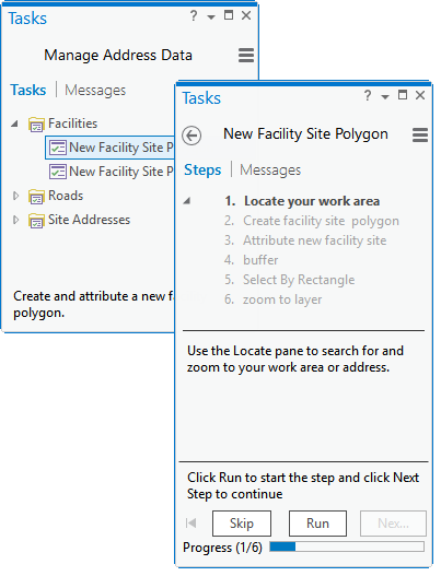
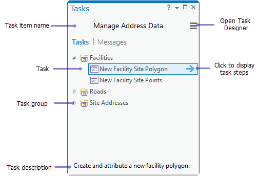
What is task? A task is a set of preconfigured steps that guide you and others through a workflow or business process. A task can be used to implement a best-practice workflow, improve the efficiency of a workflow, or create a series of interactive tutorial steps. – as described by the website. Tasks are easy to create and can also be shared. It can be used to create an automated workflow to work for similar geoprocessing request which operates and manages different other processes or groups.


This is a very promising addition, I will look forward for more.

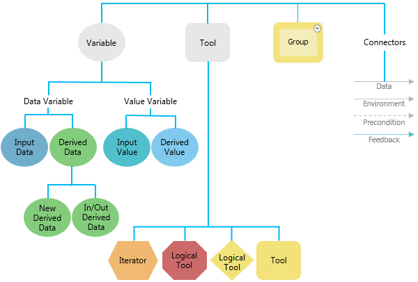
The ‘Modelbuilder’ has its charm in a separate pane. The ‘merge branches’ can merge multiple logical branches into single output. The color scheme changed a bit.


The Python scripting functionality is one of the most powerful extension of ArcGIS family. In ArcGIS Pro the Python windows has a lot of new feature.


The scripts are not only has autocomplete feature but also show helpful tool tips. Any geoprocessing that has run on Python window will show up in the current project’s Geoprocessing history. Script is taking too long to run – hit the cross to stop that immediately.


To make the operation breeze the Python window works with any file, tools and layers by simply dragging and dropping them inside the window.


Working with raster data has found some new functionality since ArcGIS Desktop 10. Part of this process ArcGIS Pro has all the raster geoprocessing tools in a new window.


Other options are distributed is many other windows but remain almost same. Raster functionalities of ArcGIS Pro are not something most of us should get eager about when programs like GRASS and Monteverdi has more tools than this and are absolutely free.

Layout making
The layout making workflow in ArcGIS Pro doesn’t seem to be much organized. Besides there is currently no option to add grids to the layout. In ArcGIS Desktop layers are automatically added to a map frame, here you need to specify a Map frame which doesn’t seem much intuitive. The north-arrow and scale bars are as usual, so does the legend. The maps and layout styles now a days changed a lot, the scale bars now have multiple units, legends are more stylish. Even though ArcGIS Pro is a mapping suit of 2015, it seems to have styles from 90’s. But there is something new, dynamic texts now can use information directly from metadata.


The individual elements now snap with each other as interactive layout tool. The ‘add guides’ window can add multiple guides at once depending on the orientation and placement. The map frame itself doesn’t have to be rectangular, it can be of any size and shape.


When you finish decorating your map, go to Share > Layout to export. The export formats remained same, except the compressed SVG (.svgz) and TGA is new, AI is gone (which you may not need when you already have .EPS). Most of the format lack some of their options compared with ArcGIS Desktop. All of them have a same option – ‘clip to graphics extent’, a familiar option which can be found in Adobe Illustrator. The default output name is surprisingly “ArcGIS.jpg” which should be “name_of_the_project.jpg”. I never understood why the DPI has to go below 100 because that creates a crappy output. Why not use a ‘quality’ slider saying ‘best’ to ‘smallest’ and adjust the DPI with the screen resolution just like Adobe Illustrator do.

Conclusion
Maybe I am not the right person to judge an application like ArcGIS Pro from a GIS powerhouse like ESRI who has been feasting on its lions share of the overall geospatial market for decades. But let me pick few things as I walk through with this new software and have them listed before it jeopardize my head.

Good things

  • The first good thing about this new software is that it is not ArcGIS desktop. ArcGIS Desktop somehow messed up in so many level that we should give up hoping for more fix
  • ArcGIS Pro is finally a cutting edge technology that works with both 2D and 3D. It takes advantage of latest multi-threaded processors and RAMs. It can also work with advanced GPUs to accelerate its 3D rendering capability
  • The project-based mapping workflow, the familiar ribbon-based user interface, the task and templates will help users of many other field to understand and communicate with each other
  • Eliminating a lot of edit-time and layout-time complexities shows that ESRI really hears what their customers use to say. For example, autocomplete polygon option now doesn’t depend on the double-click from the user to finish, it has its own finish button. This helps people with tablets a lot. There are a lot of similar complications been taken care of; so does many unnecessary options, exotic styles and commands with self-conflicting behavior.
  • I really liked the Python scripting environment. The geoprocessing windows took care of all the floating toolbars. The raster processing has found some new functionality. The users have more control over the user interface, geoprocessing capabilities and the project workflows.
  • Bad things
  • The user interface is fascinatingly dull! I would expect a darker interface for the people who work longer in front of the computer. (For example, Microsoft, the inventor of the ribbon interface themselves are switching to darker interface because they just look really good)
  • Still more to do to resolve conflicts among multiple Python environments under same workstation. Even if Python in ‘sandboxed’ inside the application (bin folder), user should get access to it and install libraries they want.
  • The biggest advertisement of ArcGIS Pro seem to be its ability of using its Large Address Aware processing engine. But in reality there are very little option to take advantage of this capability. For example, the geoprocessing tools can use more than 4 gigabyte memory, but no one sees how they are doing this. Are they taking single channel or multiple. How about running multiple tools in parallel.
  • The worst thing is actually the essential part of the application – the layout making functionality. The tool and options for layout making, map frame, adding symbols, elements and exporting to the final output seem to have spread across several panes. The steps for the final output gained complexity and sometime sluggish behavior.

The verdict
No wonder ArcGIS Pro is built on experience from a range of products which has been successful for a many good year, but the application itself is still a new born. Even if the product looks promising but it still feels underdeveloped and sometime unfinished. I understand the excitement, but let me suggest to hold your patience for a few more year. The ArcGIS Pro is good, but it can be better. There must be a balance between the functionalities and the demands. ESRI has taken a bold move, let them finish their journey.

About author
Sunbeam Rahman is self-inspired dream-guided GIS analyst who have spent most of his lifetime trying to decipher all the geospatial problems in the world, but couldn't solve one. Sunbeam had his masters with a major of 'Geography and Environment' and later joined a non-profit research NGO in Dhaka, Bangladesh. Sunbeam spends most of his time either in his office snoring or at home watching movies, cuddling with his cat, or doing bullshit like blogging.


Source: Club GIS

Πέμπτη 17 Δεκεμβρίου 2015

Where Have You Been? Using GIS to Analyze Residential History and Health Care


By Troy Lambert


A young man from Central California is diagnosed with prostate cancer. Because of how young he is, the diagnosis did not come until he was already displaying symptoms of the disease. This man’s story ended well, and the cancer is currently in remission. The reality of the situation is rarely so kind, and one study shows women from the same area are more vulnerable to breast cancer. But why? What environmental causes could there be?

When looking beyond a simple medical diagnosis for a cause, a health care professional looks at genetics, lifestyle, and environment. When you enter a doctor’s office, you usually have a stack of forms to fill out regarding the first two: a family history, and questions about height, weight, and whether you smoke, drink, and exercise regularly.

But when is the last time you filled out a residential history as part of the intake process? Unless you have a rare or unusual condition, the answer is probably never. In the three pronged query for determining the cause of a condition, the last, and perhaps the most vital, is often neglected. Not to mention the other side of the coin: prevention.


What if the young man’s doctor had known he’d lived in an area where males were often at risk for prostate cancer, and so recommended early testing? What if he knew about a woman’s exposure to certain chemicals thought to be related to higher rates of breast cancer? Early testing would not only be highly recommended, it could be seen as vital.

So what’s the problem? And how can GIS help? The reasons are plenty, but there is an increasing movement to include location data in medical records. The question involves more about how to make such information universal and accessible than anything else.
Big Data and GIS
There is a lot of talk about GIS and big data, almost to the point where the very phrase has become a buzzword. It’s not that data isn’t available, it’s a matter of finding the needle in the haystack while at the same time realizing the haystack keeps getting bigger.

GIS can help, by tying data to location, and recording relevant relationships. However, with all the other data already in Electronic Medical Records (EMR), adding residential history could be challenging, and correlating it with other location data even more so. But there are potential answers.

The CDC and GIS
The CDC has a national map for incidents of Heart Disease, and they do have a mapping department that is working on gathering and georeferencing more data. The CDC certainly serves as a great repository for this kind of data, but to make it truly effective, more studies need to be done and more data gathered. The depth and breadth of these studies is often hindered by a common missing element: funding.


HEART DISEASE MAP, CREDIT: CDC GIS

California gathers data through the Pesticide Use Reporting system, and other states will soon follow. As pesticide use may potentially correlate to increased risk of prostate and breast cancer. Such data on a wider scale could assist medical professionals in advocating for early testing in some patients.


MAP OF PESTICIDE USE IN CALIFORNIA, 1999. CREDIT: PESTICIDE ACTION NETWORK

Centralizing this data and making it available to medical professionals is a step in the right direction, and the CDC already has data from Pennsylvania, Iowa, and city specific data from Philadelphia on several health topics. data about unhealthy days in adults, and incidence of AIDS nationwide from 2004.

Health Risk Maps
What if such data could be used to predict potential incidents of cancer and other diseases, or risk, rather than to create maps of after the fact statistics? What if potential causes could be mapped, and correlated with a patient’s residential history?


STATE CANCER PROFILES. CREDIT: NATIONAL CANCER INSTITUTE

There is a map that tracks incidence and lets the user filter by age, race, and sex. The same map, created by the National Cancer Institute and the CDC, does have some screening and risk factor data, including diet and exercise, smoking, and others. Expanding this map with additional data may be one solution.

As computers and programs advance, and it becomes easier for them to handle huge sets of data, as more data is gathered, and as the use of that data gains traction in routine healthcare evaluations, the power of GIS can be leveraged to greatly influence healthcare as we know it.

Source: GIS Lounge - Maps and GIS

Κυριακή 13 Δεκεμβρίου 2015

Spatial Databases – Start Your Spatial Data Empire


Spatial Databases

What are spatial databases in GIS?

Spatial databases provide a strong foundation to accessing, storing and managing your spatial data empire.


A database is a collection of related information that permits the entry, storage, input, output and organization of data. A database management system (DBMS) serves as an interface between users and their database.

A spatial database includes location. It has geometry as points, lines and polygons.

GIS combines spatial data from many sources with many different people. Databases connect users to the GIS database.

For example, a city might have the waste water division, land records, transportation and fire departments connected and using datasets from common spatial databases.

Let’s take a closer look at spatial databases and how they are used in GIS:

What is an attribute table in GIS?
First, let’s look at the basics:

By default, spatial vector features are always associated with non-spatial attribute tables in a GIS. Spatial features store where objects are located on a map. Non-spatial attribute tables explain what the objects on the map represent.

Attribute Table Example

Attribute tables are similar to spreadsheets. Columns are fields that gives structure to tables. Fields must be constrained to different types such as text (strings), integers (whole numbers) and dates (YYYY/MM/DD). Field name are the title of the column names. A field name should be descriptive of the information being entered in the column. For example, the average population may have a field name of AVG_POP.

Rows in an attribute table represents a spatial feature in the data set or an associated record of that data set.

Rows in an attribute can have relationships with spatial features. There are three types of relationships that exist in a GIS: one-to-one relationship, one-to-many relationship and many-to-many relationship.

One-to-one relationships tie one table with one table
What are one-to-one relationships in GIS?

Spatial data on a map is always linked to a row in a table. When one feature is linked to one entry in a table, this is called a one-to-one relationship (1-1). For example, here are the geographic locations of five cities in the United States:

United States Locations

Here is the associated attribute table with these five locations:

Attribute table

As you can see, we can get some extra information about these five cities. We learn their latitude and longitude.

Not only that, but we see their pop max (which is for the metropolitan areas) and pop_min(which is for the incorporated city of the same name).

One-to-many relationships ties multiple records from a table together
What are one-to-many relationships?


When one spatial feature is associated with multiple records in an attribute table this is called aone-to-many relationship (1-M).

In this case there is a unique identifier in the spatial table that is used to uniquely identify each row in a table. These are called keys and they exists in both the spatial and non-spatial attribute table.

This unique ID (primary key) is the primary linkage between geographic data and attribute table. This key must exist in the related table as a foreign key.

1-M relationships are commonly set up in spatial databases. Relationship classes set up the type of relationship and which features are being connected by a unique ID.

Here is an example where surveys were done at two mountain locations over a period of 3 years. The coordinates of the mountain surveys remained the same over the years:

Mountain Survey Sites

These two mountains have unique IDs of A101 and A102 as shown in their attribute tables:

Survey Site Attribute Table

Over a period of three years, there have been multiple observations of different animals. The two sites of these mountains have the same IDs – A101 and A102.

The observations at each site can be found within the OBS field. The YEAR field identifies which year the animal was observed. The two fields that link up these attribute tables are
 the primary keys ID and SURV_ID.

Multiple Observations per Survey

You can see how we are reducing redundancy. We are no longer storing the latitude and longitude in each observation. This is because each latitude and longitude is only being stored once in the survey points table.

Many-to-many relationships in GIS are much less common in GIS. This type of relationship exists when there are many entries in related attribute tables and vice versa. An intersection table is usually generated to associate many records together.

Τετάρτη 9 Δεκεμβρίου 2015

GIS and IoT Business Applications


BY GIS CONTRIBUTOR


To most, GIS is still a strictly academic system. While an increasing number of people are at least vaguely aware of GIS programs’ mapping and analytical capabilities, the actual applications are not particularly well understood. But as these specific programs become more popular and are used more frequently, their applications are becoming more mainstream and they’re often tied in to Internet of Things (or IoT) initiatives in business.

The basic idea behind this tie-in is that augmenting IoT data with interactive GIS mapping can significantly improve understanding of the data. In other words, there are efforts being made in numerous aspects of business to gain a better understanding of geographical areas and patterns. And doing so armed with GIS can yield more useful information.

Companies are already analyzing geography in numerous ways to improve their efficiency and functionality. Most commonly, this calls to mind the efforts of companies to gain a better understanding of where to build new facilities, where to store resources to minimize waste, and even where to lay down power lines or electrical cables if necessary. But increasingly, there are also shipping concerns that can be addressed by way of geographical analysis. With the integration of WiFi into fleet vehicles, drivers and manager are now privy to the real-time sharing of vehicle diagnostics, which means GPS tracking, routing information, and more.

REAL-TIME FLEET TRACKING. IMAGE: FLEETMATICS

This is a strong example of how IoT practices can help businesses to improve efficiency and that’s only through WiFi and GPS tracking. Implementing GIS programs for the same purposes effectively paints a better version of the same picture. The data that can be collected through GIS analysis can yield automatic reports, and those can greatly assist businesses in performing the aforementioned assessments and making relevant decisions.

And that’s just how GIS could be used to enhance existing IoT practices in industry. The truth is, GIS integration with the IoT may also lead to entirely new practices meant to make our world safer and more efficient. It’s been suggested that spatial data could be used to change traffic lights or lock gates, and even that we could reach a stage where actions could be caused through map manipulation in response to gathered data. These types of functions are essentially hypothetical right now, but the ideas demonstrate the potential of GIS and IoT integration to change industries and create new initiatives.

This will all be fascinating to keep an eye on as GIS programs are implemented more broadly. Discussions about “smart” homes, cars, and transportation could quickly morph into talk about a “smart” world as GIS does its part within the IoT.

About the Author:
Charles Bell is a freelance writer who’s passionate about covering a number of different topics. In addition to writing about the latest technology, Charles has a soft spot for anything related to the Marvel Cinematic Universe. When he’s not researching or writing, you can find him playing Fallout 4 on his PS4.

GIS in Oil and Gas


BY SANGEETA DEOGAWANKA


As an industry that fuels progress, development and basic human needs, the oil and gas industry is a vital part of the global economy. It is also the most capital intensive. Revenues are large, as are the costs. It also makes headlines for unforeseen accidents and environmental hazards. The ever changing dynamics of this industry drives sustained efforts for increased efficiencies and risk mitigation. This is where GIS and supporting technologies step in with limitless uses and seamless applications.

The Oil and Gas industry is driven by an estimated 80% data that has a spatial component. This is the only industry that harnesses spatial information at every stage of the life-cycle, beginning with opportunity analysis and exploration, through appraisal and production, right up to the abandonment phase.


INTERACTIVE WEB MAP SHOWING OIL AND GAS BASINS IN U.S., WITH LINKS TO GEOLOGIC REPORTS

So companies are beginning to understand the importance of geospatial to maximize ROI as well as minimize risks. Beginning with the integration of spatial databases within existing systems, the oil and gas sector has also begun looking at software companies to come up with industry-specific software, tools and models to maximize value from their investments.

For the geospatially driven this is an industry to look at. Assets, offices, sites, workers as well as operations are geographically dispersed. So large and complex data is utilized to explore and manage the spatially distributed assets and operations. Dedicated maps and models are proving to be the most effective way to visualize and communicate. The spatial component is however still underutilized, and out-of-the box GIS solutions are needed to address the vast needs of this industry. With the surface barely scratched, there is an enormous potential for geospatial technology employment and software development.


GLOBAL ENERGY MAPPER – A SPATIAL DATA AND VISUALIZATION TOOL FOR OIL AND GAS INDUSTRY

GIS deployment through the oil field life-cycle


Well Planning and Acquisition

  • Basin Analysis – map of potential hydrocarbon accumulations; hydrological modeling; sub-surface secondary fluid migration network mapping; flow direction – flow accumulation mapping across DEM; potential migration pathways, etc.
  • Play Analysis – risk segment mapping for each petroleum play element; regional risk mapping; geological maps; ground truthing or validating imagery through field surveys
  • Acreage Analysis – rapid evaluation and gradation of opportunities using multi-disciplinary asset data and assigning weightings and criteria; ranking of acreage, petroleum leases, blocks and companies; exploration statistics in visual platform, etc.
  • Prospect Analysis – hydrocarbon reserve or volume estimation; raster analysis based deterministic prospect volume of petroleum reservoirs; reserve estimation and spatial analysis of well data in unconventional hydrocarbon, like shale, and so on.

Seismic planning – terrain analysis; seismic survey maps and data; satellite image processing and spatial analysis; etc.

Exploration
  • Well Planning – well planning around multiple drilling constraints; GIS tools used in well pattern optimization workflows
  • Drilling –spatial analysis within GIS for optimized well drilling patterns and efficient configurations
  • Production – GIS allows data integration and visualization of production volumes, injection rates and recovery efficiency in near real-time

Exploration (Onshore) – visual framework for exploration across assets; 3D modeling of geological, geophysical and petrophysical hierarchical data

Exploration (Offshore) – bathymetry mapping; sea floor surveys; shipping lane maps with data integration; 3D seismic analysis; on-demand satellite image processing for offshore mapping and exploration activities

Field Operations
– GIS supports drilling around surface and geologic constraints; improved field production efficiencies for whole reservoirs /basins; data integration and visualization in real time for production dashboards, coordinated workflows and personnel across rig sites; Dynamic Hazard modeling for resource allocation; asset tracking in real time; updated DEMs to help detect subsidence caused by extraction and much more.

Facilities management – 3D GIS with field layout helps accurate monitoring of associated environmental changes in near real time for HSE (Health, Safety and Environment) and emergency response during oil spills, leaks or explosions.


EMERGENCY RESPONSE SYSTEM FOR TRACKING GAS LEAK – USING ARCGIS

Distribution and Pipeline management – least cost path analysis for distribution network; network analysis for environment friendly and cost effective routes; pipeline monitoring for geo-hazards and leaks; tracking of inspections using remotely acquired data; monitoring and analysis of spatially dispersed data in real-time; seafloor geodesy and asset management in offshore operations, etc.


LEAST COST PATH ROUTES WITH WEIGHTED OVERLAYS (1,2,3) VIS-A-VIS THEOGALLALA AQUIFER CASE STUDY (KEYSTONE XL PIPELINE, NEBRASKA)

Pipeline Routing and Vehicle / Fleet Tracking – A GIS ecosystem supports tracking of valuable assets in a capital intensive sector. The precise location of vehicles and ships ensures timely delivery of goods and services, as well as efficient emergency response.


ASSET AND FLEET MANAGEMENT BY OIL COMPANY SAUDI ARAMCO – USING ARCGIS

Decommissioning – field data from earlier phases of the oil field life cycle centralized in enterprise GIS help to remove infrastructure and assets, and recover the site for land use.

Benefits of GIS in Oil and Gas 

  • Empowers decision making – which acreage or play to enter, how to shorten portfolio workflows, how to plan the optimal pipeline route, integrate results of seismic survey, planning emergency response, better management of facilities, manage pipeline outage and leaks, etc.
  • Supports future action and ongoing exploration activities – By standardizing processes and reducing technical uncertainty, GIS improves exploration efficiency. The GIS framework models a consistent exploration processes across all assets within the company. This supports a consistent, auditable corporate prospect portfolio, for ongoing portfolio decisions.
  • Increased efficiencies – multi disciplinary data integration for risk assessment and uncertainty, better access for cutting wasteful downtime, optimized maintenance schedules; monitoring and analysis of daily fleet movements in real time, least cost path analysis for pipeline routing, standardized portfolio workflows, cutting down decision cycle times, etc.
  • Cost saving – an estimate of 10-30 per cent cut in operational costs, prevention and management of incidental or accidental costs, efficient pipeline and fleet management saves costs, optimized drilling and operation workflows enhances ROI, and so on.
  • Seamless management with a real-time mapping visualization and analysis of remote /offshore sites, operations and assets
  • Improved communication across spatially dispersed locations
  • Record keeping – the huge data loaded in centralized GIS builds a strong framework for managing data with full transaction support and reporting tools.
Conclusion


The Oil and Gas industry has been a comparative late comer to GIS. However, it is fast emerging as the industry with the highest potential of GIS application through the entire life-cycle. What’s more, it enables a seamless integration of geospatial technologies like UAV, sensors, and existing computer systems within the GIS framework. This is helping companies compete in the global race to unlock new energy sources and maximize value from its assets.

Source: GIS Lounge - Maps and GIS