Εμφάνιση αναρτήσεων με ετικέτα ESRI. Εμφάνιση όλων των αναρτήσεων

Σάββατο 9 Ιανουαρίου 2016

New Edition of Designing Better Maps: A Guide for GIS Users


BY CAITLIN DEMPSEY MORAIS


A new edition of Designing Better Maps: A Guide for GIS Users was recently released by Esri Press. The second edition is authored by Cynthia Brewer, a professor and head of the geography department at Pennsylvania State University. If the name seems familiar, among her many achievements in this industry, Brewer is also one of the creators of ColorBrewer, an online app that provides “color advice for cartography” which is helpful for many uses including stylizingcolor-blind maps.


This map design edition focuses on “the basics of cartography, including layout design; working with basemaps, legends, scales, and projections; selecting colors and type; and customizing symbols.” (Esri Press release). Per Brewer, “This book helps you develop the graphic skills you need for mapmaking.”

If you want a first person perspective, Gretchen Peterson has a review of Designing Better Maps: A Guide for GIS Users on her site. Esri has also posted a short two minute video providing an overview of the book.

Designing Better Maps: A Guide for GIS Users is available in print (ISBN: 9781589484405, 250 pages, $59.99), or as an e-book (ISBN: 9781589484375, 250 pages, $49.99). The book is available at online retailers worldwide.


Δευτέρα 28 Δεκεμβρίου 2015

ArcGIS Pro: An honest review


By 
Sunbeam Rahman

It’s been a while since ESRI announced ArcGIS Pro, a clean and revamped version of the ArcGIS Desktop. After a long exhaustive wait for a proper 64-bit geoprocessing and mapping environment ESRI has finally introduced something completely modified out of the scratch. This new version has a lot of new and interesting feature – can visualize, edit, and perform analysis in both 2D and 3D, it’s multithreaded and support 64-bit processing, new set of symbols, tools, workflows in a completely new user interface. There is a lot of excitements in everywhere for this new application.

So I decided to download the trial version of ArcGIS Pro 1.1 and have a look.

ArcGIS Pro: First impression
ESRI lets you register for a trial license of ArcGIS Pro for 60 days along with few essential extension. You will get the link of the trial download page and the ArcGIS Online account at your confirmation email. Once inside the ArcGIS Online account, you will have to set the privilege for the license type and extensions. Installing the application is quite straightforward, use the same username and password to start ArcGIS Pro.


We don’t want the program to login to the account and check for license in each startup. In Project menu, under Licensing select Authorize ArcGIS Pro to work offline. ArcGIS Pro has some difficulty with any preinstalled Python, so if you already have a python installed disable your PYTHONPATH for the time being. At this stage you will meet a window to create and edit map projects. I decided to create a Map.aptx called MyProject. Throughout this demonstration you will meet a lot of new file types and workflows like this.


ArcGIS Pro is a 64-bit software, no support for 32-bit PCs. ESRI wanted to introduce a lot of new workflow mechanism and toolchain activities which is different in ArcGIS Desktop. ‘ArcMap Document’ is now ‘Project’, ‘toolbox’ is ‘geoprocessing’, ‘table of content’ and ‘attribute table’ both lost ‘table’ from their names. The ‘content’ window can list features by their snapping status and label class. Moreover, both DirectX and OpenGL options are available for display rendering. You have the freedom to change this interface completely. But before that you will need some time to find all the useful features, and there is no global search option to help you out. A side by side comparison of all these new tools can be found here.


Some of the smallest and most essential utilities now has something new. The snapping toolbar has three more option – the intersection snapping, midpoint snapping and tangent snapping. The measurement tool looks better now.


The layer context menu has most of the useful options.


The new ‘Attribute table’ has a new look and feel.


The ‘Calculate geometry’ window is now a geoprocessing tool. The ‘Definition query’ has also improved.


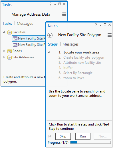
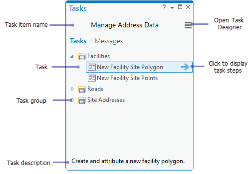
The ‘Geoprocessing tools’ aka ‘Toolbox’ lists all recently used ones under favorite tab. The ‘Analysis gallery’ is as good as ‘Favorites’. I couldn’t find two of the most useful toolbox options – batch and debug. The ‘Task’ tool can be way around.

Starting a “GIS job”
Projects are a new way of organizing everything related to your map. The Projects (.aprx) lets you start your work in blank or with preinstalled templates. ArcGIS Pro can import your .mxd, .sdx and .3dd files and converts them to its own format. So do not expect your .mxd’s will function without any glitch, besides Python 3 is in action. Projects can even be shared like Map Packages (.mpk).


The ‘Symbology’ is no longer attached to the context menu. ‘Colorbrewer’ is now a part of symbology color scheme. You have all the essential symbology options available, but not the styles as it is in ArcGIS Desktop. The ‘graduated symbol’ in my pc crashed sometime. I couldn’t find the chart option. Thelabeling toolbar tried hard to home all the familiar choices in one place. You have a truck-load of fonts, but limited font styles. I was hoping not only for a prettier but also an intelligent labeling system.


Editing and geoprocessing

Edit whenever you like, no starting and stopping editing (which may cause accidental edit, so be careful). The small ‘editing status’ utility will help you to identify any edit time complexities. Templates can be a very powerful tool. The floating ‘tool feedback’ does its work. I couldn’t locate the advanced editing features (ie. COGO, Percel editing, Topology etc).


The geoprocessing capability has been the crown jewel of ArcGIS Desktop since its beginning. It’s the simplicity and robustness of the ‘Arc toolbox’ which made it the number one choice of all the GIS professionals for decades. In ArcGIS Pro, these tools remained in their boxes with very little changes. The tools can now dock together and ‘actually’ show progress bar. The geoprocessing history shows all the messages, errors and statuses in one place.


Here is list of all the tools those are currently not available. As mentioned before, the ‘Task’ feature can work instead of batch option.

What is task? A task is a set of preconfigured steps that guide you and others through a workflow or business process. A task can be used to implement a best-practice workflow, improve the efficiency of a workflow, or create a series of interactive tutorial steps. – as described by the website. Tasks are easy to create and can also be shared. It can be used to create an automated workflow to work for similar geoprocessing request which operates and manages different other processes or groups.


This is a very promising addition, I will look forward for more.

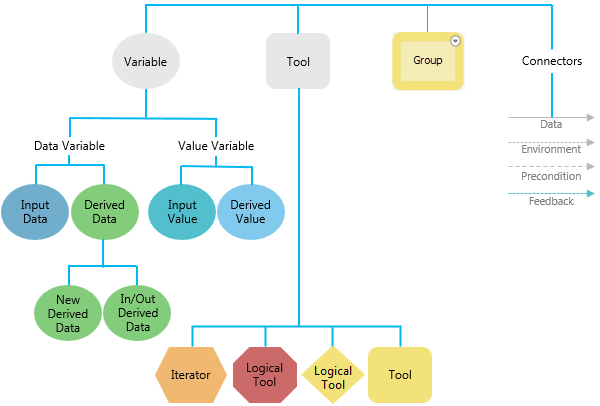
The ‘Modelbuilder’ has its charm in a separate pane. The ‘merge branches’ can merge multiple logical branches into single output. The color scheme changed a bit.


The Python scripting functionality is one of the most powerful extension of ArcGIS family. In ArcGIS Pro the Python windows has a lot of new feature.


The scripts are not only has autocomplete feature but also show helpful tool tips. Any geoprocessing that has run on Python window will show up in the current project’s Geoprocessing history. Script is taking too long to run – hit the cross to stop that immediately.


To make the operation breeze the Python window works with any file, tools and layers by simply dragging and dropping them inside the window.


Working with raster data has found some new functionality since ArcGIS Desktop 10. Part of this process ArcGIS Pro has all the raster geoprocessing tools in a new window.


Other options are distributed is many other windows but remain almost same. Raster functionalities of ArcGIS Pro are not something most of us should get eager about when programs like GRASS and Monteverdi has more tools than this and are absolutely free.

Layout making
The layout making workflow in ArcGIS Pro doesn’t seem to be much organized. Besides there is currently no option to add grids to the layout. In ArcGIS Desktop layers are automatically added to a map frame, here you need to specify a Map frame which doesn’t seem much intuitive. The north-arrow and scale bars are as usual, so does the legend. The maps and layout styles now a days changed a lot, the scale bars now have multiple units, legends are more stylish. Even though ArcGIS Pro is a mapping suit of 2015, it seems to have styles from 90’s. But there is something new, dynamic texts now can use information directly from metadata.


The individual elements now snap with each other as interactive layout tool. The ‘add guides’ window can add multiple guides at once depending on the orientation and placement. The map frame itself doesn’t have to be rectangular, it can be of any size and shape.


When you finish decorating your map, go to Share > Layout to export. The export formats remained same, except the compressed SVG (.svgz) and TGA is new, AI is gone (which you may not need when you already have .EPS). Most of the format lack some of their options compared with ArcGIS Desktop. All of them have a same option – ‘clip to graphics extent’, a familiar option which can be found in Adobe Illustrator. The default output name is surprisingly “ArcGIS.jpg” which should be “name_of_the_project.jpg”. I never understood why the DPI has to go below 100 because that creates a crappy output. Why not use a ‘quality’ slider saying ‘best’ to ‘smallest’ and adjust the DPI with the screen resolution just like Adobe Illustrator do.

Conclusion
Maybe I am not the right person to judge an application like ArcGIS Pro from a GIS powerhouse like ESRI who has been feasting on its lions share of the overall geospatial market for decades. But let me pick few things as I walk through with this new software and have them listed before it jeopardize my head.

Good things

  • The first good thing about this new software is that it is not ArcGIS desktop. ArcGIS Desktop somehow messed up in so many level that we should give up hoping for more fix
  • ArcGIS Pro is finally a cutting edge technology that works with both 2D and 3D. It takes advantage of latest multi-threaded processors and RAMs. It can also work with advanced GPUs to accelerate its 3D rendering capability
  • The project-based mapping workflow, the familiar ribbon-based user interface, the task and templates will help users of many other field to understand and communicate with each other
  • Eliminating a lot of edit-time and layout-time complexities shows that ESRI really hears what their customers use to say. For example, autocomplete polygon option now doesn’t depend on the double-click from the user to finish, it has its own finish button. This helps people with tablets a lot. There are a lot of similar complications been taken care of; so does many unnecessary options, exotic styles and commands with self-conflicting behavior.
  • I really liked the Python scripting environment. The geoprocessing windows took care of all the floating toolbars. The raster processing has found some new functionality. The users have more control over the user interface, geoprocessing capabilities and the project workflows.
  • Bad things
  • The user interface is fascinatingly dull! I would expect a darker interface for the people who work longer in front of the computer. (For example, Microsoft, the inventor of the ribbon interface themselves are switching to darker interface because they just look really good)
  • Still more to do to resolve conflicts among multiple Python environments under same workstation. Even if Python in ‘sandboxed’ inside the application (bin folder), user should get access to it and install libraries they want.
  • The biggest advertisement of ArcGIS Pro seem to be its ability of using its Large Address Aware processing engine. But in reality there are very little option to take advantage of this capability. For example, the geoprocessing tools can use more than 4 gigabyte memory, but no one sees how they are doing this. Are they taking single channel or multiple. How about running multiple tools in parallel.
  • The worst thing is actually the essential part of the application – the layout making functionality. The tool and options for layout making, map frame, adding symbols, elements and exporting to the final output seem to have spread across several panes. The steps for the final output gained complexity and sometime sluggish behavior.

The verdict
No wonder ArcGIS Pro is built on experience from a range of products which has been successful for a many good year, but the application itself is still a new born. Even if the product looks promising but it still feels underdeveloped and sometime unfinished. I understand the excitement, but let me suggest to hold your patience for a few more year. The ArcGIS Pro is good, but it can be better. There must be a balance between the functionalities and the demands. ESRI has taken a bold move, let them finish their journey.

About author
Sunbeam Rahman is self-inspired dream-guided GIS analyst who have spent most of his lifetime trying to decipher all the geospatial problems in the world, but couldn't solve one. Sunbeam had his masters with a major of 'Geography and Environment' and later joined a non-profit research NGO in Dhaka, Bangladesh. Sunbeam spends most of his time either in his office snoring or at home watching movies, cuddling with his cat, or doing bullshit like blogging.


Source: Club GIS

Σάββατο 19 Δεκεμβρίου 2015

Esri and NASA Collaborate to Advance Cloud Access to Imagery


Esri and NASA are collaborating to improve access to imagery and raster data stored in the cloud using a combination of two technologies, Meta Raster Format (MRF) and Limited Error Raster Compression (LERC). MRF is an Open raster format originally designed at the NASA Jet Propulsion Lab (JPL) to optimize web access to rasters. LERC is a highly efficient algorithm that provides fast lossless and controlled lossy compression of image and raster data. LERC is especially suitable for geospatial applications. Esri was recently awarded a US Patent for LERC, and is making the patented LERC technology freely available to the geospatial and earth sciences community.

By sharing MRF and LERC with the community, NASA and Esri will enable organizations to lower storage costs and gain fast access to imagery and data as web services. Speedy and accurate web access to imagery will help improve the way people understand and analyze changes in the Earth.

“We have been working with NASA to improve the MRF format, but want to take this a step further and release our patent on LERC,” said Esri president Jack Dangermond. “By contributing the LERC algorithm to the geospatial community, we hope to inspire innovation and encourage problem solving.”


NASA has had notable success using MRF as an image raster format and is collaborating with Esri on improvements to the format. In addition, Esri has contributed code improvements to the Open Source geospatial data abstraction library (GDAL) implementation of MRF. This work is focused on access to rasters stored in the cloud on object stores.

“We’ve been using MRF to create and distribute imagery for a number of years, but we are only now starting to explore browser access to these datasets,” said NASA Earth Science Data Systems program executive Kevin Murphy. “Our collaboration with Esri and the release of Esri’s patent on LERC ensures that more people can enjoy efficient, accurate transmission of imagery and data over the web.”


LERC is being released as Open Source under an Apache2 License and will also be included in the NASA MRF Open Source project.

Attendees of the American Geophysical Union (AGU) Fall Meeting in San Francisco, on December 17, can hear more about this as Lucian Plesea, Esri Web GIS developer, presents a talk from 11:20 AM–11:35 AM in Moscone West #2020, titled: Formats and Network Protocols for Browser Access to 2D Raster Data.

For more information on MRF and LERC, please visit the Esri ArcGIS blog atblogs.esri.com/esri/arcgis.

###

About Esri
Since 1969, Esri has been giving customers around the world the power to think and plan geographically. The market leader in GIS technology, Esri software is used in more than 350,000 organizations worldwide including each of the 200 largest cities in the United States, most national governments, more than two-thirds of Fortune 500 companies, and more than 7,000 colleges and universities. Esri applications, running on more than one million desktops and thousands of web and enterprise servers, provide the backbone for the world's mapping and spatial analysis. Esri is the only vendor that provides complete technical solutions for desktop, mobile, server, and Internet platforms. Visit us at esri.com/news.

Copyright © 2015 Esri. All rights reserved. Esri, the Esri globe logo, GIS by Esri, ArcGIS, esri.com, and @esri.com are trademarks, service marks, or registered marks of Esri in the United States, the European Community, or certain other jurisdictions. Other companies and products or services mentioned herein may be trademarks, service marks, or registered marks of their respective mark owners.

Press Information

Contact: Brian Peterson, Esri

Tel.: 909-793-2853, extension 1283

Email: Email Contact

Πέμπτη 17 Δεκεμβρίου 2015

The story of global migration visualised on a single map by Esri


By Aleks Buczkowski


International migration is a hot topic and a global phenomenon that is growing in scope, complexity and impact. It can be a positive force for development when supported by the right set of policies but performed unreasonably migration can cause short-term or long-term issue swhich is the case in couple of European countries.


Understanding global mobility patterns and its impact on countries is very difficult without a great map… but don’t have to worry about that any more as Esri has launched a new cool tool where you can visualise global migration country by country. The project is called Global Migration Data and it shows estimates of the number of international migrants by destination and origin. The data comes from the UN Department of Economic & Social Affairs for the years 1990, 2000, 2010 and 2013.


The map is very easy to use. On the top left menu you can select a country as well as its incoming or out coming migration. Below the map you’ll find a timeline where you can select years you wish to visualize on the globe. On the bottom of the website you’ll find the total number of migrants globally, per selected country as well as the number of countries migrants are from or the number of countries migrants moved to.

Cool project and a nice show case of what can be done using Esri web tools.

Σάββατο 14 Νοεμβρίου 2015

GIS Bookshelf


Developing Mobile Web ArcGIS Applications

By Matthew Sheehan
This book provides a streamlined method for learning how to build web-based mobile applications using the ArcGIS API for JavaScript. Its target audience is GIS professionals who want to build these types of applications and have beginning or intermediate development skills. A good understanding of HTML5, CCS, and JavaScript is assumed. Familiarity with the ArcGIS API for JavaScript is helpful but not required. The book begins by identifying the requirements and restraints inherent in mobile application design then covers mobile frameworks and APIs. Succeeding chapters walk the reader through the development of a responsive mobile web application and its integration with ArcGIS Online. The final chapter covers creating a hybrid application that combines web and native applications. The example code for all exercises in the book is available online. Packt Publishing Ltd., 2015, 138 pp., ISBN: 978-1-78439-579-7


The New Science of Cities

By Michael Batty

Rather than as artifacts that occupy a "place in space," author Michael Batty argues that cities can be seen as a system of flows and networks that change over time. Understanding how cities function and how to make them better places to live becomes increasingly important as more of the world's population lives in urban areas and cities grow in size and complexity. While the attempt to fashion a science of cities is not a new concept, Batty recognizes complementary work in related research areas: urban economics, regional science, urban geography, and transportation as well as complexity theory. The book is organized into three sections. The first lays out the foundations for this new science of cities. The second focuses on understanding how cities function. The third addresses how cities could be designed. Batty is Bartlett Professor of Planning at University College London, where he is also chairman of the Centre for Advanced Spatial Analysis (CASA), and Visiting Distinguished Professor at Arizona State University. The MIT Press, 2013, 520 pp., ISBN: 978-0262019521


Source: ESRI

Τετάρτη 11 Νοεμβρίου 2015

ArcGIS Expresses Your Open Data


ArcGIS Open Data provides organizations around the world with the ability to share authoritative open data in multiple open formats. ArcGIS Open Data is an Esri-hosted and managed solution that comes free with ArcGIS Online. It enables users to set up public-facing websites where members of the community can search and download open data.

Below are some organizations that use ArcGIS Open Data to share their data for a variety of purposes.


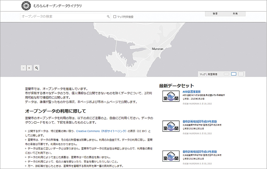
Muroran, Japan, Open Data Library

http://library.muroran.opendata.arcgis.com/?locale=ja
ArcGIS Open Data supports 25 different languages at no additional cost, giving the city of Muroran, Japan, the ability to share its open data with the public in Japanese.


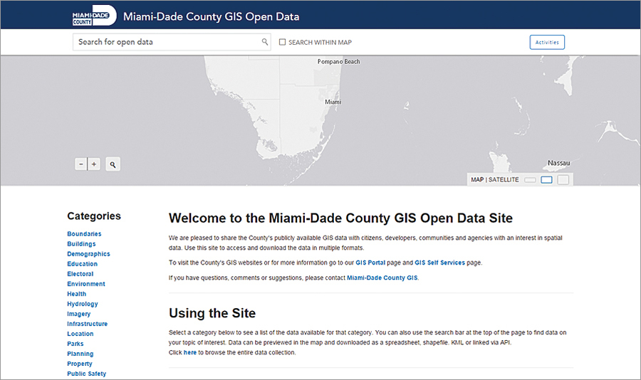
Miami-Dade County, Florida, GIS Open Data

http://gis.mdc.opendata.arcgis.com
Miami-Dade County actively uses its open data site to promote civic engagement. To make this effort sustainable and effective, Miami-Dade connects its data to the local communities that can use it to do great things by, for example, participating in local mapping and geospatial developer organizations such as MaptimeMIA and Code for Miami, the local Code for America brigade.


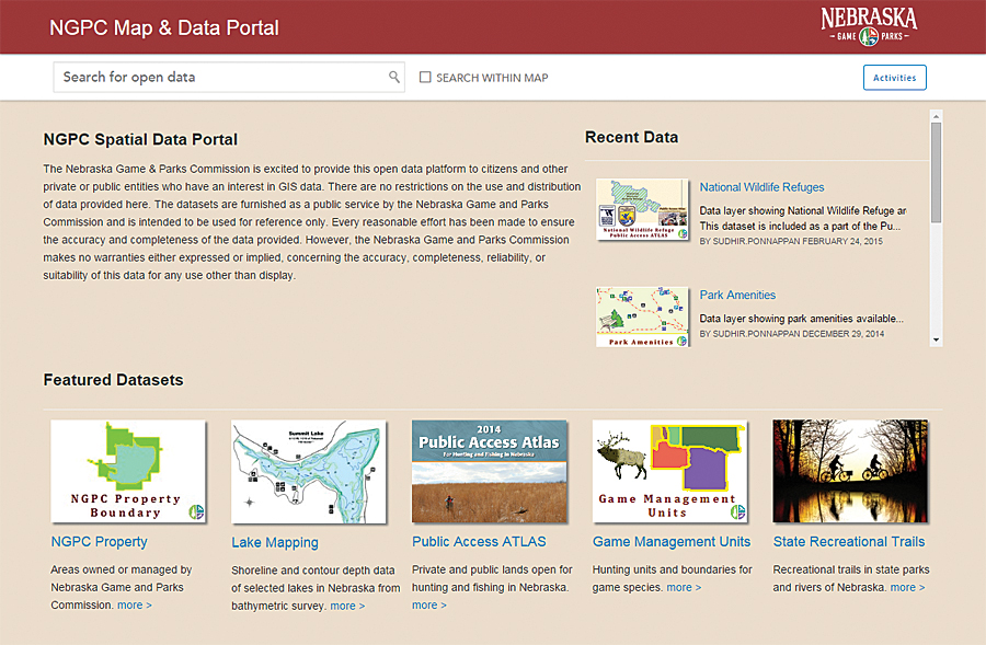
Nebraska Game and Parks Commission Open Data

http://data.outdoornebraska.gov
The Nebraska Game and Parks Commission uses its open data portal to share data about the state's fish, wildlife, park, and outdoor recreation areas. Its datasets are crafted to be authoritative, informative, and user-friendly. This open data site is a great resource for the public to find answers to common questions or to access data for geospatial analysis and application development.

To view other websites powered by ArcGIS Open Data or to create your own, visit esri.com/opendata.


Source: ESRI

Δευτέρα 9 Νοεμβρίου 2015

Tennessee Utility Proactively Stops Water Leaks


By Sarah Alban, Esri Writer


In 2013, the largest water and wastewater utility in Tennessee began transforming itself into a true GIS-centric organization.

White House Utility District (WHUD) is geographically Tennessee's largest water and wastewater utility. WHUD's service area extends 600 square miles and serves a population of just over 94,000.
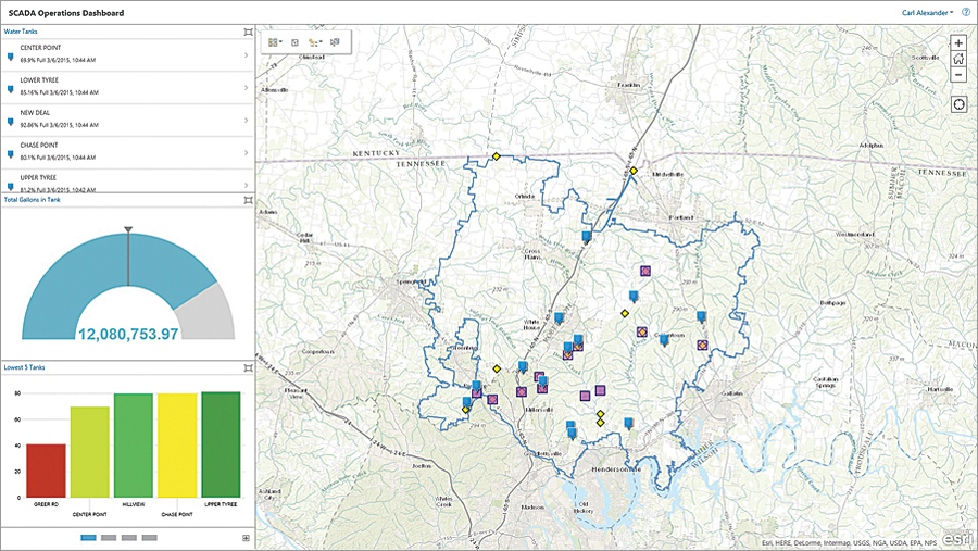
On this dashboard, red indicates excessive leakage requiring field response.On this dashboard, red indicates excessive leakage requiring field response.


"We had reached a point where continuing to develop custom software interfaces between software applications became too restrictive," said Bill Thompson, WHUD general manager.

Historically, WHUD has used GIS for managing asset information, workflows, subdivision records, and customer service and activities such as performing trend detection analysis, rate modeling, and gross revenue projection; and tracking growth areas, water use, and lots that have sold and those that are available.

In 2005, WHUD implemented an extensive leak detection program that focused on the reduction of nonrevenue water [i.e., water lost in the distribution process that was not billable]. WHUD's large coverage area posed a number of unique challenges for the district. The number one challenge was getting accurate information that could be analyzed quickly. In the initial stages of the program, the district was very successful. It reduced water loss from leaks by 50 percent, but WHUD reached a point at which results plateaued.

Primarily, this occurred because the technology in use was unable to receive real-time information that could be integrated with other field asset information. The only way WHUD could move forward with the program was to overcome this problem, so it reached out to Esri.

By working closely with Esri, WHUD was able to configure a connection that feeds real-time information from the district's smart meters into ArcGIS. Esri also helped to configure the district's supervisory control and data acquisition (SCADA) system so that flow meters, tanks, and pump stations all display real-time data. This information is accessible via ArcGIS for Server and ArcGIS Online as a web app and dashboard.

The web app uses color coding to show how the actual flow for a district metered area (DMA) compares to what has been determined by the staff as an acceptable flow rate for a particular zone. Using a set of geoprocessing tools and models, WHUD office staff can find where water loss appears excessive and then isolate potential leaks down to subzones, individual valves, and specific pipe segments.

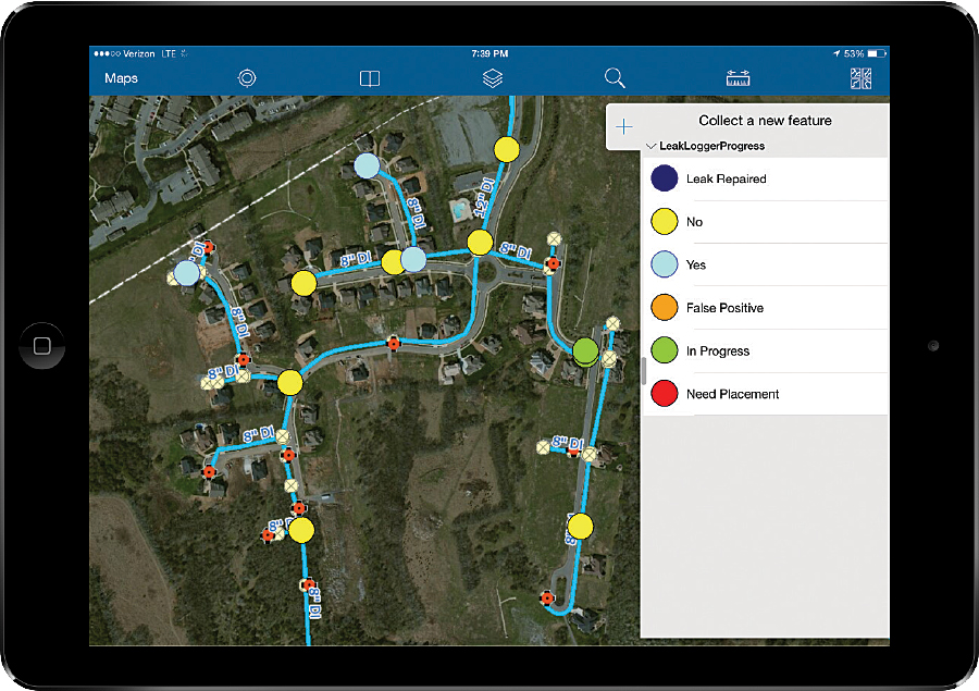
Water Leak Investigator, a solution that is a configuration of the Collector for ArcGIS app, lets field crews pull up detailed information on a specific leak that includes a projection of the number of gallons that is excessive for an area. Once a leaking area is identified, office staff create point features to let field staff know where to place the leak loggers and share that information using ArcGIS Online.

Field staff place loggers and leave them in place overnight. The next day, more staff go out and read the data from the loggers. The data is then input on the logger point feature so office staff can see if a leak has been identified.

"If we have found the leak, a work order is created to fix it," Thompson said. "If not, we continue the process in that area until the leak is found. Once the leak is found and fixed, the new flow data for this DMA zone is updated and the zone will change colors to reflect the repair."

All of the district's flow meters are set up with high- and low-flow alarms. Anytime a meter's readings go above or below the gallons-per-minute (GPM) thresholds, an alarm is sent. ArcGIS GeoEvent Extension for ArcGIS for Server receives that alarm and creates a GIS feature that notifies WHUD's personnel. Staff can access the alarm's location on any device through the point feature GeoEvent Extension creates.

Staff members can assess the situation in real time and compare it with historic data to determine if they need to dispatch a crew. For instance, after receiving a GeoEvent alert about a low-pressure tank, they can then compare that reading with historic pressure readings recorded for the tank and consult service data, such as customer call-ins related to low pressure, before making a decision.
Water Leak Investigator, a solution that is a configuration of the Collector for ArcGIS app, lets field crews pull up detailed information on a specific leak.Water Leak Investigator, a solution that is a configuration of the Collector for ArcGIS app, lets field crews pull up detailed information on a specific leak.

Three Days or Less to Repair All Leaks

Previously, it could take months to narrow down an underground leak to a specific location. Now leaks are detected and repaired within two to three weeks. The district will be able to cut repair times to 72 hours by July 1, 2015, and all field staff will have access to mobile GIS.

"The key benefit to ArcGIS in the field is the fact that

it can be viewed in real time," Thompson said. "This information allows us to be proactive rather than reactive."


The monetary savings that can be realistically achieved will likely exceed $1 million annually according to Pat Harrell, WHUD district engineer.

Beyond these direct monetary savings, there are less easily identified indirect savings. These indirect savings include recovered capacity for treatment plants and recovered distribution capacity in transmission lines. Rapid detection and repair of leaks also generate cost savings because less electricity is used, and there is less wear and tear on equipment. In addition, because the system is more efficient and proactive, there is less need for employees to work overtime.

Those benefits have a direct effect on WHUD's customers because they affect both short- and long-term water rates. WHUD expects initial savings to offset the cost of installing smart meters and the information technology infrastructure.

Other utilities in the region have made site visits to learn how WHUD is using technology to effectively detect leakage that is not coming to the surface.

"With ArcGIS Online, it's not as daunting as half the people think it is," Alexander said. "Using out-of-the-box COTS solutions like Collector has made it simple to get the tools deployed into the hands of our team quickly."

According to Harrell, "So much data is coming in the system at this point that the district has been caught a little off guard by the speed and quality of the information collected."
GIS Moves to a Leadership Role

So far, WHUD has improved planning, decision making, and customer service with the leak detection system. "The best part is that you don't have to be an engineer to make use of the GIS," Harrell said.

Customer service representatives now access the web map when customers call in. They can see right away if there are pressure issues and are able to confidently explain the situation. They are even using ArcGIS Pro to see 3D data visualizations that illustrate the effect of elevation in tank and pump station pressure to provide more accurate interpretations. With just a few minutes of analysis, staff can determine if low- to no-pressure conditions or other issues exist and use their findings to troubleshoot customer questions or work with developers on pressure issues.

After WHUD completes the smart meter installation, it will continue developing additional real-time data integration with its GIS. The information will display on simple, accessible viewers that tap into critical big data feeds.


"When we decided to move to a true GIS-centric environment, we felt like it was critical to examine every aspect of our organization from top to bottom," Thompson said. "In so doing, one of the things that I personally felt strongly about was the role GIS should play in the organization. I felt GIS should not report to the engineering department but should work collaboratively with them. I also felt equally as strong that IT should report to GIS instead of GIS reporting to IT. If we are to achieve our goal of having a true GIS-centric environment, GIS must be moved from an afterthought in the organization to a leadership role where our actions support our commitment."

Source: ESRI

Κυριακή 8 Νοεμβρίου 2015

Predictive Analytics Improve Storm Response


Dispatchr, an Esri Emerging partner, is rethinking how organizations manage their field workforces. Companies in the energy industry use the Dispatchr service to automate work processes, optimize personnel, and predict work before disasters occur.


Many energy companies still manage their field staff using printed maps and work order forms to route employees. This manual process is labor-intensive and susceptible to human error. To solve this problem, Dispatchr uses integrated internal, operational, and external data to generate predictive analytics. This information helps energy companies identify, plan, and communicate repairs. Power companies such as the Pacific Gas and Electric Company use Dispatchr with Esri technology to predict storm threats to their infrastructure.

Before a storm hits, a user can predict how the weather system will most likely impact the power grid. Integrating with Esri ArcGIS, Dispatchr searches large volumes of relevant geospatial data including storm trajectory, topography, and vegetation. It shows these features' relation to infrastructure data and predicts where and how badly the grid will be hit. This helps the power company prepare for the storm by pre-positioning equipment and personnel. Once the storm hits, the power company is ready to respond.

Dispatchr is the first service to use predictive analytics to optimize work crew response. The mobile workforce system prioritizes risk and guides field staff to the most critical work first. This improves response time to the areas most affected and to those outages that have the highest priority.

Energy companies continue to use Dispatchr after storms as well to enhance their restoration efforts. Dispatchr fully automates the work order process. Users can follow field crews' location in real time and see the status of their restoration efforts. Utilities say that Dispatchr significantly improves field communication and increases worker productivity by several hours each day. One company reports that it saves about $17 million annually.

Dispatchr improves utility customer service by helping crews quickly get the lights back on. Moreover, customers can use the Dispatchr mobile app to report outages and receive restoration updates.

For more information, visit dispatchr.com.

Source: ESRI

Παρασκευή 6 Νοεμβρίου 2015

Forest Atlas Informs How Woodland Changes Affect Earth


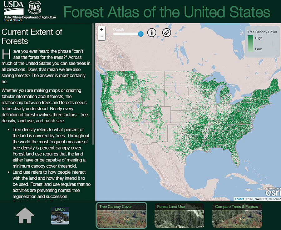
An interactive GIS atlas tells a story about what the world was like in the past, what it's like right now, and what we can ask of it in the future. The US Forest Service (USFS) has one such GIS atlas, the Forest Atlas of the United States.

The Forest Atlas "represents a new strategy and architecture for sharing data, information, and knowledge with policy makers, resource managers, landowners, and constituents," explained project manager and research soil scientist Charles "Hobie" Perry.

Built on Esri technology, the Forest Atlas is a resource for answering questions about how changes in forests affect people and the earth.

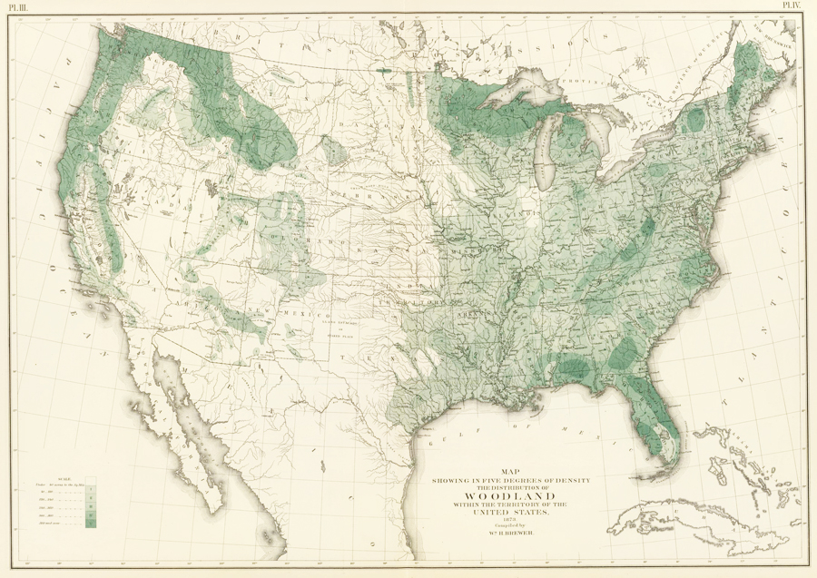
This 30-meter digital data of tree canopy cover has superseded William H. Brewer's map of woodland density from 1873.

This 30-meter digital data of tree canopy cover has superseded William H. Brewer's map of woodland density from 1873.

This 30-meter digital data of tree canopy cover has superseded William H. Brewer's map of woodland density from 1873.

A Bountiful Archive of Forest Maps
Forest maps have a long history in the United States. In 1873, William H. Brewer of the US Census Bureau produced one of the first maps of forests and woodlands. In 1898, George B. Sudworth, a dendrologist in the early Forest Service, published hisCheck List of the Forest Trees of the United States, Their Names and Ranges. From that, he and his team used contour maps of the United States to record where various forest flora could be found. The Forest Service and the US Geological Survey then published these maps in a loose-leaf volume in 1913—the firstForest Atlas of the National Forests of the United States.

But due to all the legwork that went into producing this, only one volume was published.

Forest Inventories Help Track Change
In 1928, the USFS began the Forest Inventory and Analysis (FIA) program, which manages information on forest conditions and reports on sylvan trends. FIA inventories describe the location, health, age, and tree species of forests. Forest managers need this information to write sustainable forest plans; understand the risks of fire, insect, and disease outbreaks; and schedule treatment activities such as harvests—all to maintain forest health.

This information has wider reaching applications as well. Water resource managers use forest data to trace water life cycles. State forest managers use it to track insects, diseases, and invasive species so they can implement effective treatments. Scientists rely on forest measurements to calculate how much carbon dioxide should be captured and stored for carbon sequestration. Natural resource planners also build strategies and design policies using forest changes measured over time.

Reviving the Forest Atlas
Because more forest analysts and scientists are incorporating geospatial analysis into their work, FIA is paying more attention to geospatial technology. Recently, the USFS decided to revive the Forest Atlas project to better organize its tremendous amounts of spatial data, and it used Esri technology to rebuild the resource.

The foundation for the new Forest Atlas is a set of highly accurate forest maps derived from FIA and other research projects. FIA inventories nearly 1,000 different plant species across 12 time zones, from Puerto Rico and the Virgin Islands in the Atlantic Ocean to the Marshall Islands and Palau in the Pacific Ocean. FIA recognizes species according to the US Department of Agriculture's Plants Database to eliminate the inherent biases that can arise when people inventory forests according to their own needs.

In addition to showcasing FIA inventory data, the Forest Atlas features datasets and information from across the agency. This includes the Forest Health Technology Enterprise Team's National Insect and Disease Risk Map, the Monitoring Trends in Burn Severity Program's burn severity and fire perimeter maps, and other researchers' historic tree species migration maps and future range projections.

In the Forest Atlas, this information is combined with other forest attributes to tell a comprehensive story about the forces shaping US forests and the ecosystem services they provide.

"Good data tells a very significant story," said FIA's national program manager Greg Reams. "This helps us demystify reasons why species shift in the forest. Geospatial analyses tell a story of change, [allowing] us to track invasive species and understand how these events are occurring."

The Forest Atlas addresses other related but broad forestry concerns as well, including changes in employment trends, biomass availability, land cover, and land use. It also helps the USFS, firefighters, and other responders better manage wildfires and aids scientists in analyzing carbon sequestration potential.

More Inclusive Fire Management Strategies
Fires are a natural event in any wooded landscape. When strategically managed, they help forests grow stronger and healthier. But native and invasive pests, overcrowded clusters of forest, and drought conditions reduce forests' resilience to fire and increase the likelihood that fires will be catastrophic.

The USFS and its partners need to integrate fire as a critical natural process in land and resource management but control wildfires that pass through properties with various ownership structures, all while implementing the best available science.

The Forest Atlas lets stakeholders and policy makers share essential knowledge for making environmentally sound and cost-effective fire management decisions. Sharing open data on GIS platforms ensures that everyone can understand and participate in these critical decisions.

Forecasting Carbon Sequestration Capabilities
US forests offset about 16 percent of the nation's annual carbon emissions, according to the USFS, making the Forest Atlas invaluable for designing carbon mitigation strategies.

People involved in discussions about climate change and carbon are very interested in forests' past; current; and, most of all, future carbon sequestration rates. These people are particularly keen on seeing various mapped-out scenarios that project carbon storage rates over the next 10 to 30 years.

Using Esri model building tools, researchers can construct simulations of future carbon sequestration based on variables such as population growth, fluctuations in gross domestic product, and changes in forest age and density. Forest Service scientists can also use projected climate scenarios—ranging from warm dry seasons to mild wet seasons—to calculate the effects these different conditions would have on future forest growth, including changing forest areas and carbon sequestration rates over the next 30 years. Analysts can then use these projections to forecast economic development such as housing starts, future lumber demand, and the quantity and quality of water that will be derived from forested ecosystems.

Complex and connected scenarios such as these are easier to understand when presented as geospatial displays. For example, positive and negative carbon storage levels can be represented as a range on a map so the resource community can see areas that need management action and policy makers and city planners can see what the effects will be.
Making the Forest Atlas Accessible

The Forest Atlas is available on the USFS GIS platform and is published in accordance with the Federal Geographic Data Committee's metadata standards. This makes it easy to integrate the information with other open data across government organizations.

"I see us aligning with other agencies, not just in a statistical manner but in a geospatial manner," Reams concluded. "Geographic metadata makes it easier to track monitoring information such as the shifts among land-use and land-cover categories, particularly forests, agriculture, and urban landscapes. The open-source data platform enables data integration among agencies in ways that will prove highly meaningful."


The general public can also access the atlas via ArcGIS Online and through the US government's open-source spatial data website.

Source: ESRI

Τετάρτη 4 Νοεμβρίου 2015

A Collaborative Approach to Storm Recovery


In the aftermath of Hurricane Sandy, which struck the northeastern United States in 2012, New York State Electric and Gas (NYSEG) and Rochester Gas and Electric (RG&E) saw an opportunity to enhance their emergency response planning by improving data collection. Not long into the modification process, these two Iberdrola USA-owned companies used Esri solutions to turn their plans for hurricane response improvement into a new, all-events assessment strategy—a cost-effective overhaul that would impact nearly 3 million electricity and natural gas customers in upstate New York.

Using Esri's Collector for ArcGIS app on iPad minis, Iberdrola USA field staff can now report broken poles, downed wires, and damaged transformers in real time using online and offline editing modes. 

The Catalyst: Hurricane Sandy
Hurricane Sandy, a superstorm packing torrential downpours and 80-mile-per-hour (129-kilometer-per-hour) winds, roared into the northeastern United States on October 29, 2012. With damages totaling more than $65 billion, Hurricane Sandy is the second most destructive hurricane in US history, behind the Gulf Coast's Hurricane Katrina in 2005.

While Long Island and New York City bore the brunt of the damage from wind, rain, and storm surge, more than 117,000 NYSEG and 27,000 RG&E customers were without power.

Shortly after the hurricane, New York governor Andrew Cuomo established the Moreland Commission to make recommendations for how New York State's power utility companies could improve their responses to extended power interruptions. One outcome of the commission was the development of a utility scorecard, filed with the New York State Public Service Commission, to report on key performance indicators during outages lasting 72 hours or longer.

An essential performance measurement is how quickly utility companies can do a preliminary damage assessment. To comply with this feature of the scorecard and to improve their emergency response systems, the two New York-based Iberdrola USA companies, plus the Central Maine Power Company (CMP), sought to change from a manual damage assessment method to an automated system designed around a central data repository.

Pre-Sandy Storm Response
Although Iberdrola USA companies had begun enhancing their restoration processes—particularly their damage assessment practices—before Hurricane Sandy, these operations were still quite labor-intensive and time-consuming.

By 2012, damage assessors from NYSEG and RG&E were no longer bringing paper maps and tally sheets into the field. Iberdrola USA had gotten PDAs in 2006, which ran a customized version of Esri's ArcPad. But six years later, the maps were only semiautomated; the geodatabases were only a bit quicker to access; and office staff still had to collate the data after collection, usually after hours. What's more, the devices were stored at each division office, so before a storm, NYSEG's GIS and mapping project manager, Stephen Hope, had to pack them up and drive them—sometimes through threatening conditions—to affected locations for fast deployment.

Working with Local Authorities
Local municipalities and counties had been looking for ways to leverage their own resources to assist with postemergency damage assessments as well, particularly in areas that had a lot of ground to cover. Hurricane Sandy made the need for collaboration even more apparent.

After the hurricane, secondary roads were in such disrepair that utility workers couldn't access their equipment to complete even preliminary assessments of broken poles, downed wires, and damaged transformers. The municipalities asked if there was a way that their own workers could report damage to Iberdrola USA companies rather than having to wait for company assessors to get to their areas. Municipalities wanted to have access to Iberdrola USA's database to record downed poles or blocked roads, for instance, complete with geographic coordinates, pictures, and details.

The utility companies thought this was a good idea, so Iberdrola USA's IT applications manager, Paul Booker, and programmers Dean Hartley and Dick Abram worked in ArcGIS Online to make that happen. Moreover, this aspect of the project fell in line with the Moreland Commission's recommendation that utilities collaborate more with municipalities.

A New Kind of Storm Recovery Collaboration
NYSEG, RG&E, and CMP were looking for a damage assessment solution that could be ready within about a year. With guidance from Esri, they came up with one that could be deployed quickly and easily and that fit their licensing packages.

In November 2014, the Iberdrola USA companies released a three-part GIS solution to make postemergency damage assessments more swift, collaborative, and comprehensive. It was one part mobile, one part web maps, and one part dashboard.


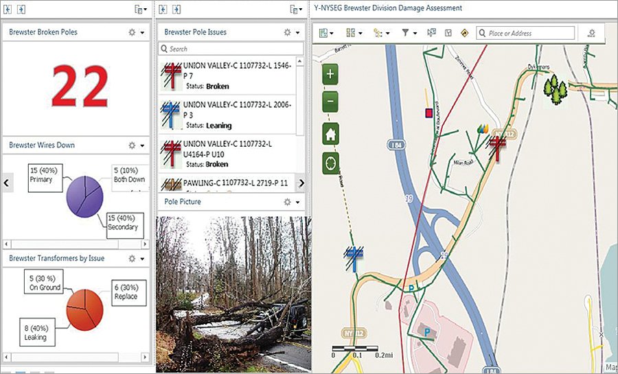
Supervisors now use an in-house dashboard in ArcGIS Online to monitor incoming data from the field.

Part One: Mobile Damage Assessments
To help with its own damage assessments, Iberdrola USA launched the Esri Collector for ArcGIS app on 300 iPad minis with data plans and individual phone numbers. Hope worked with NYSEG's manager of electric distribution quality assurance and quality control, La Wanda Ervin, to distribute these devices evenly across the company's New York and Maine service areas so that damage assessors could be deployed quickly wherever a storm hit.

Field personnel can now more accurately report damaged assets in real time using online and offline editing modes. The iPad minis communicate with the utilities' central geodatabase as soon as they enter cellular service zones. And data collection is map based.

"We did not use maps on the PDAs because the screen was so small," Hope said. "With the tablets, the maps are large and easy to use."

As fieldworkers record damage data, the tablets' GPS automatically pans to that location. Technicians can drop pinpoints to mark assets that need to be repaired, and the back-office programming automatically identifies each asset by drawing location data from the nearest utility pole. Field crews can also input photos, enter the type and extent of the damage, and report nearby conditions. What's more, assessors can communicate to and from the field using email or texting.

This system is more efficient and user-friendly than any of the utilities' previous procedures, and it saves time and money.

"The feedback we received has been wonderful," said Ervin. "The data coming in is more accurate, and most of our field technicians already used iPhones, so the technology is familiar to them. They love it."

Part Two: Collaborating with Municipalities Using Web Maps
Right after a storm or other emergency, municipal workers can now call their dispatchers to report preliminary damage to utility infrastructure and access points. The dispatchers can then log in to the municipalities' ArcGIS Online accounts and record the damages in the appropriate Iberdrola USA web map. Municipal personnel require minimal training to input the data, and the interface furnishes a simple way for municipalities and utility companies to work together to record damage assessments.

NYSEG has so far piloted this approach in three municipalities. Iberdrola USA hopes that more of the nearly 1,000 municipalities in its two-state service area join the initiative. They must have ArcGIS Online named user accounts, though, before they can participate.

Part Three: Monitoring Operations via a Web-Based Dashboard
Supervisors at all three utilities no longer have to wait to get field information compiled overnight. They can now monitor incoming data from the field on an in-house, Esri technology-based web application.

This higher-level dashboard view, available through ArcGIS Online, summarizes information such as the locations of downed primary and secondary wires, where transformers are leaking or need replacing, and how many broken utility poles there are. Training was minimal for this application too, said Hope, since the interface is so simple and intuitive.
Ticking All the Boxes—and Then Some

This three-pronged mobile, web, and dashboard solution was just what the Iberdrola USA companies needed. The quickly executed project lets utilities enter real-time damage assessment data, facilitates municipal involvement, and gives managers timely awareness of the overall situation.

Putting the system into practice was exceedingly cost-effective too. It took less than $100,000 to implement, including initial payments for licensing, devices, and other equipment.

And, as Ervin points out, the payoffs for being able to restore power more quickly exceed the monetary benefits.

"Imagine the cost savings in a storm like Sandy if you can leverage technology to get the power on one day faster," she said. "The payoff is also increased customer satisfaction and improved municipal relations."

Source: ESRI

Τρίτη 3 Νοεμβρίου 2015

Waiting for the new Bond movie? Check out this map by Esri.


By Aleks Buczkowski


Last week the new Bond movie – Spectre has hit screens around the world. Every fan of the series knows that agent 007 has certainly more stamps in his passport than most of us.

Marking the release of Spectre Esri decided to map every location the famous agent visited in all 24 movies, starting from Dr No (1962) and finishing will all known locations from Spectre (2015) including Mexico City, London, Rome, Austria and Morocco.


The interactive map shows 146 visits made to 49 countries. London is naturally the most frequented place, while Hong Kong, Istanbul and Venice have all been visited three times. Interestingly we see that Bond has only visited the United States once since the Roger Moore era.

Roger Moore is also the most travelling Agent 007 with 44 locations visited during his 7 Bond movies. Sean Connery, who also made seven films, is in second place with 32 places visited.

O boy, I can’t wait to go the movies.

source: Guardian and Geoawesomeness

Δευτέρα 2 Νοεμβρίου 2015

Editing with Feature Templates


By Mike Price, Entrada/San Juan, Inc.


This tutorial is one of a series that demonstrates best  practices for editing in ArcGIS for Desktop. It introduces feature templates and shows how they are created, updated, and applied.

ArcGIS 10.x for Desktop uses feature templates to create and update spatial data. These templates help manage symbology and populate selected attributes efficiently. Feature templates are usually created in or just before an editing session and often apply predefined layer symbology displayed in the map's table of contents (TOC).

Feature templates define information used to create a feature, including the default construction tool, selected attributes, and storage rules. Templates contain a user-defined name, description, and useful tags. Once created, templates are stored in the ArcMap document and in an item's layer file.


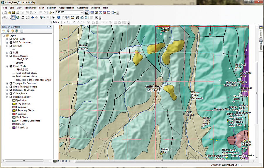
This exercise uses data shown on the US Geological Survey Antler Peak 7.5-minute quadrangle.

Well-Behaved Feature Templates

Users often ask me to explain why feature templates tend to behave badly for them. Carefully constructed and managed feature templates behave quite well, but you need to understand the rules for using them.

The first step when creating a feature template usually involves starting an edit session and loading the Create Features window. Often, the editing layer does not appear in the Create Features window, which creates confusion. A template might not appear because

  • The layer or its group is not visible.
  • The layer's visible scale range is beyond the map's current scale.
  • The layer is a parcel fabric dataset.
  • The layer has a definition query applied, and the default feature template does not match that query. This is the most common reason.

The best way to avoid problems with templates is to create the definition query first, clear any old templates, and create a new template for the queried data.


After applying a definition query to select the thrust faults, symbolize this data using the USGS symbol set.

Getting Started
This exercise uses data shown on the US Geological Survey Antler Peak 7.5-minute quadrangle. This is a portion of the Battle Mountain, Nevada, training set that has been used in seven previous exercises. This installment in the series will explain how to create, update, manage, and use feature templates for geological and topographic data including faults, hydrology, mineral occurrences, and bedrock.

To get started, download the sample dataset [ZIP] and unzip it to a local machine.

  1. Start ArcMap, navigate to the \Battle_Mountain08 folder, and open Antler_Peak_01.mxd.
  2. Explore the data layers and look at their attribute tables. Expand all layers and turn them on and off. Check out labeling schemes. Verify that the Maplex label engine is being used by right-clicking the data frame, choosing Properties, and clicking the General tab. Under Label Engine, make sure Maplex is selected. Maplex comes with ArcGIS 10.3 for Desktop.
  3. From the ArcMap standard menu, choose File > Map Document Properties. Complete the descriptive fields, providing a title, summary, and simple description. Include your name as Author and include Antler Peak, Geology as tags. Set paths to relative and set Battle_Mountain08\GDBFiles\Antler Peak.gdb as the default database.


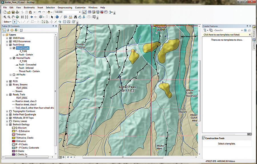
Fault lines showing the direction of faults can be corrected easily in ArcMap using templates.

This file geodatabase contains all the data for this exercise except for one georeferenced image, which is stored in Battle_Mountain08\JPGFiles. Since this is a rather simple editing exercise, it uses only one geodatabase to store all vector data. In an ArcMap editing session, only shapefiles stored in a common folder or feature classes inside a selected geodatabase may be edited.

Sometimes, when I edit in large, complex projects or share editing duties with others, I store edited data in one or more separate geodatabases to minimize the chances that a data management disaster might occur. Once editing is finished, I may copy edited feature classes back to master project geodatabases. However, for this exercise, remember to make only the editing layer selectable.

Preparing Data Layers

  1. Begin by studying all the layers in the map.
  2. Right-click the Bedrock Geology layer and choose Data > View Item Description to view the attribution. It is limited but is a complete attribution.
  3. Open the attribute table for All Faults and sort on the [F_TYPE] field in ascending order. Notice that attributes include Faults - Certain, Faults - Concealed, Faults - Inferred, and Thrust Fault - Certain. Close the All Faults attribute table.
  4. In the TOC, right-click All Faults and select Copy. Right-click the data frame name, Layers, and choose Paste Layers twice. Select all three instances of All Faults and group them, naming the group Faults Group. Rename the first copy "All Faults to Thrust Faults" and the second copy "Normal Faults." Leave the All Faults layer unchanged and turn it off.
  5. Double-click Thrusts, select Properties and click the Definition Query tab. Use the Query Builder to create the expression F_TYPE = 'Thrust Fault-Certain'. Select and copy this query to your clipboard. Then click OK and Apply.
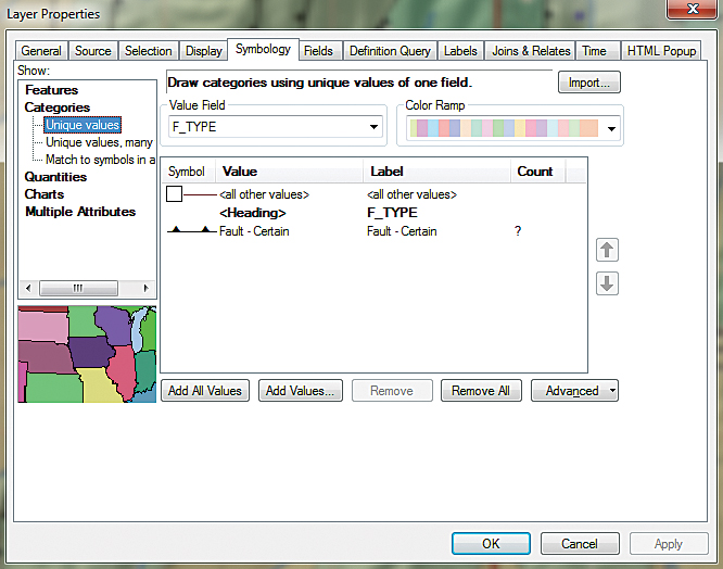
  6. To symbolize the Thrust Faults layer, double-click the layer, choose Properties, and click the Symbology tab. Set Categories to Unique Values and the Value Field to F_TYPE. Click the Get All Values button, uncheck , and double-click the default symbol.
  7. In the search window, type "thrust fault certain," select All Styles, and click Search. Six symbols should appear. Select Thrust Fault, 1st generation-Certain. Click OK twice to apply this symbology. Carefully inspect the symbology.
  8. Save the project.


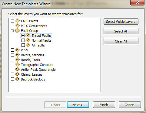
Use the Create New Templates Wizard to create a feature template to edit fault lines.

These symbols are included in the Geology 24K Style. They are carefully created to conform with the geology symbol sets used by the US Geological Survey and other agencies. The full symbol definition can be downloaded from the US Geological Survey as FGDC Document Number FGDC-STD-013-2006.
Check Symbol Direction
Consider what happens when faulted blocks frequently override other blocks at a low angle. Symbolized as triangles (or barbs), these symbols should point in the direction that the overlying rocks came from. The next step is to load a map to see if they are correct.

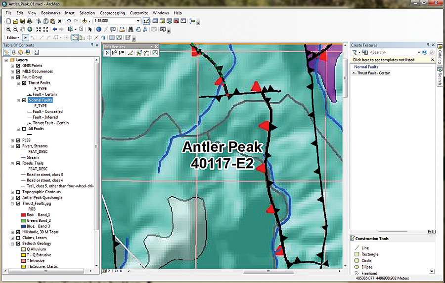
Navigate to \Battle_Mountain08\JPGFiles and load Thrust_Fault.jpg. Zoom in to the northeast corner of the project at a scale of approximately 1:15,000 and inspect the image and the symbolized lines. Notice that the red triangles in the image point west, toward the source of possible compressive forces.

In this case, the Pumpernickel Formation occurs above the Antler sequence, and the thrust barbs must be switched. To do this will require opening an editing session, creating a feature template, selecting the offending fault lines, and flipping them.


The Thrust_Faults.jpg lets you see which fault lines need to be flipped.

Creating Thrust Fault Template
  1. Before opening an edit session, change the TOC display to List By Selection. Make Thrust Faults the only selectable layer. Change the TOC to List By Drawing Order and make sure Thrust Faults is displayed.
  2. In the TOC, right-click the Thrust Faults layer and select Edit Features. The context menu provides three choices: Start Editing, Define New Types of Features, and Organize Feature Templates. The Define New Types of Features option allows symbology editing to be expanded later. Choose Start Editing from the context menu. The Editor toolbar should appear and can be docked above the TOC.
  3. In the Editor toolbar drop-down, choose Editing Windows > Create Features. The Create Features window appears and can be docked on the right side of the workspace.
  4. In the Create Features window, click the Organize Templates button. Inspect the layers listed in the Organize Features Template window. Select Thrust Faults Layer and click the New Template button.
  5. The Create New Templates Wizard opens. Look at the layers in the Faults Group. Check Thrust Faults and make sure all others are unchecked. Click Next. Click Finish and Close.
  6. Double-click the new Thrust Fault - Certain template to look at its properties. Inspect the Template Properties. In this dialog box, you can rename the template, specify an alternate Default Tool, and set field defaults.
  7. Change F_CODE to 5, F_MOVE to D, and EditCode to 0. Now, when a new thrust fault is created using this template, the attributes will be populated using these values. Click OK.
Flipping Faults

  1. Open the Thrust Faults attribute table. Select F_Index = 88, close the table, and look for the highlighted selection in the northeast portion of the map.
  2. Select the Edit Tool in the Edit toolbar. Double left-click the highlighted segment to display its vertices. Notice the single red node that marks the terminus of the fault line. Right-click the northernmost vertex and choose Flip. The barbs on the fault line change direction from east to west. Select the next line (F_Index = 89), and use the same process to flip it. Repeat the edits for F_Index = 96.
  3. Inspect your edits, and if they are correct, open the attribute table and use the Field Calculator to change all EditCodes to 3.
  4. Turn on Bedrock Geology labels and use the Identify tool to check the relationships between upper and lower rocks separated by each Fault. Are there older rocks on top of younger rocks?
  5. Open the Edit toolbar drop-down and choose Save Edits. Close the Thrust Faults attribute table, turn off Thrust_Faults.jpg, zoom to the project extent, and save the project.


After flipping the direction of two Thrust Fault lines, symbolize the three types of Normal Faults after applying a definition query and USGS symbology.

Symbolizing Normal Faults
The same steps used with Thrust Faults will be used to symbolize the Normal Faults layer. The fault lines in Normal Faults will not be edited.
  1. In the TOC, right-click Normal Faults and open Properties. Click the Definition Query tab. Use the Query Builder to form the expression F_TYPE <> 'Thrust Fault - Certain' and apply it.
  2. Click the Symbology tab. Choose Categories > Unique values, choose F_TYPE as the Value Field, and click the Add All Values button.
  3. Use the search function in the Symbol Selector using the layer name to locate the appropriate symbology from the Geology 24K Style Reference. For example, search on fault inferred to find the symbol for the Fault - Inferred layer.
  4. Now create a feature template for Normal Faults. In the Create Features window, click Organize Templates and select Normal Faults. Click New Template, making sure only Normal Faults is checked, click Next then click Finish. Close the Template Organizer.
  5. Save the Thrust Faults and Normal Faults as layer files to capture the associated feature templates. Save the map.

When finished, inspect the fault symbology on the map. Can you determine the difference between a concealed fault and an inferred fault? A concealed fault is hidden by an overlying geologic map unit, water, or ice, even though it may be observed nearby. An inferred fault's location must be inferred by indirect means such as geophysics and remote sensing.

Summary
This exercise showed how to access meaningful geologic symbology and use definition queries when applying symbology. This updated symbology was used when creating several feature templates.

Acknowledgments
Once again, thanks to my Battle Mountain data providers and to my earth sciences followers. Special thanks to my editor, who keeps me always heading in the right direction.


See also the accompanying article, "Building Antler Peak."
Source: ESRI