
acquired May 27 - 31, 2015
download large image (444 KB, PNG, 1994x998)
Look at natural-color satellite images and it becomes clear that most of the water on Earth (about 97 percent) is stored in the oceans. Next you might notice some on the land: liquid water fills lakes and rivers, while frozen water blankets the poles and mountaintops. In the atmosphere, water is visible in the countless tiny droplets that compose the clouds, though there is plenty of moisture even in cloud-free skies.
Not immediately visible, however, is the water residing in the soil. This water does not appear brilliantly blue or white, like the oceans or ice. In fact, it is hard to spot in natural-color satellite images.
Compared to the amount of water stored elsewhere on the planet, the amount in the soil is minuscule. But that small volume has great significance. It can affect when, where, and what a farmer will plant. It can influence the weather. And at high northern latitudes, soil moisture has serious implications for global climate.
For all of these reasons, researchers have developed satellite instruments to measure the water hidden between soil particles. The instruments are either active or passive. Active sensors allow scientists to measure moisture in very specific areas (high resolution), but they are less accurate than other sensors. In contrast, passive measurements give better estimates of the amount of water, but over a broader area (coarse spatial resolution) than active radar. NASA’s Soil Moisture Active Passive (SMAP) satellite was launched in January 2015 and carries both a radiometer and radar. (Note: the radar stopped transmitting data in July 2015.)
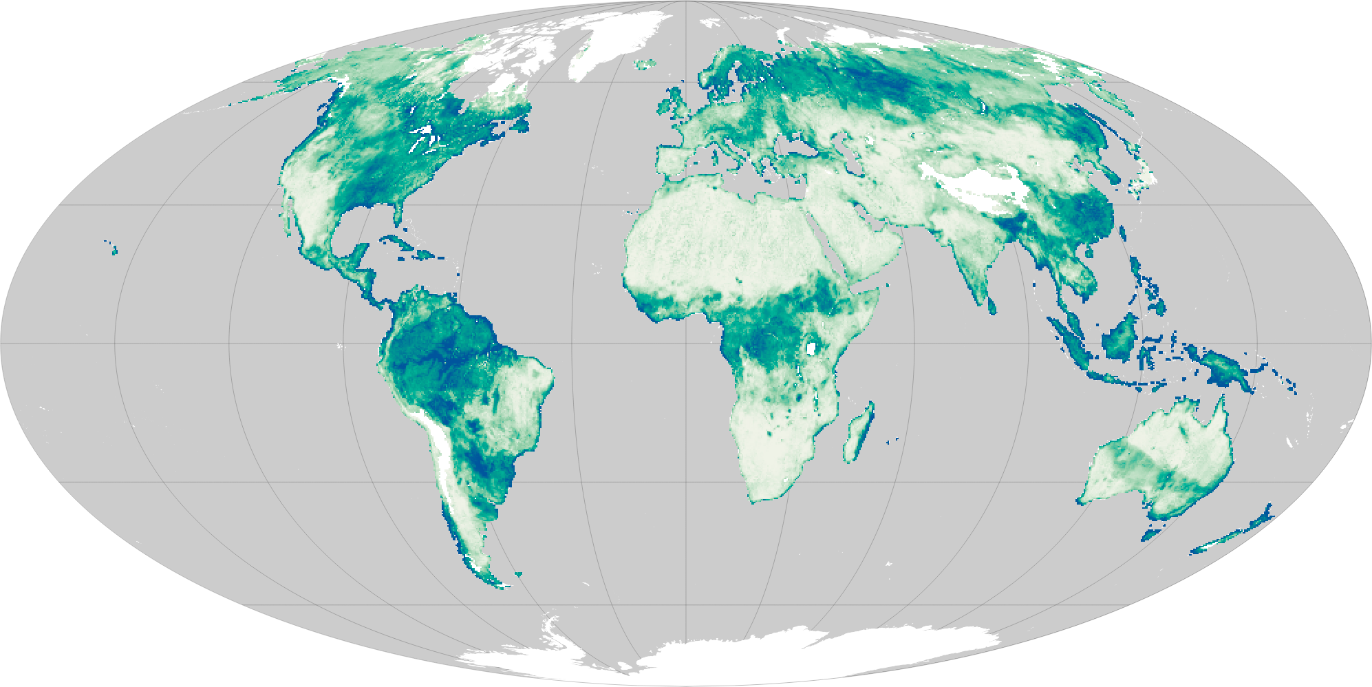
The map above was produced with data collected by SMAP’s radar and radiometer from May 27–31, 2015. It shows the amount of moisture in the top 5 centimeters of the ground at a resolution of about 9 kilometers. Data are mapped as the fraction of the volume of water contained in a volume of soil. Dark green and blue areas are progressively wetter, up to a ratio of about 0.5; at that point, the ground is considered saturated.
As expected, deserts around the world have low soil moisture content, and appear light yellow in this map. Soils in areas such as rainforests, boreal forests, and vegetated mountain regions are generally wetter.
There is often good correspondence between areas where meteorologists observe high amounts of rainfall and areas of maximum soil moisture, as was the case in October 2015 following extreme rainfall in the eastern United States. But soil moisture depends on other factors, too, such as the state of the soil preceding an event. Soil that is already wet can saturate more quickly and cause runoff and flooding.
Space-based platforms like SMAP, combined with insights from ground-based sensors, contribute to a growing record of global soil moisture. The goal is to establish a standardized set of measurements for the entire planet so that everyone from meteorologists to climate modelers can track the movement of this small but vital reservoir of water.
Read more in our latest feature story: A Little Bit of Water, A Lot of Impact.
Selected ReadingLu, H. et al., (2009) Monitoring Soil Moisture from Spaceborne Passive Microwave Radiometers: Algorithm Developments and Applications to AMSR-E and SSM/I. Advances in Geoscience and Remote Sensing, Chapter 17.
NASA’s Jet Propulsion Laboratory (2015) Soil Moisture Active Passive (SMAP).
NASA’s Jet Propulsion Laboratory (2015, March 9) NASA’s Soil Moisture Mapper Takes First ‘SMAPshots’. Accessed September 16, 2015.
SMAP Mission Brochure (2014) Mapping Soil Moisture and Freeze/Thaw State from Space. Accessed September 16, 2015.
NASA Earth Observatory map by Joshua Stevens, using data courtesy of JPL and the SMAP science team. Caption by Kathryn Hansen.
Look at natural-color satellite images and it becomes clear that most of the water on Earth (about 97 percent) is stored in the oceans. Next you might notice some on the land: liquid water fills lakes and rivers, while frozen water blankets the poles and mountaintops. In the atmosphere, water is visible in the countless tiny droplets that compose the clouds, though there is plenty of moisture even in cloud-free skies.
Not immediately visible, however, is the water residing in the soil. This water does not appear brilliantly blue or white, like the oceans or ice. In fact, it is hard to spot in natural-color satellite images.
Compared to the amount of water stored elsewhere on the planet, the amount in the soil is minuscule. But that small volume has great significance. It can affect when, where, and what a farmer will plant. It can influence the weather. And at high northern latitudes, soil moisture has serious implications for global climate.
For all of these reasons, researchers have developed satellite instruments to measure the water hidden between soil particles. The instruments are either active or passive. Active sensors allow scientists to measure moisture in very specific areas (high resolution), but they are less accurate than other sensors. In contrast, passive measurements give better estimates of the amount of water, but over a broader area (coarse spatial resolution) than active radar. NASA’s Soil Moisture Active Passive (SMAP) satellite was launched in January 2015 and carries both a radiometer and radar. (Note: the radar stopped transmitting data in July 2015.)
The map above was produced with data collected by SMAP’s radar and radiometer from May 27–31, 2015. It shows the amount of moisture in the top 5 centimeters of the ground at a resolution of about 9 kilometers. Data are mapped as the fraction of the volume of water contained in a volume of soil. Dark green and blue areas are progressively wetter, up to a ratio of about 0.5; at that point, the ground is considered saturated.
As expected, deserts around the world have low soil moisture content, and appear light yellow in this map. Soils in areas such as rainforests, boreal forests, and vegetated mountain regions are generally wetter.
There is often good correspondence between areas where meteorologists observe high amounts of rainfall and areas of maximum soil moisture, as was the case in October 2015 following extreme rainfall in the eastern United States. But soil moisture depends on other factors, too, such as the state of the soil preceding an event. Soil that is already wet can saturate more quickly and cause runoff and flooding.
Space-based platforms like SMAP, combined with insights from ground-based sensors, contribute to a growing record of global soil moisture. The goal is to establish a standardized set of measurements for the entire planet so that everyone from meteorologists to climate modelers can track the movement of this small but vital reservoir of water.
Read more in our latest feature story: A Little Bit of Water, A Lot of Impact.
Selected ReadingLu, H. et al., (2009) Monitoring Soil Moisture from Spaceborne Passive Microwave Radiometers: Algorithm Developments and Applications to AMSR-E and SSM/I. Advances in Geoscience and Remote Sensing, Chapter 17.
NASA’s Jet Propulsion Laboratory (2015) Soil Moisture Active Passive (SMAP).
NASA’s Jet Propulsion Laboratory (2015, March 9) NASA’s Soil Moisture Mapper Takes First ‘SMAPshots’. Accessed September 16, 2015.
SMAP Mission Brochure (2014) Mapping Soil Moisture and Freeze/Thaw State from Space. Accessed September 16, 2015.
NASA Earth Observatory map by Joshua Stevens, using data courtesy of JPL and the SMAP science team. Caption by Kathryn Hansen.
Instrument(s): SMAP
Source: Nasa Earth Observatory


