Εμφάνιση αναρτήσεων με ετικέτα Aerial imagery. Εμφάνιση όλων των αναρτήσεων

Δευτέρα 28 Δεκεμβρίου 2015

PrecisionHawk develops data and safety tools to take drone use to the next level


By Aleks Buczkowski


For many years, remote sensing was directly connected to collecting data with satellites and manned aircraft. Originally this was a truly game changing technology, but it had its limitations. These data gathering technologies, while effective, can be expensive and, in many cases, time inefficient.


Traditional remote sensing multispectral images


Over the years market needs have evolved and today’s decision makers require hyper accurate, hi-resolution data in a near real-time, which is difficult to achieve using traditional methods. This is where drones, previously used for military reconnaissance, entered the remote sensing arena. UAV flights can be conducted daily, for smaller areas, at low altitudes, resulting in higher resolution imagery at a fraction of the cost..


PrecisionHawk
– North Carolina-based start-up was one of the first who realised the potential of drones in remote sensing. In 2008 they started flying their first aircraft, The Lancaster, for commercial applications in Canada, specifically in the viticulture industry. The vision behind it was however much different from most of the players on the market. PrecisionHawk understood early on that the use of small UAVs goes far beyond data collection; the key is turning around actionable information, so a platform needs to include data processing and analysis. In the past, these functions were separated. Data was often collected by one company and then handed over to another organization for processing and analysis.


PrecisionHawk took a different approach and decided to build an end-to-end solution that did not require a pilot or remote sensing expert to operate and understand, but would allow an average grower to gather field data in the matter of minutes. Five years ago the idea seemed crazy, but today the approach introduced by PrecisionHawk is recognized as industry standard.


All you need is a tablet or laptop with the dedicated map platform where you mark area you need to survey. Than you simply throw the plane into the air. Everything else is done automatically. The aircraft computes flight paths, survey parameters, take-off and landing paths on its own. Once the survey is complete, the on-board computers will automatically connect to Wi-Fi networks and transfer all remote sensing data, flight information and diagnostics to remote servers, which can be accessed via its DataMapper platform. Moreover the drone sensors are fully customisable. Depending on your needs, you can buy extra sensors like Lidar and just plug it in. Sounds cool?


That’s not all. The PrecisionHawk software platform, DataMapper, is used for storing, processing and analysing remote sensing data features a really unique thing – a marketplace where a user can buy and sell your remote sensing algorithms. It is one of the first places where a user can easily commercialize it’s analysis tools and developments. But this is not the only area where the company is taking the approach to create an aerial information ecosystem. In early 2015, PrecisionHawk acquired TerraServer – a popular web portal to buy satellite images. In the future using TerraServer technology you will be able not only to buy satellite imagery, but order drone services from PrecisionHawk and other companies to get a higher-resolution picture of your desired location.


But building the end-to-end drone platform is just a beginning. In 2014 PrecisionHawk raised $11m in seed funding with the aim to go beyond being just an outstanding drone start-up. The company developed the first, automated air traffic control system for drones calledLATAS (Low Altitude Traffic and Airspace Safety) to help solve the safety issue presented when integrating drones into the airspace with competing obstacles.

The existing air traffic control system almost fully relies on ground radars. It works well with regular aircrafts, but small drones, flying at low altitudes are almost impossible to be detected. Besides, any system of human operators could not possibly scale to accommodate the millions of drones expected in years to come. LATAS on the other hand uses cellular and satellites technologies to manage millions of simultaneous connections between drones and other ground and air obstacles. By relaying on existing infrastructure the platform has the ability to scale and to accommodate the millions of drones expected in years to come.

The aim of the project is to safely integrate drones into the national airspace, and it is being tested together with United State’s FAA under the Pathfinder program.

From PrecisionHawk perspective LATAS is a strategic project as the safety requirements are still a key barrier for the industry. This doesn’t stop the company to expand from agricultural data collection business to new industries including construction, insurance and energy among other. Today PrecisionHawk’s client base includes several Fortune 500 companies in the US, Europe and Asia. Not to shabby.

“A million-dollar idea” for a start-up needs to have a clear vision which either solves an existing problem or generates a new desire. PrecisionHawk is a model example of that sort of thinking. The company’s founders had a clear vision and found a proper people to make it happen. Today PrecisionHawk is one of the industry leaders and it sets standards for everyone else.

Παρασκευή 4 Δεκεμβρίου 2015

Bluesky Achieves Irish Aerial Survey Milestone


Aerial mapping company Bluesky is celebrating a successful 2015 flying season in Ireland. Having captured nearly 10,000 square kilometres of high resolution aerial photography, Bluesky is well on the way to achieving its ambitious plans to capture high resolution aerial photography for the whole of Ireland. Bluesky is also pleased to announce the early take up of its ground breaking Irish datasets, with sales of aerial photography and detailed LiDAR height models to early adopters including Local Government organisations, Central Government departments and commercial businesses.

“We are extremely pleased with the amount of high quality imagery and data we have been able to capture, in spite of the challenging weather conditions we have experienced this flying season,” commented Rachel Tidmarsh, Managing Director of Bluesky. “The interest in this new data from both public and private sector organisations has also been immensely encouraging, and we are already delivering high quality data products to end users.”

Bluesky originally announced its plans to capture high resolution, leaf on, aerial photography and colour infrared imagery for the whole of The Republic of Ireland in 2014, and began flying as planned during the Spring of 2015. Bluesky has already committed to a three year update cycle for core data products, and will recommence flying in early spring of 2016 as soon as weather conditions allow.

Products from the Bluesky 2015 Irish flying season include 25 cm and 20 cm resolution coverage for nearly 10,000 square kilometres, including the county of Waterford, and higher resolution, 12.5 cm and 10 cm, data for urban areas including Sligo, Limerick, New Ross, Enniscorthy, Gorey and Wexford.

In addition to the aerial photography and CIR imagery already captured, national Digital Terrain Models (DTM) at 2m resolution and Digital Surface Models (DSM) at 25cm, 12.5cm and 10cm resolutions, are being created. The first datasets, available in a variety of GIS ready formats, are already being delivered to clients and will soon be available online at Bluesky’s Mapshop (www.blueskymapshop.com).

Bluesky’s team is expert in the capture of remotely sensed data and the production of innovative geographic data products. Bluesky’s work includes providing a technical lead in a European Commission funded project into a web based renewable energy rating platform, the laser mapping of overhead power line networks, new technology for air quality mapping, night time thermal surveying and the creation of the National Tree Map (NTM).

Contacts:
Bluesky
tel +44 (0)1530 518 518

www.bluesky-world.com

Τετάρτη 21 Οκτωβρίου 2015

Is Remote Sensing The Answer To Today's Agriculture Problems? Wheat Growers Turn To Aerial Imagery To Overcome Economic, Environmental Challenges


Today's wheat growers face many economic and environmental challenges, but arguably their greatest challenge is the efficient use of fertilizer.


Growers need to apply nitrogen-based fertilizer in sufficient quantities to achieve the highest possible crop yields without over-applying - a situation that could lead to serious environmental effects. In wheat, a critical factor comes down to timing in order to determine how efficiently plants will use nitrogen fertilizer. Current methods for determining the optimum timing of nitrogen fertilizer application can be costly, time consuming, and difficult.

To assist wheat growers, scientists at North Carolina State University recently developed a technique to properly time nitrogen fertilizer applications. The technique? Remote sensing - a relatively new technology to today's modern agriculture that uses aerial photography and satellite imagery.

In this 2000-2001 study, scientists used remote sensing in the form of infrared aerial photographs to determine when early nitrogen fertilizer applications were required. By relating the infrared reflectance of the crop canopy to wheat tiller density, the scientists were able to differentiate wheat fields that would benefit from early nitrogen fertilizer applications compared to wheat fields that would benefit from standard nitrogen fertilizer applications. They tested 978 field locations, representing a wide range of environmental and climatic conditions. The remote sensing technique was found to accurately time nitrogen fertilizer applications 86% of the time across all field locations. The results of this study are published in the January/February 2003 issue of Agronomy Journal.

Michael Flowers, project scientist, said, "This is one of the first applications of remote sensing technology for nitrogen management available to growers. With the ability to cover large areas in a quick and efficient manner, this remote sensing technique will assist growers in making difficult nitrogen management decisions that affect profitability and environmental stewardship."

These scientists at North Carolina State University and other institutions around the world are continuing to research remote sensing techniques to improve the efficiency of nitrogen fertilizer applications in crops. These techniques will allow growers to more efficiently apply nitrogen fertilizer, increase profitability, and avoid detrimental environmental effects.


Agronomy Journal, http://agron.scijournals.org is a peer-reviewed, international journal of agriculture and natural resource sciences published six times a year by the American Society of Agronomy (ASA). Agronomy Journal contains research papers on all aspects of crop and soil science including resident education, military land use and management, agroclimatology and agronomic modeling, extension education, environmental quality, international agronomy, agricultural research station management, and integrated agricultural systems.

The American Society of Agronomy (ASA), the Crop Science Society of America (CSSA), and the Soil Science Society of America (SSSA) are educational organizations helping their 10,000+ members advance the disciplines and practices of agronomy, crop and soil sciences by supporting professional growth and science policy initiatives, and by providing quality, research-based publications and a variety of member services.


Story Source:

The above post is reprinted from materials provided by American Society Of Agronomy. Note: Materials may be edited for content and length.

Article source: Science Daily

Τρίτη 20 Οκτωβρίου 2015

Remote Sensing Technique Uses Agricultural Aircraft

Once images have been retrieved from an agricultural aircraft, ARS scientists combine them to create a mosaic for study. This mosaic was used in a study of several catfish ponds near Lake Village, Arkansas.
Credit: Photo by Roger Bright


The need for higher resolution images in remote sensing projects has led to a new technique using agricultural airplanes in the Mississippi Delta.


Agricultural Research Service (ARS) agricultural engineer Steven J. Thomson, located in the ARS Application and Production Technology Research Unit, Stoneville, Miss., is applying remote sensing technology using agricultural aircraft to projects as diverse as crop water stress management, invasive imported fire ant control (a concern for ranchers and growers alike) and catfish production.

Thomson initially developed the method to collect field images as part of a concept known as precision agriculture. The idea is to determine only those areas in a field that require more attention by growers of cotton, soybeans, corn and other crops. This practice helps growers save on their input costs, such as fertilizer and pesticide, and reduces runoff.

An advantage of using agricultural aircraft is that they are potentially easier to schedule for remote sensing because they are frequently used in the field for pesticide spray operations, according to Thomson.

The new system is being used in studies for several applications with a variety of cameras, such as weed detection in cotton and soybean fields using digital video, and detection of crop nutrient or water stress using thermal imaging.

The use of agricultural aircraft for observation, as well as for spraying, has advantages other than additional utilization of the planes, including flexibility in how high or low the plane is flown. Flying an airplane close to the ground avoids atmosheric interference experienced with satellite images.

Although agricultural aircraft can be flown at a variety of altitudes, low flights limit the ability to capture images of large areas at once. That problem is overcome by making multiple flights over the site and assembling many images over different portions.

ARS is the U.S. Department of Agriculture's chief scientific research agency.


Story Source:

The above post is reprinted from materials provided by USDA / Agricultural Research Service. Note: Materials may be edited for content and length.


Article source: Science Daily

Κυριακή 18 Οκτωβρίου 2015

To Take Earth’s Pulse, You Have to Fly High


Ecologist Greg Asner and his team at the Carnegie Institution for Science can measure the biomass of a forest from the air. In this false-color video of Amazon rain forest in Peru, the biggest, heaviest trees are red, while yellow, green, and blue trees are progressively lighter. Carnegie's research aircraft is equipped with a scanning lidar—a laser ranging device that works like radar—and imaging spectrometers.


Story by Peter Miller
THE VIEW OUT THE WINDOW WAS BAD ENOUGH. As his research plane flew over groves of California’s giant sequoias, some of the world’s tallest trees, Greg Asner could see the toll the state’s four-year drought had taken. “It looked wicked dry down there,” he said. But when he turned from the window to the video display in his flying lab, the view was even more alarming. In places, the forest was bright red. “It was showing shocking levels of stress,” he said.

The digital images were coming from a new 3-D scanning system that Asner, an ecologist with the Carnegie Institution for Science, had just installed in his turboprop aircraft. The scanner’s twin lasers pinged the trees, picking out individual branches from 7,000 feet up. Its twin imaging spectrometers, one built by NASA’s Jet Propulsion Laboratory (JPL), recorded hundreds of wavelengths of reflected sunlight, from the visible to the infrared, revealing detailed chemical signatures that identified each tree by species and even showed how much water it had absorbed—a key indicator of health. “It was like getting a blood test of the whole forest,” Asner said. The way he had chosen the display colors that day, trees starved of water were bright red.


As California's historic drought continues, scientists are turning to remote sensing from the skies. Orbiting satellites measure groundwater depletion, and aircraft monitor the snowpack and the tree canopy's chemical composition, bringing crucial information to those working to alleviate the drought—and to the people who depend on them.

Disturbing as the images were, they represented a powerful new way of looking at the planet. “The system produces maps that tell us more about an ecosystem in a single airborne overpass,” Asner wrote later, “than what might be achieved in a lifetime of work on the ground.” And his Carnegie Airborne Observatory is just the leading edge of a broader trend.

At a time when human impacts on the planet are unprecedented, technology offers a chance to truly understand them.

A half century after the first weather satellite sent back fuzzy pictures of cloudsswirling over the North Atlantic, advanced sensors are doing for scientists what medical scanners have done for doctors—giving them ever improving tools to track Earth’s vital signs. In 2014 and early 2015 NASA launched five major Earth-observing missions (including two new instruments on the space station), bringing its total to 19. Space agencies from Brazil, China, Europe, and elsewhere have joined in. “There’s no question we’re in a golden age for remote sensing,” said Michael Freilich, NASA’s earth science director.


Four years of drought have taken a harsh toll on California's farms and forests. Last spring Greg Asner and his team flew over the Sierra Nevada, home to sequoias and other giant trees. With the new instruments on their airplane, the researchers completed in days a damage survey that would have taken a lifetime from the ground.
PHOTOGRAPH BY GREGORY ASNER, CARNEGIE INSTITUTION FOR SCIENCE


Climate Change Is Here

Germany Could Be a Model for How We’ll Get Power in the Future


The news from all these eyes in the sky, it has to be said, is mostly not good. They bear witness to a world in the midst of rapid changes, from melting glaciers and shrinkingrain forests to rising seas and more. But at a time when human impacts on Earth are unprecedented, the latest sensors offer an unprecedented possibility to monitor and understand the impacts—not a cure for what ails the planet, but at least a better diagnosis. That in itself is a hopeful thing.


WHAT THIS IS It’s a map of atmospheric carbon dioxide over land last summer, made by NASA’s OCO-2 satellite. Red areas have a bit more CO₂, green areas a bit less, than the global average of 400 parts per million.

WHAT THIS TELLS US Forests and oceans have slowed global warming by soaking up some of the CO₂ we emit. OCO-2 will shed light on where exactly it’s going—and on how fast the planet could warm in the future.MAP BY NGM STAFF: SOURCE NASA/JPL

WATER IS EARTH’S LIFEBLOOD, and for the first time, high-flying sensors are giving scientists a way to follow it as it moves through every stage of its natural cycle: falling as rain or snow, running into rivers, being pumped from aquifers, or evaporating back into the atmosphere. Researchers are using what they’ve learned to predict droughts, warn of floods, protect drinking water, and improve crops.

Forest


WHAT THIS IS The Carnegie Airborne Observatory made this image of rain forest in Panama with its scanning lidar, which probes the trees’ size and shape, and a spectrometer that charts their chemical composition.

WHAT THIS TELLS US The technique allows Asner's team, flying at 7,000 feet, to identify individual trees from their chemical signatures—and even to say how healthy they are. The reddish trees here (the colors are arbitrary) are growing the fastest and absorbing the most CO₂.PHOTOGRAPH BY GREGORY ASNER, CARNEGIE INSTITUTION FOR SCIENCE
In California the water crisis has turned the state into something of a laboratory for remote-sensing projects. For the past three years a NASA team led by Tom Painter has been flying an instrument-packed aircraft over Yosemite National Park to measure the snowpack that feeds the Hetch Hetchy Reservoir, the primary source of water for San Francisco.
Until now, reservoir managers have estimated the amount of snow on surrounding peaks the old-fashioned way, using a few gauges and taking surveys on foot. They fed these data into a statistical model that forecast spring runoff based on historical experience. But lately, so little snow had fallen in the Sierra Nevada that history could offer no analogues. So Chris Graham, a water operations analyst at Hetch Hetchy, accepted the NASA scientists’ offer to measure the snowpack from the sky.

Water


WHAT THIS IS It’s an image of the Tambopata River in eastern Peru made by the scanning lidar aboard the Carnegie observatory.

WHAT THIS TELLS US The area in this image is actually covered with rain forest. Some lidar pulses penetrate the forest and reflect off the ground, revealing the subtle topography—red is a few feet higher than blue—and faint, abandoned river channels that have shaped the forest and helped create its rich biodiversity.
PHOTOGRAPH BY GREGORY ASNER, CARNEGIE INSTITUTION FOR SCIENCE
Painter’s Twin Otter aircraft, called the Airborne Snow Observatory, was equipped with a package of sensors similar to those in Greg Asner’s plane: a scanning lidar to measure the snow’s depth and an imaging spectrometer to analyze its properties. Lidar works like radar but with laser light, determining the plane’s distance to the snow from the time it takes the light to bounce back. By comparing snow-covered terrain with the same topography scanned on a snow-free summer day, Painter and his team could repeatedly measure exactly how much snow there was in the entire 460-square-mile watershed. Meanwhile the imaging spectrometer was revealing how big the snow grains were and how much dust was on the surface—both of which affect how quickly the snow will melt in the spring sun and produce runoff. “That’s data we’ve never had before,” Graham said.

Land


WHAT THIS IS NASA’s Aqua satellite captured these visible-light images of California and Nevada on March 27, 2010 (left), the most recent year with normal snowfall, and on March 29, 2015 (right).

WHAT THIS TELLS US After four years of drought, the snowpack in the Sierra Nevada—a crucial water reservoir for California—is just 5 percent of the historical average. Snow has virtually vanished from Nevada. And west of the Sierra, in the Central Valley, much of the fertile farmland is fallow and brown.
PHOTOGRAPHS COURTESY NASA
Painter also has been tracking shrinking snowpacks in the Rocky Mountains, which supply water to millions of people across the Southwest. Soon he plans to bring his technology to other mountainous regions around the world where snow-fed water supplies are at risk, such as the Himalayan watersheds of the Indus and Ganges Rivers. “By the end of the decade, nearly two billion people will be affected by changes in snowpacks,” he said. “It’s one of the biggest stories of climate change.”


WITH LESS WATER FLOWING into California’s rivers and reservoirs, officials have cut back on the amount of water supplied to the state’s farmers, who typically produce about half the fruits, nuts, and vegetables grown in the U.S. In response, growers have been pumping more water from wells to irrigate fields, causing water tables to fall. State officials normally monitor underground water supplies by lowering sensors into wells. But a team of scientists led by Jay Famiglietti, a hydrologist at the University of California, Irvine, and at JPL, has been working with a pair of satellites called GRACE(for Gravity Recovery and Climate Experiment) to “weigh” California’s groundwater from space.
Planet Probes
Earth's vital signs are monitored by NASA's 19 Earth-observing missions. Ten of the most critical, shown here, circle the globe up to 16 times a day, collecting data on climate, weather, and natural disasters.

MONICA SERRANO, NGM STAFF; TONY SCHICK
SOURCE: STEVEN E. PLATNICK AND CLAIRE L. PARKINSON, NASA GODDARD SPACE FLIGHT CENTER


The satellites do this by detecting how changes in the pull of Earth’s gravity alter the height of the satellites and the distance between them. “Say we’re flying over the Central Valley,” Famiglietti said, holding a cell phone in each hand and moving them overhead like one satellite trailing the other. “There’s a certain amount of water down there, which is heavy, and it pulls the first satellite away from the other.”

The GRACE satellites can measure that to within 1/25,000 of an inch. And a year later, after farmers have pumped more water out of the ground, and the pull on the first satellite has been ever so slightly diminished, the GRACE satellites will be able to detect that change too.

Depletion of the world’s aquifers, which supply at least one-third of humanity’s water, has become a serious danger, Famiglietti said. GRACE data show that more than half the world’s largest aquifers are being drained faster than they can refill, especially in the Arabian Peninsula, India, Pakistan, and North Africa.

Since California’s drought began in 2011, the state has been losing about four trillion gallons a year (more than three and a half cubic miles) from the Sacramento and San Joaquin River Basins, Famiglietti said. That’s more than the annual consumption of the state’s cities and towns. About two-thirds of the lost water has come from aquifers in the Central Valley, where pumping has caused another problem: Parts of the valley are sinking.

This concrete wellhead on Allan Clark’s almond farm at Chowchilla, east of Los Banos in California’s Central Valley, used to be flush with the ground. But groundwater pumping accelerated by drought has caused the land to sink—in some places, according to satellite measurements, by around a foot a year. Two of Clark’s irrigation wells have run dry; he’s on a waiting list to have one deepened.
PHOTOGRAPH BY MARK THIESSEN, NGM STAFF
The spectrometer view would be like “Star Trek technology”: We’d be able to see and name individual trees from space.

Tom Farr, a geologist at JPL, has been mapping this subsidence with radar data from a Canadian satellite orbiting some 500 miles up. The technique he used, originally developed to study earthquakes, can detect land deformations as small as an inch or two. Farr’s maps have shown that in places, the Central Valley has been sinking by around a foot a year.

One of those places was a small dam near the city of Los Banos that diverts water to farms in the area. “We knew there was a problem with the dam, because water was starting to flow up over its sides,” said Cannon Michael, president of Bowles Farming Company. “It wasn’t until we got the satellite data that we saw how huge the problem was.” Two sunken bowls had formed across a total of 3,600 square miles of farmland, threatening dams, bridges, canals, pipelines, and floodways—millions of dollars’ worth of infrastructure. In late 2014 California governor Jerry Brown signed the state’s first law phasing in restrictions on groundwater removal.

AS EVIDENCE HAS MOUNTED about Earth’s maladies—from rising temperatures and ocean acidification to deforestation and extreme weather—NASA has given priority to missions aimed at coping with the impacts. One of its newest satellites, a $916 million observatory called SMAP (for Soil Moisture Active Passive), was launched in January. It was designed to measure soil moisture both by bouncing a radar beam off the surface and by recording radiation emitted by the soil itself. In July the active radar stopped transmitting, but the passive radiometer is still doing its job. Its maps will help scientists forecast droughts, floods, crop yields, and famines.


No one gets a better look at how we’ve transformed Earth—and conquered night—than astronauts on the space station. The view here is to the north over Portugal and Spain. The green band is the aurora.
PHOTOGRAPH COURTESY NASA
“If we’d had SMAP data in 2012, we easily could have forecast the big Midwest drought that took so many people by surprise,” said Narendra N. Das, a research scientist at JPL. Few people expected the region to lose about $30 billion worth of crops that summer from a “flash drought”—a sudden heat wave combined with unusually low humidity. “SMAP data could have shown early on that the region’s soil moisture was already depleted and that if rains didn’t come, then crops were going to fail,” Das said. Farmers might not have bet so heavily on a bumper crop.

Climate change also is increasing the incidence of extreme rains—and SMAP helps with that risk too. It can tell officials when the ground has become so saturated that a landslide or a downstream flood is imminent. But too little water is a more pervasive and lasting threat. Without moisture in the soil, a healthy environment breaks down, as it has in California, leading to heat waves, drought, and wildfires. “Soil moisture is like human sweat,” Das said. “When it evaporates, it has a cooling effect. But when the soil is devoid of moisture, Earth’s surface heats up, like us getting heatstroke.”

DESPITE ALL THE CHALLENGES
to Earth’s well-being, the planet so far has proved remarkably resilient. Of the 37 billion metric tons or so of carbon dioxide dumped into the atmosphere each year by human activities, oceans, forests, and grasslands continue to soak up about half. No one knows yet, however, at what point such sinks might become saturated. Until recently, researchers didn’t have a good way to measure the flow of carbon in and out of them.

That changed in July 2014, when NASA launched a spacecraft called the Orbiting Carbon Observatory-2. Designed to “watch the Earth breathe,” as managers put it, OCO-2 can measure with precision—down to one molecule per million—the amount of CO₂ being released or absorbed by any region of the world. The first global maps using OCO-2 data showed plumes of CO₂ coming from northern Australia, southern Africa, and eastern Brazil, where forests were being burned for agriculture. Future maps will seek to identify regions doing the opposite—removing CO₂ from the atmosphere.

Greg Asner and his team also have tackled the mystery of where all the carbon goes. Prior to flying over California’s woodlands, they spent years scanning 278,000 square miles of tropical forests in Peru to calculate the forests’ carbon content.

At the time, Peru was in discussions with international partners about ways to protect its rain forests. Asner was able to show that forest areas under the most pressure from logging, farming, or oil and gas development also were holding the most carbon—roughly seven billion tons. Preserving those areas would keep that carbon locked up, Asner said, and protect countless species. In late 2014 the government of Norway pledged up to $300 million to prevent deforestation in Peru.

Within the next few years NASA plans to launch five new missions to study the water cycle, hurricanes, and climate change, including a follow-up to GRACE. Smaller Earth-observing instruments, called CubeSats—some tiny enough to fit into the palm of a hand—will hitch rides into space on other missions. For scientists like Asner, the urgency is clear. “The world is in a state of rapid change,” he said. “Things are shifting in ways we don’t yet have the science for.”

Within the next decade or so the first imaging spectrometer, similar to the ones used by Asner and Painter, could be put into Earth orbit. It would be like “Star Trektechnology” compared with what’s up there now, Painter said. “We’ve orbited Jupiter, Saturn, and Mars with imaging spectrometers, but we haven’t had a committed program yet for our own planet,” he said. The view from such a device would be amazing: We’d be able to see and name individual trees from space. And we’d be reminded of the larger forest: We humans and our technology are the only hope for curing what we’ve caused.

Τρίτη 13 Οκτωβρίου 2015

Forest Canopy Density Classification Using Texture Quantization of Panchromatic Aerial Images


By Hamed Ashoori, MasoudTaefi Feijani, Valadan Zoej


ABSTRACT

Forest canopy density is an important criterion for forestry application. Several methods were introduced to compute these criteria. None manual methods use multispectral images to determine the canopy density. It also could be extracted from Arial images manually. Arial images are valuable data with rather high special resolution, but some of them are panchromatic and are not suitable for spectral processing. Image texture which is valuable contextual information helps the interpreter to distinguish different canopy density areas. In this paper panchromatic Arial images were used to classify forest canopy density cover. Texture features were generated from image and use beside the image in classification. The results shows good improvement in classifying different canopy density covers.


INTRODUCTION

The importance of studying,Forest is a very complex ecosystem. The complexity of forested area in Iran is more than similar area in the world. The Caspian Hyrcanian mixed forest in the north of Iran has a very great diversity. UNESCO classifies the Forested area in Iran as a natural world heritage sites for their great age and diversity. Forest in Iran is habitat of many endemic and semi-endemic and relic species; these exclusive properties make difficult processing and analyzing of satellite images.

Different methods were introduced to estimate forest canopy density; some of them are based on multispectral images which are rather expensive for large areas. Arial panchromatic images have been captured approximately for all the parts of Iran. These images could not be used for spectral processing, but has valuable information which could be used for interpretation and classification of forest canopy density visually. Sotexture quantification could be used to generate new features from panchromatic image, then they are used with the source panchromatic band as input data for classification.

Forest Canopy Density Estimation Models
Since now many models have been used for estimation forest canopy density and biomass inventory from satellite images. Forest canopy density or FCD is a very important factor for forest management and assessment. Some of the general methods for this issue is explained in short term as below:

Artificial neural network (Boyd et al., 2002)
,Artificial neural networks are neurologically inspired statistical mechanisms also employed in classification of forest cover using various sensors (Boyd et al., 2002). A three layer feed forward error-back propagation artificial neural network implemented in Interactive Data Language (IDL) was used in order to predict forest canopy density as a continuous variable. The algorithm minimizes the root mean square error between the actual output of the multi-layered feed forward perceptron and the desired output (Skidmore et al., 1997). Following Atkinson and Tatnall (1997) to search for system parameters to increase the accuracy of the method and avoid overtraining of the neural network. The neural networks with the sub sample of 186 sites with canopy density and the seven ETM+ bands was trained and the best combination of optimum learning rate and momentum to minimize the root mean square error (RSME) was empirically established. The best results were obtained with a learning rate of 0.7, a momentum of 0.7 and four hidden nodes. The RSME stabilized after approximately 7000 epochs. Finally, 20 iterations of 7000 epochs were performed and the best one was selected based on root mean square error.

Multi Linear regression techniques (Iverson et al., 1989 ; Levesque and King, 2003),Multiple linear regression techniques have been used to model the relation between spectral response and closed canopy conifer forest cover (Ripple, 1994). In this study, a multiple linear regression model has been developed, which best described the relation between canopy density and the seven ETM+ spectral bands. The regression equation using n = 186 observations is:

Y= 3.32 + 0.021B1 – 0.002 B2 + 0.003 B3+0.024 B4+0.023 B5+0.021 B6-0.029 B7 (1)
Where Y is the predicted forest canopy density and B1–B7 is the reflectance value of bands 1–7 of Landsat ETM+ image.

Forest canopy density mapper (Rikimaru, 1996), Rikimaru introduced an alternative deductive approach, i.e. forest canopy density mapper to map forest canopy density using four indices (vegetation, bare soil, shadow and surface temperature) derived from Landsat TM imagery.
Based on these four variables, nine canopy density classes, namely 0, 1–10, 11–20. . . 71–80+ were obtained. This model involves bio-spectral phenomenon modeling and analysis utilizing data derived from four indices, namely:
  • advance vegetation index (AVI)
  • bare soil index (BI)
  • shadow index (SI)
  • Thermal index (TI).

Using these four indices the canopy density for each pixel was calculated in percentage
The method requires intervention by an operator to establish threshold values. The accuracy obtained in three SE Asian countries averaged 92% (Rikimaru, 1996).
Maximum likelihood classification (MLC),as a parametric classifier, maximum likelihood classification method calculates the probability that a given pixel belongs to a specific class and assigns the pixel to the class having the highest probability (Richards, 1999). The training set of 186 pixels into 10 canopy classes, namely 0, 1–10, 11–20, . . ., 71–80+ was classified. The Interactive Data Language (IDL 6.0) and ENVI 4.0 (ENVI, 2003) was used for image classification. (Chudamani Joshi, 2005)
They are the more general models used for forest canopy classification. Some of others methodologies are:
  • Object based classification (Dorren et al., 2003)
  • Decision tree classification (Souza et al., 2003)
  • Spectral unmixing at pixel or subpixel scale (Cross 1991)
General Models Used in Operational and Research Project in Iran
In international scale many models have been used in operational projects. Great center and organizations such as USGS, CRC, ITTO& FAO used one of the mentioned models for their activities under operational large projects.
In IRAN only research project that applied by universities or research institutes used professional models and algorithms.
Administrative agencies and executive organization used very elementary and basic models for their simplicity of implementation. Our study shows that 3 model (or indices) is very popular in these projects:
  • NDVI
  • Principle Component Analysis
  • Visual Interpretation

Along with simplification of these models and indices the main reason for this issue is lack of satellite and field data in Iran. Indeed high spatial resolution data of natural and forested area is very low besides related lack of simultaneous field and train data.

Aerial photo interpretation of natural resource is a common activity that is being followed from near 1960 till now. And mid resolution images are accessible from 1973 (1 year after launching landsat#1).although any model that can use the aerial photo as a source of data not face with lack of image data, because as mentioned above they are taken from 1960 by 5-10 year of intervals. According to these capacities and limitations we use Panchromatic Arial Images in our model as aninput image data.

DATA SPECIFICATIONS
Two panchromatic Arial stereo images from Zagros MountainsGavbarg region inYASUJ province area where used. Images were captured at 1999 in 1:40,000 scale. At first images was oriented using ground control points, then DEM were generated in overlap area. Ortho image were generated using one oriented image and generated DEM.
Train and check data were selected using manually classified image. (Figure 1)
Sixclasseswere selected based on their canopy density which was determined manually, and 500*500 subsets were selected around each class.Selected classes were very dense canopy to bare land; they were ranked based on the canopy density. The test image was generated by mosaicking the 6 subsets. (Figure 2)


Feature generation
Different methods were introduced by authors for quantifying image texture. These methods could be used to generate image base features. Generated features could improve image classification accuracy beside spectral features.
Several methods were used to generate images, mean and variance from first statistical methods, direct variogram and madogram from geostatistical methods, low-pass and high-pass ringing and slice filters from Fourier based filters. These features use the following equations to generate features.

First Order Statistical Features
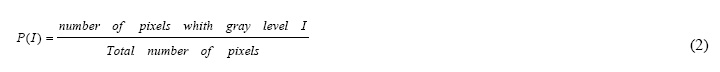
If (I) is the random variable representing the gray levels in the region of interest, the first order histogram P (I) is defined as (Theodoridis, 1999):

Now different features can be generated by using the following equations.

Moment

Where Ng = number of gray levels.
is the simple mean of pixels. Also 2nd, 3rd and other moments can be used.

Central Moments
(3)

Geostatistical Features
Geostatistics is the statistical methods developed for and applied to geographical data. These statistical methods are required because geographical data do not usually conform to the requirements of standard statistical procedures, due to spatial autocorrelation and other problems associated with spatial data (http://www.geo.ed.ac.uk).
Semivariogram that represents half of the expectation of the quadratic increments of pixel pair values at the specified distance can quantify both spatial and random correlation between the adjacent pixels. (Goodenough, et al, 2003) It is defined as:
(4)


That is the classical expression of variogram (h) here represents a vectorial lag between pixels. In this study direct variogram, madogramvariogram have been used.

Direct Variogram

In this approach the following equation is used to estimate:

(5)


n(h) is the number of pairs that are in mask filter.
Madogram

This is similar to direct variogram except squaring differences, but uses the absolute value of differences.
(6)
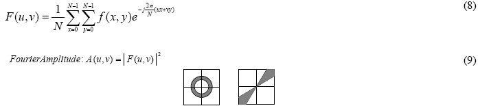
Fourier Based Features
Fourier transformation, transforms a signal from space/time domain to frequency domain. The amplitude and phase coefficients are two outputs of a Fourier transformation. So different texture patterns could be identified by their Fourier coefficients but because in this research one value for each pixel is required, raw Fourier coefficients couldn’t be used. Several features can be generated using sum of the Fourier amplitude under different masks (Pratt, 2001). These are comprised ringing, sectorial, horizontal and vertical which are shown in figure 2.


(7)


(8)


Figure3. Different mask which can be used to generate features from Fourier coefficients
Different parameters can be set in each method; the main parameter is window size. Different window sizes were used to generate features in each method.All features were generated using
3*3, 9*9, 15*15, 21*21, 27*27 and 33*33 window sizes. In geostatistical method four lags were used, they are [1, 0], [1, 1],[1,1] and [-1,1] also in Fourier method, two masks which are shown in figure 2 were used and high frequency and low frequency features were generated using each mask.

Implementation, Results and Conclusion
To evaluate the effect of using generated features in classification process, firstly the image was classified using dn slicing (parallel pipe classification) because the input is a gray-scale panchromatic image and couldn’t be classified using other methods.
All possible features using mentioned methods and selected window sizes and lag or mask parameter were generated. Then classification was done using each generated image beside panchromatic image as input data. Accuracy assessment was done, generating confusion matrix and computing overall, kappa and producer accuracies.
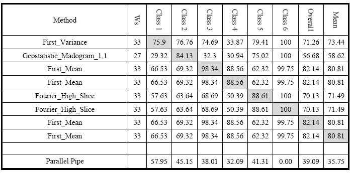
Table 1 shows parallelepiped results and best results obtained for each class user accuracy and overall and mean accuracy.

Results shows that using generated features could separate different forest canopy densities better and increase classification accuracy. It could be said that different methods for generating image based features should be used for different aims (e.g. Madogram for class 2); also some features could be used for general improvement (Mean with 33*33 window size).


References

References from Journals

Atkinson, P.M., Tatnall, A.R.L., 1997. Introduction neural networks in remote sensing. Int. J.Remote Sensing 18, 699–709

Boyd, D.S., Foody, G.M., Ripple, W.J., 2002. Evaluation of approaches for forest cover estimation in the Pacific Northwest, USA, using remote sensing. Appl. Geography 22, 375–392

Chudamani Joshi, Jan De Leeuw, Andrew K. Skidmore, Iris C. van Duren, Henk van Oosten, 2005, “Remotely sensed estimation of forest canopy density: A comparison of the performance of four methods”, International Journal of Applied Earth Observation and Geoinformation

Cross, A.M., Settle, J.J., Drake, N.A., Paivinen, R.T.M., 1991. Subpixelmeasurement of tropical forest cover using AVHRR data. Int. J. Remote Sensing 12, 1119–1129.

Haralick, R.M., Shanmugam, K., Dinstein, I., 1973. “Textural features for image classification”, IEEE Transactions on Systems, Man and Cybernetics, vol. 3, no. 6, pp 610-621.

Iverson, L.R., Cook, E.A., Graham, R.L., 1989. A technique forextrapolating and validating forest cover across large regions:calibrating AVHRR data with TM data. Int. J. Remote Sensing 10,1805–1812

Levesque, J., King, D.J., 2003. Spatial analysis of radiometric fractions from high-resolution multispectral imagery for modelling individual tree crown and forest canopy structure and health. Remote Sensing Environ. 84, 589–602.

Skidmore, A.K., Turner, B.J., Brinkhof, W., Knowle, E., 1997. Performance of a neural network: mapping forests using remotely sensed data. Photogrammetric Eng. Remote Sensing 63, 501–514.

Souza Jr., C., Firestone, C.L., Silva, L.M., Roberts, D., 2003. Mapping forest degradation in the Eastern Amazon from SPOT-4 through spectral mixture models. Remote Sensing Environ. 87, 494–506.

References from Books
John A. Richards, 1999, “Remote Sensing Digital Image Analysis an Introduction”, Springer-Verlag

Pratt, 2001,” Digital Image Processing”

SergiosTheodoridis, 1999, “Pattern Recognition”, Academic Press
References from Other Literature

Ashoori, H., Alimohammadi, A., ValadanZoej, M. J., Mojarradi, B., 2006. Generating Imagebased Features for Improving Classification Accuracy of High Resolution Images, May, ISPRS Mid-term Symposium, Netherlands.

Dorren, L.K., Maier, A.B., Seijmonsbergen, A.C., 2003. Improved Landsat-based forest mapping in steep mountainous terrain using object-based classification. Forest Ecol. Manage. 183, 31–46.

Goodenough, David, A.S. Bhogal, R. Fournier, R.J. Hall, J. Iisaka, D. Leckie, J.E. Luther, S.Magnussen, O. Niemann, and W.M. Strome, Earth Observation for Sustainable Development of Forests (EOSD), Victoria, B.C.: Natural Resources Canada, http://www.aft.pfc.forestry.ca,1998

P.S. Roy, S. Miyatake and A. Rikimaru, “Biophysical Spectral Response Modeling Approach for Forest Density Stratification”, ACRS 1997

Rikimaru, A., 1996. Landsat TM data processing guide for forest canopy density mapping and monitoring model. In: International Tropical Timber Organization (ITTO) workshop on utilization of remote sensing in site assessment and planning for rehabilitation of logged-over forest, Bangkok, Thailand, pp. 1–8.
References from websites

http://www.geo.ed.ac.uk

Acknowledgements
Visual classified image which have been used as training source is received from “Forests, Range and Watershed Management Organization (FRWO); Engineering and Evaluation Bureau”


Source: Coordinates 

Κυριακή 23 Αυγούστου 2015

Apple expands Maps Flyover coverage with 20 new cities


By Aleks Buczkowski


Apple Maps are getting better. No one can argue with that. Couple of months ago Apple finally introduced public transit to Maps. It is also working on its own Street View using Apple mapping vans. Already 34 of them are driving across US and Europe and the number of vehicles is growing fast.

But that’s not all. Last week Apple has extended its Map Flyover coverage with 20 new locations.
  • Aarhus, Denmark
  • Bobbio, Italy
  • Budapest, Hungary
  • Cádiz, Spain
  • Chenonceaux, France
  • Dijon, France
  • Ensenada, Mexico
  • Gothenburg, Sweden
  • Graz, Austria
  • Loreto, Mexico
  • Malmö, Sweden
  • Mayagüez, Puerto Rico
  • Millau, France
  • Nice, France
  • Omaha Beach
  • Rapid City, SD
  • Rotterdam, Netherlands
  • Sapporo, Japan
  • Strasbourg, France
  • Turin, Italy

The Flyover technology comes back to 2011 when Apple acquired C3 Technologies – a Swedish Company specialized 3D modelling based on combined in aerial imagery and Lidar scanning. Flyovers resemble 3D buildings in Google Earth but the production process is done semi-automatically and its based on actual images and shapes rather than sketching, which makes it look more realistic.

I strongly believe that with new Apple mapping vehicles the company is working on the combination of areal data with street level data to make a detailed 3D model of the world. We should see the effects in 1–2 years. I can’t wait to experience it.

Here is a full list of all available Flyover cities as of August 19th, 2015:

Australia, New Zealand:
  • Auckland
  • Canberra
  • Christchurch
  • Dunedin
  • Nelson
  • Perth
  • Sydney
  • Melbourne
  • Wellington

Canada:

  • Calgary
  • Montreal
  • Surrey
  • Toronto
  • Vancouver

Denmark, Finland, Sweden:

  • Aarhus
  • Copenhagen
  • Gothenburg
  • Helsingborg
  • Helsinki
  • Linköping
  • Malmö
  • Odense
  • Stockholm
  • Roskilde
  • Visby

France, Monaco:

  • Bordeaux
  • Chambord
  • Chenonxeaux
  • Côte d’Azur (including Marseille, Nice)
  • Dijon
  • Le Mans
  • Lyon
  • Paris
  • Perpignan
  • Millau
  • Monaco
  • Mont Saint-Michel
  • Montpellier
  • Nimes
  • Reims
  • Rennes
  • Saint Etienne
  • Saint-Tropez
  • Strasbourg

Germany, Austria

  • Berlin
  • Graz
  • Cologne
  • Hamburg
  • Karlsruhe
  • Kiel
  • Linz
  • Munich

Ireland:

  • Cork
  • Cliffs of Moher
  • Dublin

Italy:

  • Ancona
  • Bari
  • Bobbio
  • Rome
  • Milan
  • Turin
  • Paestum
  • Perugia
  • Venice

Japan:

  • Sapporo
  • Tokyo

Hungary, Czech Republic:

  • Brno
  • Budapest

Mexico:

  • Chichen Itza
  • Culiacán
  • Ensenada
  • Guadalajara
  • Teotihuacán

The Netherlands:

  • Rotterdam

Portugal:

  • Braga

Spain:

  • Alicante
  • Almería
  • Badajoz
  • Barcelona
  • Cáceres
  • Cádiz
  • Cordoba
  • Jerez de la Frontera
  • Huelva
  • Madrid
  • Sevilla
  • Valencia

South Africa:

  • Cape Town
  • Durban


United Kingdom:

  • Belfast
  • Birmingham
  • Edinburgh
  • Glasgow
  • Kingston upon Hull
  • Leeds
  • Liverpool
  • London
  • Manchester
  • Wolverhampton

United States:

  • Aguadilla, Puerto Rico
  • Albany, NY
  • Arecibo, Puerto Rico
  • Arches National Park
  • Arlington, MA
  • Arlington, TX
  • Atlanta, GA
  • Austin, TX
  • Bakersfield,CA
  • Baltimore, MD
  • Baton Rouge, LA
  • Beverly Hills, CA
  • Boise, ID
  • Boston, MA
  • Buffalo, NY
  • Century City, CA
  • Chicago, IL
  • Cleveland, OH
  • Cupertino, CA
  • Dallas, TX
  • Denver, CO
  • Fort Worth, TX
  • Green Bay, WI
  • Honolulu, HI
  • Hoover Dam, AZ
  • Houston, TX
  • Indianapolis, IN
  • Las Vegas, NV
  • Long Beach, CA
  • Los Angeles, CA
  • Memphis, TN
  • Miami, FL
  • Milwaukee, WI
  • Minneapolis, MN
  • Modesto, CA
  • Mayagüez, PR
  • Mount Rushmore, SD
  • Nashville, TN
  • New Orleans, LA
  • New York, NY
  • Oakland, CA
  • Philadelphia, PA
  • Phoenix, AZ
  • Ponce, Puerto Rico
  • Portland, ME
  • Portland, OR
  • Providence, RI
  • Rapid City
  • Sacramento, CA
  • Saint Paul, MN
  • Salem, OR
  • San Antonio, TX
  • San Diego, CA
  • San Francisco, CA
  • San Jose, CA
  • San Juan, PR
  • Santa Monica, CA
  • Seattle, WA
  • Stanford University, CA
  • Stockton, CA
  • Tacoma, WA
  • Tulsa, OK
  • Zion National Park, Utah

Πέμπτη 13 Αυγούστου 2015

Building Knowledge with People Power & Remote Sensing


By Diana S. Sinton


Aerial images are rich with data just waiting to be interpreted and converted into knowledge, perhaps even actionable knowledge. Given the unimaginable amount of imagery being collected by satellites and other aerial devices each day, even relying on automated pattern deciphering by computers doesn’t provide the capacity to keep up with both the supply and demand. As smart as software algorithms have been designed to be, there are still times when the best combination for speed and accuracy in image interpretation is a pair of human eyes — or, thousands of pairs — which is one reason why we have seen an exciting growth in applications for crowdsourced remote sensing, one dimension of the citizen science trend.

Citizen science today sits at a sweet spot with benefits from several converging factors: an abundant usage of hand-held devices capable of returning geographic location information, a rich supply of software developers looking to apply their skills to engaging projects on mobile devices, constantly expanding Wi-Fi access, faster and more robust bandwidth for sharing images and a ludicrous amount of data being constantly collected. It’s like a dog that’s caught a flailing fire hose of data and can barely hold it in its mouth, much less gulp and swallow the stream. Processing even a fraction of the images being gathered would be impossible without the volunteer contributions of people around the world.

In this article, we’ll consider programs that require the visual cognition skills that people bring to the table, ones that humans can do better than machines, at least at this point. This can mean looking at an aerial image and tracing what you see, comparing two images or reading a pattern in an image. Practice with these now and you’ll be all set for when winter arrives. There’s nothing cozier than gathering together with the family around the coffee table while each person’s laptop keeps them warm!

Tracing and drawing
Though it’s only been around for about a decade, OpenStreetMap is a grandfather in the world of crowd-produced geospatial data. Its premise is simple: provide raster images of the world over which people trace shapes and create vector data, then add descriptive information; then people can download the vector data. Having a computer pick out a square building top or a road from the rest of a scene might not seem so difficult a task, but knowing that the structure is a school, or that the road is dirt and cannot support significant weight, is the human-provided value add.

Moreover, for most of the world, having current and freely available geospatial data files of buildings and roads is still uncommon, yet disasters are often likely to strike in locales that have not been well mapped, often because they are remote and/or impoverished. Haiti’s 2010 earthquake was the inspiration that brought the potential for OSM to the world’s attention and inspired the launch of the Humanitarian OpenStreetMap Team, a widely popular application of OSM.

The maturing of OpenStreetMap has meant they’ve been able to figure out how to best support the efforts of their volunteer contributors and increase the likelihood that the energy exerted will produce good results. They’ve produced training materials such as LearnOSM that explain the basics of heads-up digitizing. The global community has developed affiliated programs to support and facilitate the editing process, such as Java OpenStreetMap, and they’re organized enough to have a Tasking Manager in place.

The U.S. government has followed their lead and recognized the power of local expertise to inform and enhance their geospatial data sets. The U.S. Geological Survey, primary stewards of The National Map, has established The National Map Corps to coordinate volunteer data contributions, particularly for updating information on structures. According to Elizabeth McCartney, lead coordinator of the project, volunteers are welcome to edit anywhere in the U.S., Puerto Rico and the U.S. Virgin Islands, but periodic Map Challenges are sponsored to target efforts to areas needing special attention. Recent Map Challenges have focused on prisons (think federal and state penitentiaries) and law enforcement (think sheriff's offices, local police departments, highway patrol) in Kentucky and Tennessee, so that those data sets will be improved prior to the next print run of topographical maps scheduled for those states in 2016. They expect to emphasize post offices and schools in the future, but McCartney notes that all structural features would benefit from attention.

Categorizing and classifying
Using imagery as a visual background for creating new data sets is a fairly high level of active participation on the part of volunteers. Another useful cognitive task we can offer the community is our ability to categorize and classify information based on the patterns we see in an image. In each case, some training is provided to guide the viewer through the image interpretation process. Such efforts could result in identifying the movement patterns of wildebeests, noting evidence of fracking or types of underwater plankton from countless underwater images — who knew there were so many types?! If astronomical space is more your thing, there are galaxies and dust-surrounded stars just waiting to be found!

Comparing

Making an interpretation decision can be made easier by comparing two side-by-side images. With CycloneCenter, users decide which of two storms is stronger and then proceed to classify the event further.SunSpotter asks for help in classifying sun spots by their complexity.

Platforms and progress
If some of the interfaces start to look familiar, there's good reason. Organizations have now sprung up to help initiatives launch image-based, crowdsourcing platforms. The State Department's MapGiveprogram relies on the HOT Task Manager to support data entry for their humanitarian projects. Geo-Wiki once hosted a popular project to classify images by their land cover and is now available for others to launch related activities. Not all of the research projects thatZooniverse supports are geo-related, but all are “people-powered.”

Editing structures or tagging galaxies may seem like endless tasks but projects do reach an endpoint, and we don’t often enough appreciate the satisfying conclusions. Collaborative efforts contributed to acomplete set of global forest cover maps, and the iCoast project allowed almost 8000 images to be tagged following Hurricane Sandy. Any one user’s contributions seem small until the cumulative effort is considered, like the before- and after-earthquake maps of Kathmandu. Every little bit really does help.

Τρίτη 4 Αυγούστου 2015

Phase One Industrial Introduces the iXU-R Camera Series


Phase One Industrial, a manufacturer and provider of medium format aerial digital photography equipment and software solutions, introduced the iXU-R camera series. Available in 80 MP, 60MP and 60MP achromatic versions, these cameras feature dedicated interchangeable 40 mm, 50 mm and 70 mm Phase One Rodenstock lenses equipped with central leaf shutters that can be quickly changed in the field. They offer unprecedented flexibility in aerial applications.


The Phase One iXU-R systems have been designed to address the aerial data acquisition market’s needs for a small, lightweight camera with the high resolution of a medium format system, plus high performance optics, flexibility to fit into small places and Phase One’s fastest 80 MP platform. For example, the iXU-R 180 is built around a large 80-megapixel sensor, with 10,328 pixels cross-track coverage yet it is compact enough to be easily integrated into a small gimbal or pod space or an oblique/nadir array. Or it can be used as a standalone photogrammetric camera with optional Forward Motion Compensation.

Cameras are easily integrated into new or existing setups with USB 3.0 connectivity for control and storage via the Phase One iX Capture application. All Phase One aerial cameras offer direct communication with GPS/IMU systems and the ability to directly write data to the image files. For more details about the cameras, please go to: http://industrial.phaseone.com/iXU-R_camera_system.aspx.

“As the use of UAVs and small aircraft increases dramatically around the world, and every gram in a payload counts, Phase One Industrial is committed to offering small and lightweight cameras without sacrificing data accuracy, image quality and resolution,” said Dov Kalinski, General Manager of Phase One Industrial. “With this announcement, Phase One Industrial has established itself as the clear leader in digital medium format aerial cameras, with its range of 13 unique camera systems optimized for all aerial data acquisition projects.”

All Phase One iXU-R systems are available now from authorized Phase One Industrial partners.

Internet: www.phaseone.com

Κυριακή 2 Αυγούστου 2015

North American Imagery Program And How To Develop Your Staff


Disclaimer: I know people and have friends that push pixels for a living, at least I did at the time of this writing.


The North American Imagery Program (NAIP) is a productive use of our federal tax dollars. NAIP is a program that is run by the United States Department of Agriculture (USDA), with a primary purpose of ensuring compliance in agriculture. Since many crops are subsidized and insured in this country, the NAIP conducts flights to image crops during the growing season in states that grow a large number of crops.

The imagery is used (remote sensed) to make sure that “Farmer Joe” is getting subsidies for the right crop. Typically, the imagery taken at a resolution of 2 meter pixels. However, every 5 years, generally, a state may be surveyed at the higher 1 meter pixels resolution. Once the imagery is certified by NAIP, it is released for public consumption via many sources, including Geospatial Data Gateway (GDG), a service run by the United States Department of Agriculture’s (USDA) through a close partnership between the three Service Center Agencies (SCA); Natural Resources Conservation Service (NRCS), Farm Service Agency (FSA), and Rural Development (RD).

NAIP and the GDG can be used to develop and train in-house staff on various geoprocesses, data management, data storage management, and understand the length and breadth of the associated processes. This approach can be very successful, and actually can yield quickly useable, realistic results. For those companies that have a reasonable number of geospatial analysts, one approach is to pick someone every year, and give them exposure to the NAIP and ask have them certain counties for a State or Area of Interest (AOI).

They would start by accessing the GDG, looking at the current year’s data, and begin downloading it. The GDG throttles how much data can be downloaded at once. Nonetheless, this would help the analyst start learning how to allocate resources, and manage time, with respects to keeping the downloads as continuous as possible.

Once the data is in house, a number of different applications and processes can be performed against the data. Some of these processes include understanding when pixels overlap from multiple images, how to choose which one you want to keep; how to ignore certain values (for example, black collars); and set up a workflow for the newly compiled image. “Rinse and repeat” these processes against other portions of the available data.

With analysts having a mature understanding to geospatial data processing, companies should enture that they working with the IT Infrastructure group on provisioning enough free storage capacity, such that it allows the analysts to combine several very large images (often over 100GB per image).

At this point the analyst can take ownership of the data set. Luckily, the actual time an analyst spends at the keyboard is relatively small. The majority of time is taken up with computer processing. However, analysts will check frequently to make sure the process is still running.

Once processed, the newly compiled data would get loaded into an image server, file share, webservice, or someone other device that can distribute and share the new aerial image for other users to utilize.

Ideally, processing of the NAIP data should take place every year. Analysts can look at images from the past and the current ones to see what had changed. In combination, there are great benefits for end-users, while providing each with a realistic learning experiences for internal analysts who want to be developed, and utilizing available resources .

The outcome of this process of training is to develop analysts who are capable of:

• Project management;
• Learning from mistakes;
• Learn new skill sets;
• Being aware of public datasets;
• How to improve analysts on their use and understanding of how data is formatted and transformed; and of course
• Taking pride in their work.


Source

Παρασκευή 31 Ιουλίου 2015

A Case Study in Environmental GIS: Light Pollution Mapping


Marcus Hinds, a geospatial consultant, shares the results of his work with using remote sensing and methodologies from environmental GIS to better understand and provide solutions to mediate light pollution in the Greater Toronto Area in Canada.

Nathan Heazlewood in one of his recent blurbs urged us Geomatics practitioners to be proud of the Geospatial profession, in his article “take pride in the Geospatial Profession“. GIS and Geomatics are a large part of many environmental projects, because, let’s face it, environmental projects have to occur in time and space. That space is always located on the surface or beneath the earth, and persons responsible for the progress of the project need to know the specs of the project like what is happening, where it’s happening, why it’s happening and who is doing it. Every event is linked to the project in some way.

I’m no stranger to environmental GIS projects. Many of these (GIS projects) projects cross into other disciplines such as Energy, Finance, and Engineering and probably the most controversial of all, Politics.


Light Pollution Mapping in Toronto, Canada

One example of how interdisciplinary an environmental GIS project can become, is one that I recently worked on; the Light Pollution Initiative with the City of Toronto. The City was looking to reduce its lighting footprint and find ways of informing Greater Toronto Area (GTA) residents, about sources and effects of light pollution. Light pollution in this case is mainly classified, as any form of up-lighting and or over-lighting that emits unwanted light into the night sky, also known as sky glow. SKy-glow has a number of harmful and non-harmful effects, but the most popular has to be when light spreads to suburban and rural areas and drowns the night sky and stars. Environmental Heath Perspective Research has shown that star gazing and night sky observation is on a rapid decline in the younger generation, simply because we can’t see the night sky in the majority of our cities. Another effect is that deciduous trees have delayed adaption to season changes because of prolonged exposure to light. Wildlife like turtles, birds, fish, reptiles, and other insects show decreased reproduction due to higher levels of light in previously dark habitats. I didn’t even mention the increased risk of smog in urban areas, preceding periods of heavy light pollution. In us humans, light pollution has been linked to the cause of sleep deprivation in the short term, melatonin deficiency, increased risk of cancer (breast and prostate), obesity, and raises the probability of early-onset diabetes in the long term.


Because a project like is sensitive to so many variables, like the layout of power grid, culture of the city, socioeconomic classes, and urban design of the city; it was a very multidisciplinary feat, which required tactical thinking. The response needed to be tailored from principles from Urban Planning, Environmental Engineering, Architecture and Ecology. The fact that the end user was a broad, largely non technical audience also had to be factored in. As I got to working, I quickly realized that this is an onion. The more you look at it, the more layer you find. Before I knew, I had to think about Illumination Engineering, Power Generation and Energy Efficiency, due to the hundreds of megawatt hours in electricity being consumed by up-lighting and over-illumination, adding stress to an already stressed set of grid infrastructure. I also had to think about the health care system because, any ailments stemming from light pollution will add casualties to the health care system. I quickly noticed how broad (and valuable) environmental GIS really is.

My original thought of the project’s response, was to go about highlighting light pollution hotspots throughout the greater city area and compare it to data coming out the electricity provider. As suspected, the brightest areas on the maps, where the most energy intensive areas of the grid. The real challenge though, was to highlight light pollution at night, when all the base maps available are “of day”, then how do I communicate this? Well just bled the two came to mind, and that I did.

To find the light pollution hotspots, I got a Google base map and overlayed a geo-referenced satellite light pollution image of the city from NASA’s International Space Station (ISS). Areas of bright up lighting and sky glow around the city were obvious to the naked eye; but I wanted to show more. I applied lighting standards from the Illuminating Society of North America (IESNA), which meant that IESNA’s effective lighting series was now involved.

I used RP-8 for street and roadway lighting, RP-6 for sports and recreational lighting, RP-33 for outdoor lighting schemes. RP-2 for mercantile areas and RP-3 for schools and educational facilities. Each standard had prescribed lighting thresholds, which suggest efficient and appropriate light levels that should be used for each application. Each standard also discussed the type and quality of light suitable for each application. Now; only to find how much over the lighting threshold each point of sky glow on my map wa, and use this to estimate energy use figures.


I determined the areas brighter than the lighting threshold, through blending the geo-referenced base map and the NASA light pollution image together in Image J image processing software, and passing that image through filters. Image J is an open source Java based image processing software. The first image filter I used was the Gaussian High Pass filter for image sharpening the image, in order to highlight areas of bright light contrasted against dark areas. Then I applied a Gaussian Low Pass for smoothing the image and highlighting the contrast between bright pixels and dark pixels. Finally I added the nearest neighbor filter in order to generalize individual points of up-lighting, and spread the pixels showing sky glow evenly around each area of up-lighting. This method highlighted individual points in the GTA that were contributing to up-lighting, but I still needed to find the amount of light generated by each point of up-lighting and the value that each point stands above the lighting threshold set out in IESNA’s standards.

Since Image J does not have the capacity to calculate exact threshold, I had to find another open source software package that was easy to use and was Java based as Image J was. My rebuttal was Open Source Computer Vision, better known as Open CV image processing software. I used the blended image output from Image J, input that into Open CV and made some copies of it. This process called simple thresholding was applied in series. The first image was greyscaled in order to assign a value to each pixel in the image; the second image was used to classify pixel values and the third used to set a lower lighting threshold value. These three images were then overlayed pasted onto to each other and were made transparent in order to see the detail on all three images. This led to a pixel value being assigned to each pixel, and being able to determine the value of how much each pixel was over the defined threshold. This order of filtering was suggested by an Open CV technician and delineated light pollution areas around the GTA with high precision. Open CV is very well suited to working with environmental GIS and has a strong point in working with polygons in photo interpretation.


AERIAL IMAGE OF THE GREATER TORONTO AREA (GTA), SHOWING LIGHT POLLUTION HOTSPOTS IN WHITE LIGHT. MAJOR STREETS AND HIGHWAYS CAN CLEARLY BE IDENTIFIED.

In retrospect, I’ve seen a couple photometric surveys of cities in my time, and I must say that the data created from this project is simultaneous with photometric surveys. And the most intriguing part is that it all happened through remote sensing.

The outcome of this survey is ongoing, but there are a number of items in progress:

  • The City releasing documents surrounding the use of decorative lighting and its contribution to the skyline, noting that this form of lighting should not only be efficient and sustainable and should comprise LED’s, but should be turned off during migration periods for migratory birds. See Page 60 of Tall Building Design Guidelines (link:http://goo.gl/ddANm0)
  • Many condo developers are now turning decorative lighting off at 11pm in the downtown core to facilitate light pollution standards and migratory bird guidelines set out by FLAP on the Flap Website (link:http://www.flap.org/)
  • Discussion and literature has been released and in circulation for sometime, evaluating the efficiency of buildings that use glass as the main material in the building facade. Glass facades not only cause the building to be more energy intensive but also pose a hazard to birds, where they usually become disorientated and collide with the building, inflicting serous injuries and death. There have also been many cases of glass falling from these buildings in many Canadian cities. Building scientist Ted Kesik, a prominent building scientist based in Toronto, has estimated that condo pricing and maintenance fees to skyrocket in the next decade, simply because of the use of glass. The Condo Conundrum 
  • Discussion surrounding implementing guidelines for the GTA to implement full cut off/fully shielded light fixtures for outdoor lighting, as some parts of Ottawa have done. See the Report to the Planning & Environmental Committee submitted by Deputy City Manager Planning, Transit and Environment, City of Ottawa

References: Skyglow/Light Pollution – NASA