Εμφάνιση αναρτήσεων με ετικέτα Statistics. Εμφάνιση όλων των αναρτήσεων

Τρίτη 27 Οκτωβρίου 2015

The Growth and Decline of Urban Agglomerations in Germany


Innovative maps that illustrate the most recent socio-demographic urban changes in the major city urban agglomerations in Germany have very recently been produced in a joint project of the School of Geography and the Environment at the University of Oxford and the Research Institute for Regional and Urban Development Dortmund (Germany).
The Research Institute for Regional and Urban Development (Institut für Landes und Stadtentwicklungsforschung, ILS) investigates new social processes, especially those involving urbanisation in Germany and Europe. This includes economic, social and structural processes that are compared and monitored over time to gain a better understanding of the underlying developments. Testing state-of-the-art visualisation techniques are a significant part of this effort. This was the focus of a collaboration between researchers of the University of Oxford and the ILS Dortmund which resulted in the development of a series of highly effective maps called “cartograms” that provide new insights in the changing geographies of city regions in Germany.

The method used in the research creates gridded cartograms in which equally-sized grid cells are resized according to number of people in any area. The resulting map looks as if the reader has placed a magnifying glass on the most densely populated regions while sparsely populated areas are much smaller than they appear on a land area map. This allows additional spatial information such as socio-demographic data to be shown in their relation to population. Using such visualisations dynamic changes, such as shifting populations, can be analysed in their spatial as well as their human context.


Approximately half the population of Germany lives in the 30 major urban German agglomerations, such as Berlin, Hamburg, Munich (München), and Cologne (Köln) but also in smaller cities including Münster, Freiburg, Leipzig, and Dresden. The gridded cartogram helps to understand the demographic processes and development that occurred there in recent years, revealing some distinct trends of re-urbanisation in some of the most densely populated areas.
Examination of the average annual change in the populations of the selected urban agglomerations highlights the regional differences in these trends. Contrary to the national population decline, which is predicted to continue, 26 out of the 30 major agglomerations show population growth between 2008 and 2013. In 25 of these areas population growth in the city centre is even higher than in its suburban area. This can be seen as evidence of a very recent trend of re-urbanisation in these places.

One particularly notable trend is the dynamics in smaller cities such as Freiburg and Münster, as well as Dresden and Leipzig in east Germany. In addition to high rates of re-urbanisation, the suburban areas often have stagnating or even declining populations.
The Ruhr area agglomerations are distinctively different from the other areas described in the overall summary of trends. The stagnating populations in the centres of Dortmund and Essen are complemented by considerably declining populations in their surrounding areas.
Two cartograms depicting growth and decline have been produced as separate maps. These reveal, population decline in the settlements in the Ruhr area that is larger than in all other urban agglomerations put together. Growth, in contrast, is spatially spread much more evenly.
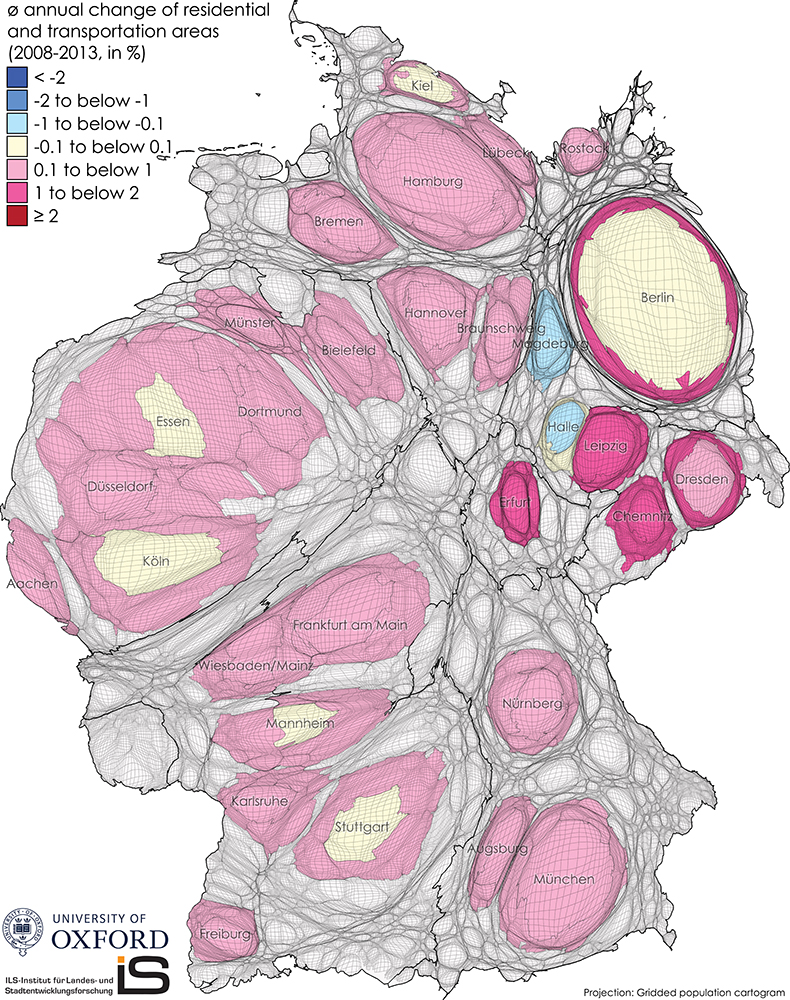
Amongst the influencing factors or growth and decline are developments in social structures, employment as well as changes in land development in these regions. How these factors are interconnected and influence each other is part of further research within this project that aims at establishing a long-term geomonitoring of these regions in order to better understand these new forms of urbanisation in Germany that are currently only just beginning to emerge.

Average annual change of employees
between 2008 and 2013


Average annual change of benefit recipients
between 2008 and 2013


Average annual change of residential and transportation areas
between 2008 and 2013

Average annual change of commercial areas and open spaces
between 2008 and 2013

The content on this page has been created by Benjamin Hennig and Stefan Kaup with the support of Tanja Ernst of ILS – Research Institute for Regional and Urban Development(Dortmund, Germany) using data from the forthcoming edition of the annual geomonitoring report of urban agglomerations in Germany. Please contact me for further details on the terms of use.

Σάββατο 24 Οκτωβρίου 2015

A Lonely Planet


‘How to Land a Jumbo Jet’ is the catchy title of a little book published by Lonely Planet a couple of month ago. The book is a “visual exploration of travel facts, figures and ephemera” and a “visual guide to the way we live, travel and inhabit the globe”. Edited by the British graphic designer Nigel Holmes, the book follows the increased interest in information graphics that started to flourish yet again with the increasing availability of ever growing amounts of data. This reminds a lot of the ‘Golden age of statistical graphics‘ from the 19th century, where we have seen a manifestation of the prospering achievements in statistical graphics and thematic maps that we take for granted nowadays.

Jumbo jet is a mixed bag of visualised information that fits in that renaissance with a wide-ranging look into (as one might expect from Lonely Planet) everything travel-related (some sample pages can be downloaded from the link at the end of this page). And what would a travel book be without maps? Certainly quite incomplete, which is why there are some maps included that provide a different look at the world than that one usually finds in travel literature. One example for that is my contribution on visualising the more remote parts of our planet – the lonely patches on the world’s land surface.
Drawing a map of the remote areas (as also described in my PhD thesis) it is not simply a matter of putting the less populated area of the world in the foreground. Transformed maps that show the human spaces, such as a gridded population cartogram, work very well because of the specific distribution of people in a very limited amount of space. With more than 95% of the world’s population living in approximately only 10% of the land area, the remaining 90% of the land area vanish from a gridded population cartogram. Reversing this therefore is much less striking, because 90% of the land surface is almost empty and would remain on a transformed cartogram, making it look much more like a conventional map projection. The optimal grid data for a gridded cartogram transformation thus needs a high variation and a data distribution that has the highest values for the topic of interest in a limited amount of grid cells, like the major population densities cover approximately 10% of the full grid. A different approach is therefore needed when looking at the loneliest places on the planet. Such an indicator is the relative distance of areas to the majority of people, which can be measured e.g. by travel times – most of the remotest places are also hardest to get to (apart from flying over it and jumping out of the plane, which is when Nigel Holmes’ infographic on how to land a jumbo jet from that book may come handy for the remaining passengers).
In an analysis of people’s closeness, Nelson points out that only 15% of people in rich countries live more than an hour of travel time from a city (of at least 50,000 people), while the same applies to 65% of people living in the poor countries of the world. The information about the absolute travel time from a given point can be transformed into a grid that translates remoteness into a quantifiable measure which combines the human and physical space in one layer. The gridded dataset can then be transformed according to the absolute travel time that is necessary to reach the nearest major city that was defined by Uchida & Nelson, the authors of the study, as one of the 8,518 cities with 50,000 or more people. The transformed grid thus shows each grid cell resized according to that absolute travel time that is needed from that grid cell to the nearest major city by land transport, giving the remotest places most space on the map.


The following gridded cartogram of the remotest places visualises the picture of a lonely planet where the spaces shown are those that are furthest away from those places of civilisation that define the 21st century. The map is resized according to the estimated land travel time to the nearest large city (over 50,000 inhabitants). Antarctica has not been included in the calculation, as there are no cities of that category. More than half of the world’s population according to UN estimates now lives in cities, and this map shows those places that most of the people living in the world need the longest time to get to. It draws an image of the areas that are almost disconnected from those shrinking effects of globalisation. This world map is the striking opposite representation of our image of a globalised and interconnected world, of those vanishing places that we thought do not exist anymore:


“Getting yourself to one of the remotest spots in the world doesn’t necessarily mean flying to a distant Pacific island surrounded by nothing but open ocean: Some continental locations can be days from the closest large city” (quote from the Huffington Post).
Want to get away? No, really get away? This map is your ultimate guide…

Other maps included in the Lonely Planet infographics book show the world population, world tourist destinations, and the most crowded air spaces on the planet. Further questions answered from the other graphics include the best place to experience a volcano, which nation is the proudest in the world, or why your luggage occasionally disappear on flights. How to land a jumbo jet can be ordered from the Lonely Planet website. Here are some examples from the book:


The content on this page has been created by Benjamin D. Hennig. You are free use the material under Creative Commons conditions (CC BY-NC-ND 3.0); please contact me for further details. I also appreciate a message if you used my maps somewhere else. High resolution and customized maps are available on request.


Πέμπτη 8 Οκτωβρίου 2015

Where Britain's immigrants historically come from


from Niall McCarthy


Immigration is dominating the news headlines at the moment but where do Britain's immigrants actually come from? Historically, Ireland was the main source of immigrants to the United Kingdom but as time went on, that has been taken over by India, Poland and Pakistan. Read more on the Independent.


This chart shows the top five origin countries of British immigrants from 1951 to 2011.


Source: Statista

The sticky superpower


America remains the world’s economic hegemon even as its share of the global economy has fallen and its politics have turned inwards. That is an unstable combination, says Patrick 


IN JUNE THIS year Jack Ma, the founder of Alibaba, a giant Chinese e-commerce firm, addressed the Economic Club of New York, whose members include many Manhattan luminaries and Wall Street chiefs. Mr Ma’s message was that his company exists for the long-term good of society, a far cry from the creed of shareholder value followed by many in the room. He pledged to help America’s struggling small firms export to China’s 630m internet users, who between them now spend more online than Americans do. The venue for the event was the Waldorf Astoria hotel, which, when it opened in 1931, in the midst of the Depression, was hailed by President Herbert Hoover as “an exhibition of confidence and courage to the whole nation”. Today the Waldorf is owned by a Chinese insurance firm run by Deng Xiaoping’s grandson-in-law. The whole event seemed to symbolise a change in the world’s economic order.

Yet as a parable of American decline that would be too neat. The lesson from Mr Ma’s big day in the Big Apple is more subtle: that America remains the world’s indispensable economy, dominating some of the brainiest and most complex parts of human endeavour. Alibaba is listed in New York, not on Shanghai’s bourse, whose gyrations this year have alienated investors. Four of the six banks that underwrote Alibaba’s flotation were American. Alibaba makes only 9% of its sales outside China (and has just hired a former Goldman Sachs executive to increase that share). The Waldorf is run by an American firm, Hilton, that does well out of owning intellectual-property rights worldwide. Days after his speech Mr Ma spent $23m on a mansion in New York state’s Adirondack mountains. No doubt he will enjoy the trout streams, but like many Chinese tycoons he may also want a bolthole in a country that embraces the rule of law. Two months later China devalued its currency, causing panic about its economy.


This special report will examine the paradox illustrated by Mr Ma’s speech. It will argue that America is a sticky economic superpower whose capacity to influence the world economy will linger and even strengthen in some respects, even though its economic weight in the world is declining. For some, this is a welcome prospect. Hillary Clinton, a front-runner for the job of America’s next president, wrote last year: “For anyone, anywhere, who wonders whether the United States still has what it takes to lead…for me the answer is a resounding ‘yes’…everything that I have done and seen has convinced me that America remains the indispensable nation.” But if handled badly, the growing gap between America’s economic weight and its power will cause frustration and instability.
"Until recently one thing was clear: America had the biggest weight of any country in global GDP and trade"

Power is the capacity to compel another to do what they otherwise would not. It can be exercised through coercion, by setting rules or by engendering expectations and loyalties. American power is sometimes defined so broadly that it includes both the flight decks of the USS Abraham Lincoln and the legs of Taylor Swift. This report will focus on a narrower point: how America’s grip on the global economy helps, enriches, organises, bosses and annoys the rest of the world . This kind of power is often wielded inadvertently: for example, America has no desire to run India, yet India’s economy is affected by the Federal Reserve’s monetary policy; and two of the subcontinent’s leading industries, technology and pharmaceuticals, are subject to American rules that are a de facto world standard.

American economic dominance has never been absolute. Between 1946 and 1991 the Soviet Union’s empire of queues and rust aspired to be a rival model. From the 1970s onwards Europe pursued closer integration partly as a counterweight to America; the idea of a single European currency gained momentum as Europeans grumbled about the ascendancy of the dollar. Japan appeared to pose a threat in the 1980s and in its pomp tried to persuade Asia to join a yen zone. Even when the so-called Washington Consensus of American-inspired liberal economic policies was at its peak in the 1990s, many countries, most notably China, ignored it. But until recently one thing was clear: America had the biggest weight of any country in global GDP and trade.

In the first change in the world economic order since 1920-45, when America overtook Britain, that dominance is now being eroded. As a share of world GDP, America and China (including Hong Kong) are neck and neck at 16% and 17% respectively, measured at purchasing-power parity. At market exchange rates a fair gap remains, with America at 23% and China at 14%. By a composite measure of raw clout—share of world GDP, trade and cumulative net foreign investment—China has probably overtaken America already, according to Arvind Subramanian, an economist (see chart). Even if China’s economy grows more slowly from now on, at 5-6% a year, its strength on such measures will increase.


The experience of the 20th century suggests that such a transition can happen fast. In 1907 America lacked a central bank and suffered a banking collapse, but by the 1920s the dollar rivalled the pound sterling as the world’s most widely used and trusted currency. If the past is a guide, China could surpass America in the blink of an eye, giving it the heft to issue the world’s reserve currency and set the rules of trade and finance. A plurality of people polled by the Pew Research Centre around the world believe that China will become the world’s leading economic power. Those aged under 30 are most likely to believe they will live in a Chinese epoch.

But any reordering of the world economy’s architecture will not be as fast or decisive as it was last time. For one thing, the contest is more balanced. America is far stronger than Britain was at its moment of precipitous decline, and China is weaker today than America was when it took off. For all its efforts to promote its currency and its institutions, the Middle Kingdom is a middle-income country with immature financial markets and without the rule of law. The absence of democracy, too, may be a serious drawback.


Today’s world also relies on a vastly bigger edifice of trade and financial contracts that require continuity. Trade levels and the stock of foreign assets and liabilities are five to ten times higher than they were in the 1970s and far larger than at their previous peak just before the first world war. The speed and complexity of capital flows surpass anything the world has ever seen before. Britain and America were allies, which made the transfer of power orderly, if often humiliating for the declining power. Having squashed Britain’s global pretensions at the Bretton Woods conference on the international monetary and financial order in 1944, America helped cushion its financial collapse in 1945-49. China and America are not allies. The greater complexity and risk involved in remaking the global order today create a powerful incentive for current incumbents to keep things as they are.

Last, the nature of economic activity has changed, shifting towards intangible, globalised services (such as cloud computing and computerised financial trading) in a way that may allow America to exert dominance by remote control.

Economists, Tea-Partiers, trade unionists and Bruce Springsteen have chronicled America’s slide on traditional measures of economic and institutional prowess. Judged by its share of world steel production, manufacturing, merchandise trade, transport and commodities production and consumption, the country is going to the dogs (see chart). The number of countries for which America is the biggest export market has dropped from 44 in 1994 to 32 now. Over the same period the equivalent figure for China has risen from two to 43.


America’s lead in other areas, such as research-and-development spending, technology equipment and consumer brands, is no longer as comfortable as it was. Many of the world’s most valuable firms are still American, but this overstates their clout abroad: their share of the stock of international corporate investment has fallen from 39% in 1999 to 24%.

America still shines in a number of fields. It has 15 of the world’s 20 leading universities. Its Food and Drug Administration is the global benchmark for the efficacy of a new medicine. A patent registered in New York is far more credible than one booked in Shanghai. And Hollywood’s domination of the world’s box offices is as eternal as a Californian film star’s youth.

What is less widely acknowledged is that in some domains America’s clout is increasing. The country has demonstrated an astonishing capacity to dominate each new generation of technology. It is now presiding over a new era based on the cloud, e-commerce, social media and the sharing economy. These products go global faster and penetrate more deeply into people’s minds and jobs than anything Silicon Valley has invented before, affecting everyone from cabbies to philanderers to despots.

Facebook and Google do a majority of their business abroad, and that share is rising. When Microsoft was at the height of its powers in 2000, it made less than a third of its sales overseas. American firms now host 61% of the world’s social-media users, undertake 91% of its searches and invented the operating systems of 99% of its smartphone users. China’s internet firms, including Mr Ma’s, are both protected and trapped behind China’s “Great Firewall”.

America’s dominance of the commanding heights of global finance and the world monetary system has risen. The global market share of Wall Street investment banks has increased to 50% as European firms have shrunk and Asian aspirants have trodden water. American fund managers run 55% of the world’s assets under management, up from 44% a decade ago, reflecting the growth of shadow banking and new investment vehicles such as exchange-traded funds. Global capital flows, larger than at any time in history, move in rhythm with the VIX, a measure of volatility on America’s stockmarkets.

Power through neglect

One of the oddities of globalisation is that although America’s trade footprint has shrunk, its monetary footprint has not. The Federal Reserve is the reluctant master of this system, its position cemented by the policies put in place to fight the 2007-08 financial crisis. When the Fed changes course, trillions of dollars follow it around the world. America’s indifference towards the IMF and World Bank, institutions it created to govern the system and over which it has vetoes, reflects power through neglect.

The position of the dollar, widely seen as a pillar of soft power, has strengthened. Foreign demand for dollars allows America’s government to borrow more cheaply that it otherwise could, and the country earns seigniorage from issuing bank notes around the world. America’s firms can trade abroad with less currency risk, and its people can spend more than they save with greater impunity than anyone else. Even when a global crisis starts in America it is the safe haven to which investors rush, and foreigners accumulate dollars as a safety buffer.

Since the attacks of September 11th 2001, America has emphatically asserted control over the dollar payment system at the heart of global trade and finance. Hostile states, companies or people can be cut off from it, as Iran, Burmese tycoons, Russian politicians and FIFA’s football buffoons have found to their cost. The threat of this sanction has given America an enhanced extraterritorial reach.

Finance and technology are already a battleground for sovereignty, as Europe’s pursuit of Google through antitrust cases has shown. So for America to lay a claim to running the world economy’s central nervous system even though it is no longer its dominant economic power would be the ultimate expression of its exceptionalism. The country would need to show an extraordinarily deft touch. It would have to act, and to be seen as acting, in the collective interest.

America’s political system has shown itself capable of great leadership in the past, not least during and after the second world war. Today it is falling short of these ideals. The global financial crisis proved that America always does the right thing in the end, but only after exhausting all the alternatives. The Federal Reserve provided liquidity to the world, and with a gun to its head Congress stumped up the cash to rescue American financial firms. But since then America’s political system has flirted with sovereign default, refused to reform or fund the IMF, obstructed China’s efforts to set up its own international institutions, imposed dramatic fines on foreign banks and excluded a growing list of foreigners from the dollar system.

The idea that America’s political system does not feel obliged to meet what self-interested foreigners present as its global economic responsibilities is nothing new. When informed about a speculative attack against Italy’s currency in 1972, Richard Nixon snapped: “I don’t give a shit about the lira.” But the country’s current indifference may be more than a temporary lull. America’s middle class is unhappy with globalisation and its politics are deeply polarised.

If America failed to live up to expectations, what would that mean for the rest of the world? For the moment it is easy for America’s policymakers and politicians to be complacent: China’s aura of competence has been damaged by its recent economic troubles, and America has the world’s perkiest economy, admittedly in a sluggish field. But it is important to be clear-headed about the long-term choices. America cannot expect effortlessly to dominate global finance and technology even as its share of world trade and GDP declines and it becomes ever more inward-looking.

This special report will argue that the present trajectory is bound to cause a host of problems. The world’s monetary system will become more prone to crises, and America will not be able to isolate itself from their potential costs. Other countries, led by China, will create their own defences, balkanising the rules of technology, trade and finance. The challenge is to create an architecture that can cope with America’s status as a sticky superpower. The next article will explain why its internal politics have made this ever more difficult.

Source: The economist

Τετάρτη 30 Σεπτεμβρίου 2015

America's Top-Earning Toll Agencies


from Niall McCarthy


The 122-mile long New Jersey Turnpike has gained notoriety for its tolls. Every year, the authority running that stretch of road collects the most revenue of any toll agency in the United States - a whopping $1.4 billion. Annually, America's toll agencies take in $13 billion in revenue and the New York tri-state area accounts for nearly a third of that. Drivers in that region have to fork over about $4 billion in tolls every year.


This chart shows revenue collected by top U.S. toll agencies in 2013.

Πέμπτη 6 Αυγούστου 2015

Mapping County Demographic Data in R


BY ARI LAMSTEIN


Ari Lamstein, a technology consultant and author of the free email course, L​earn to Map Census Data in R, provides an introduction to mapping US demographic data using open source software R.

Today I will demonstrate how to map US County demographic data in R. Esri recently announced​ that it is adding additional support for R. This, in turn, has led to an increased interest in R from the GIS community. While R is not a full­fledged GIS program, its ability to import, manipulate and visualize data is phenomenal. Additionally, its packaging system makes it easy for users to create, package and share additional functionality.

We will use the c​horoplethr ​package to map our data. The name “choroplethr” is a play on the words “choropleth” and “R”. In addition to facilitating the creation of choropleth maps, choroplethr ships with demographic statistics from the US Census Bureau.

If you are new to R, you might want to take a quick primer (such as h​ere​ or h​ere)​ before continuing.

Step 1: Install and Load the Packages

As I mentioned above, we will be using the choroplethr package to generate our maps. We will also need the “choroplethrMaps” package. From the R command line, type the following commands. This will install and load the packages:

install.packages(c("choroplethr", "choroplethrMaps"))
library(choroplethr)
library(choroplethrMaps)

Step 2: Create a Simple Map

The choroplethr package comes with a data frame containing 2012 US County Population Estimates. The data frame is called d​f_pop_county.​ We can load it and see the first few elements like this:

data(df_pop_county) 
head(df_pop_county)
## region value 
##1 1001 54590 
##2 1003183226
##3 1005 27469 
##4 1007 22769 
##5 1009 57466 
##6 1011 10779


An important point is that the one column is named r​egion​and one column is named value.​ The regions are c​ounty FIPS codes.​

The function we will use to create county choropleth maps is called c​ounty_choropleth. ​It requires you to pass it a data frame with one column named r​egion ​and one column named v​alue.​

county_choropleth(df_pop_county)


Adding a title and legend is as simple as adding parameters to county_choropleth:​

county_choropleth (df_pop_county, 
                                title ="2012County Population Estimates",
                                legend = "Population")


Step 3: Experiment with the Colors

By default c​ounty_choropleth​ uses seven quantiles to display the color. That is, seven colors are used, and an equal number of regions have the same color. The number of quantiles can be changed with the n​um_colors​ parameter. For example, n​um_colors=2​ will show which counties are above and below the median:

county_choropleth (df_pop_county, 
                              title = "2012 State Population Estimates", 
                              legend = "Population", num_colors = 2)


Using one color will use a continuous scale. This is useful for seeing outliers in the data:

county_choropleth (df_pop_county, 
                               title = "2012 County Population Estimates", 
                               legend = "Population", num_colors = 1)


Los Angeles County (FIPS code 6037) has a population of almost 10 million, which is far larger than any other county in the US.


Step 4: More Demographics


Eight demographic statistics from 2013 are available in the data frame df_country_demographics:

data("df_county_demographics") 
colnames(df_county_demographics) 
##[1] "region"   "total_population" "percent_white" 
## [4] "percent_black" "percent_asian" "percent_hispanic" 
## [7] "per_capita_income" "median_rent" "median_age"


We can map any of them by creating a new column in the data frame called “value”, and setting it equal to the value we want to map:

df_county_demographics$value = df_county_demographics$percent_white county_choropleth (df_county_demographics, 
                               title = "2013 County Demographics\nPercent White", 
                               legend = "Percent White")


Summary

I hope that you have enjoyed this introduction to mapping county demographics in R. Similar functionality exists for mapping state demographics; see the function ?state_choropleth​ for details.