Εμφάνιση αναρτήσεων με ετικέτα environmental monitoring. Εμφάνιση όλων των αναρτήσεων

Τετάρτη 30 Δεκεμβρίου 2015

260 years of global carbon emissions on a single map


By Aleks Buczkowski


Global warming is the most significant environmental problem facing us today, as we experience more and more weather anomalies every year. In long-term perspective it will probably make life harder, not easier, for most of us. This is mainly because we have already built enormous infrastructure based on the climate we now have. People in some temperate zones may benefit from milder winters, more abundant rainfall, and expanding crop production zones. But people in other areas will suffer from increased heat waves, coastal erosion, rising sea level, more erratic rainfall, and droughts.


Today we are able to estimate some of the consequences of the global warming for example the rising sea level. But in order to understand and prevent or at least slow down the process we need to look back and understand how has it all started. French economist Aurélien Saussay created the map which might help us to do that.

The Global Historical Emissions Map charts global carbon emissions over the course of 260 years. It is based on data from the U.S. Department of Energy’s Carbon Dioxide Information Analysis Center which gathered data about global emissions from fossil-fuel burning, cement production and gas flaring between 1750 and 2010. The dataset is weighted by population distribution over time and represented as a grid.


The map shows historical responsibilities of each region of the world in the total amount of carbon emitted. During the Industrial Revolution, Europe was the carbon hotspot for a close to a century. In 1891 U.S. surpassed the U.K. as Earth’s leading CO2 polluter. Since last decade, China is the leading CO2 polluter.

Cool project.

Παρασκευή 4 Δεκεμβρίου 2015

Map showing how global warming will influence sea level in your city


By Aleks Buczkowski


This year, similarly to the previous one, will be the warmest year ever recorded. We may argue about the measurement methodology and accuracy but today no one doubts that climate change and global warming are facts rather than crazy theories of Al Gore. Ongoing 2015 United Nations Climate Change Conference in Paris only confirms it.

We don’t know how this change will influence natural disasters, we can however quite precisely estimate how the rising sea level will affect places and cities we live in. Climate Central, an independent US-based environmental awareness organisation, used the latest PNAS data and created a really cool Google Maps mash-up which answers this question.

The project is called Mapping Choices and it lets you choose any city in the world to see what rising seas will do to it based on a range of projections about how high sea levels could increase. In addition the app lets you configure your view to compare side-by-side how different responses to curb pollution will impact the environment differently, resulting in a range of potential sea-level scenarios.

Click here for the Mapping Choices project.

In addition Climate Central created cool videos with visualizations of how the rising sea level will affect the landscape of cities around the world.


Scientists are not yet sure what will be the exact characteristics of the rising sea level. The estimations say about the level of between 4.2 meters and 10 meters until 2100. In theory it’s a lot of time. In practice our children or grandchildren may still witness it. Multiple countries including China and the US are critical about introducing policies to reduce the carbon dioxide emissions due to economic reasons but as Climate Central explains on its website that “the sea level rise we map may take centuries to play out, but we set it in motion today.” And we are obligated to future generations to do something about it.


Τετάρτη 4 Νοεμβρίου 2015

State of our countryside: Land use map of United Kingdom reveals large-scale changes in environment

This is the CORINE land cover map 2012 for the UK.Credit: University of Leicester


Large-scale changes to the environment of the United Kingdom, including an apparent loss of habitats and agricultural land, have been revealed through an updated national map of land cover launched by researchers at the University of Leicester together with consultancy company Specto Natura on 1 July.


The land cover map, which examines data from 2006 and 2012, is based upon a standardised classification system of 44 land cover and land use classes which are structured in a three tier system that shows how much of the UK is made up of artificial surfaces, agricultural areas, forest and semi-natural areas, wetlands and water bodies.

The 'Coordination of Information on the Environment' (CORINE) Land Cover (CLC) map forms the central part of the European Land Monitoring Service under the Copernicus Programme. It is a European-wide project gathering together information relating to the Environment within the European Union.

Professor Heiko Balzter, director of the Centre for Landscape and Climate Research at the University of Leicester and leader of the study, said: "Environmental information from satellites is hugely important to keep a check on the quality of life in the UK. The European land monitoring service turns satellite data into policy-relevant information. The CORINE map is the only consistent European information on land cover change that allows a comparison with our neighbours."

The land cover map depicts areas larger than 25 hectares (0.25 km2) and with a width of 100m. In addition, a land cover change map between 2006 and 2012, which detects changed areas larger than 5 hectares, has been produced.

Professor Balzter added: "For the reference year of 2012, this is the only land cover information available for the UK. At the scale of change mapping of 5 hectares or larger, there appears to be a loss of semi-natural habitats and agricultural land. The apparent decline in wetlands is particularly concerning.

"The maps show the need for a more detailed study of the state of our countryside, because of the technical limitations of the CORINE mapping approach at a coarse spatial scale."

Key findings from the 2006-2012 land cover map are:
  • An area of 225,200 hectares (over 2,250 km2) or 1% of the total area of the UK showed a change in land cover / use from 2006 to 2012. Altogether, 167 different types of change were seen from the satellite images.
  • The changes are dominated by forest management, therefore their concentration is higher in Scotland and Wales, following the distribution of managed forest.
  • Forestry: The dominant change was clear-cutting of coniferous forest (over 100,000 hectares). Almost 50,000 hectares were regrowing or being replanted with coniferous forest. Clear cutting far exceeded replanting of coniferous forest, however the slow regrowth of forest is more difficult to map consistently.
  • Forest loss: Nearly 3,000 hectares of coniferous forests were cleared for industrial development. Conversion of coniferous forest to industrial and mineral extraction sites largely relates to the erection of wind turbines in upland areas, mainly in Scotland. Wind farms fall into the industrial land cover class in the European system. The rate of conversion of land to sport and leisure facilities, mainly golf courses at this scale, continues to decline. Clear cutting of mixed forests accounted for another ca. 3,000 hectares.
  • Urban expansion: Changes of a range of other cover types to artificial surfaces indicate urbanisation. Over 7,000 hectares were converted from forest to artificial surfaces, and over 14,000 hectares changed from agricultural areas to artificial surfaces. Over 1,000 hectares were converted from wetlands to artificial surfaces. Completion of construction sites in urban areas made up nearly 3,000 hectares and completed new industrial and commercial developments just over 1,000 hectares.
  • Loss of arable land: Over 3,000 hectares of arable land and 2,000 hectares of pastures were converted to mineral extraction sites. Over 2,000 hectares of arable land and 2,000 hectares of pasture land were converted to construction sites, but nearly 2,000 hectares of mineral extraction sites were converted back to pasture land. Pasture land converted to arable land made up over 1,000 hectares. Some agricultural land was planted with forest and some changed to wetlands.
  • The most dominant land cover type in the UK in 2012 remains agricultural land, followed by forest and semi-natural vegetation. Artificial surfaces represent 8% of the country with the majority being urban settlements.

In addition to the new land cover map, the previous 2006 land cover map has also been corrected by the team and updated to make sure the change results more closely reflect reality.

The 2006 revision and 2006-2012 change maps were produced by visual interpretation of optical and near-infrared satellite images provided by the European Space Agency with a spatial resolution of 20m, supplemented with higher spatial resolution images with 5m pixels. The 2012 map was produced in a GIS operation adding the revised database and the change database.

Dr Beth Cole, postdoctoral researcher from the University of Leicester's Department of Geography in charge of the map production, said: "The production of the 2012 CLC map and the detection of land cover change between 2006 and 2012 shows a continuing trend in the UK landscape of the rotation of clear-cutting and regrowth associated with forest management and a growth in artificial surfaces associated with urban expansion.

"Monitoring like this at a National and European scale is key to allow us to identify these broad landscape scale changes. With a significant improvement on the previous version of the 2006 map, as well as the 2012 update, this study provides data for a large number of users and can be fed into a wide range of research topics and applications."

The interpretation of satellite images took two years and was carried out with funding by the European Union, supported by the Department of Environment, Food and Rural Affairs (Defra) and the European Environment Agency (EEA).

Initiated in 1985, the 2012-based land cover map is the 4th generation of the CORINE map, providing consistent geographical information across Europe.

Previous maps were produced for the years 1990, 2000 and 2006.

Dr Geoff Smith, director at Specto Natura Ltd., added: "We have been involved in the CORINE at UK and European levels since the 2000 iteration. Although not always relevant at the local scale, CORINE is an important initiative demonstrating continental-wide environmental monitoring and placing the UK in a broad European context.

"The European Sentinel satellites and harmonisation activities such as the EAGLE Group will drive and improve the future CORINE and high-resolution layer iterations producing a paradigm shift in the information that will be available freely and repeatedly to practitioners and policy makers responsible for environmental monitoring."

The CORINE land cover maps have many real-world applications. As a freely available dataset they can be used in any agency or business.

Examples of previous uses include land management, insurance companies, planning regulations, population disaggregation, forest mapping, green infrastructure, land fragmentation assessment, studies of the urban heat island effect and flood risk mapping.

The maps have informed environmental policy in the fields of climate change, nature conservation and biodiversity, natural resources, environmental health and quality of life.

They have also found uses in research of biodiversity, crop yield monitoring, ecosystem services, the water cycle, urban sprawl and wildfire management.

A new set of products for this iteration are the high-resolution layers (HRLs) on land cover characteristics. These provide maps at 100m spatial resolution of impervious surfaces (roads, buildings and others sealed surfaces), tree cover density, forest type, permanent grassland, wetlands and permanent water bodies.

These are produced by commercial service providers and have been checked by the University team as part of verification and enhancement processes.

The HRLs are currently being revised by the EEA and the service providers and will be officially launched in October 2015 during the "New horizons for European and Global land monitoring" event be organised by the European Environment Agency and the European Commission's Joint Research Centre, supported by DG GROW.

The event will cover the whole range of products, from the local, pan-European and global components and also the in-situ component.

Chris Steenmans, Head of ICT and data management at the EAA added: "The EEA is very pleased to have the collaboration of countries in a European project that already reached its fourth edition and which provides very valuable information to support its regular assessments and reports."

Further information: http://www.eea.europa.eu/soer


Story Source:
The above post is reprinted from materials provided by University of Leicester. Note: Materials may be edited for content and length.

Article source: Science Daily

A Collaborative Approach to Storm Recovery


In the aftermath of Hurricane Sandy, which struck the northeastern United States in 2012, New York State Electric and Gas (NYSEG) and Rochester Gas and Electric (RG&E) saw an opportunity to enhance their emergency response planning by improving data collection. Not long into the modification process, these two Iberdrola USA-owned companies used Esri solutions to turn their plans for hurricane response improvement into a new, all-events assessment strategy—a cost-effective overhaul that would impact nearly 3 million electricity and natural gas customers in upstate New York.

Using Esri's Collector for ArcGIS app on iPad minis, Iberdrola USA field staff can now report broken poles, downed wires, and damaged transformers in real time using online and offline editing modes. 

The Catalyst: Hurricane Sandy
Hurricane Sandy, a superstorm packing torrential downpours and 80-mile-per-hour (129-kilometer-per-hour) winds, roared into the northeastern United States on October 29, 2012. With damages totaling more than $65 billion, Hurricane Sandy is the second most destructive hurricane in US history, behind the Gulf Coast's Hurricane Katrina in 2005.

While Long Island and New York City bore the brunt of the damage from wind, rain, and storm surge, more than 117,000 NYSEG and 27,000 RG&E customers were without power.

Shortly after the hurricane, New York governor Andrew Cuomo established the Moreland Commission to make recommendations for how New York State's power utility companies could improve their responses to extended power interruptions. One outcome of the commission was the development of a utility scorecard, filed with the New York State Public Service Commission, to report on key performance indicators during outages lasting 72 hours or longer.

An essential performance measurement is how quickly utility companies can do a preliminary damage assessment. To comply with this feature of the scorecard and to improve their emergency response systems, the two New York-based Iberdrola USA companies, plus the Central Maine Power Company (CMP), sought to change from a manual damage assessment method to an automated system designed around a central data repository.

Pre-Sandy Storm Response
Although Iberdrola USA companies had begun enhancing their restoration processes—particularly their damage assessment practices—before Hurricane Sandy, these operations were still quite labor-intensive and time-consuming.

By 2012, damage assessors from NYSEG and RG&E were no longer bringing paper maps and tally sheets into the field. Iberdrola USA had gotten PDAs in 2006, which ran a customized version of Esri's ArcPad. But six years later, the maps were only semiautomated; the geodatabases were only a bit quicker to access; and office staff still had to collate the data after collection, usually after hours. What's more, the devices were stored at each division office, so before a storm, NYSEG's GIS and mapping project manager, Stephen Hope, had to pack them up and drive them—sometimes through threatening conditions—to affected locations for fast deployment.

Working with Local Authorities
Local municipalities and counties had been looking for ways to leverage their own resources to assist with postemergency damage assessments as well, particularly in areas that had a lot of ground to cover. Hurricane Sandy made the need for collaboration even more apparent.

After the hurricane, secondary roads were in such disrepair that utility workers couldn't access their equipment to complete even preliminary assessments of broken poles, downed wires, and damaged transformers. The municipalities asked if there was a way that their own workers could report damage to Iberdrola USA companies rather than having to wait for company assessors to get to their areas. Municipalities wanted to have access to Iberdrola USA's database to record downed poles or blocked roads, for instance, complete with geographic coordinates, pictures, and details.

The utility companies thought this was a good idea, so Iberdrola USA's IT applications manager, Paul Booker, and programmers Dean Hartley and Dick Abram worked in ArcGIS Online to make that happen. Moreover, this aspect of the project fell in line with the Moreland Commission's recommendation that utilities collaborate more with municipalities.

A New Kind of Storm Recovery Collaboration
NYSEG, RG&E, and CMP were looking for a damage assessment solution that could be ready within about a year. With guidance from Esri, they came up with one that could be deployed quickly and easily and that fit their licensing packages.

In November 2014, the Iberdrola USA companies released a three-part GIS solution to make postemergency damage assessments more swift, collaborative, and comprehensive. It was one part mobile, one part web maps, and one part dashboard.


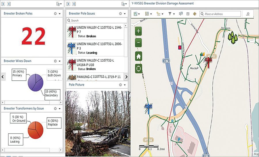
Supervisors now use an in-house dashboard in ArcGIS Online to monitor incoming data from the field.

Part One: Mobile Damage Assessments
To help with its own damage assessments, Iberdrola USA launched the Esri Collector for ArcGIS app on 300 iPad minis with data plans and individual phone numbers. Hope worked with NYSEG's manager of electric distribution quality assurance and quality control, La Wanda Ervin, to distribute these devices evenly across the company's New York and Maine service areas so that damage assessors could be deployed quickly wherever a storm hit.

Field personnel can now more accurately report damaged assets in real time using online and offline editing modes. The iPad minis communicate with the utilities' central geodatabase as soon as they enter cellular service zones. And data collection is map based.

"We did not use maps on the PDAs because the screen was so small," Hope said. "With the tablets, the maps are large and easy to use."

As fieldworkers record damage data, the tablets' GPS automatically pans to that location. Technicians can drop pinpoints to mark assets that need to be repaired, and the back-office programming automatically identifies each asset by drawing location data from the nearest utility pole. Field crews can also input photos, enter the type and extent of the damage, and report nearby conditions. What's more, assessors can communicate to and from the field using email or texting.

This system is more efficient and user-friendly than any of the utilities' previous procedures, and it saves time and money.

"The feedback we received has been wonderful," said Ervin. "The data coming in is more accurate, and most of our field technicians already used iPhones, so the technology is familiar to them. They love it."

Part Two: Collaborating with Municipalities Using Web Maps
Right after a storm or other emergency, municipal workers can now call their dispatchers to report preliminary damage to utility infrastructure and access points. The dispatchers can then log in to the municipalities' ArcGIS Online accounts and record the damages in the appropriate Iberdrola USA web map. Municipal personnel require minimal training to input the data, and the interface furnishes a simple way for municipalities and utility companies to work together to record damage assessments.

NYSEG has so far piloted this approach in three municipalities. Iberdrola USA hopes that more of the nearly 1,000 municipalities in its two-state service area join the initiative. They must have ArcGIS Online named user accounts, though, before they can participate.

Part Three: Monitoring Operations via a Web-Based Dashboard
Supervisors at all three utilities no longer have to wait to get field information compiled overnight. They can now monitor incoming data from the field on an in-house, Esri technology-based web application.

This higher-level dashboard view, available through ArcGIS Online, summarizes information such as the locations of downed primary and secondary wires, where transformers are leaking or need replacing, and how many broken utility poles there are. Training was minimal for this application too, said Hope, since the interface is so simple and intuitive.
Ticking All the Boxes—and Then Some

This three-pronged mobile, web, and dashboard solution was just what the Iberdrola USA companies needed. The quickly executed project lets utilities enter real-time damage assessment data, facilitates municipal involvement, and gives managers timely awareness of the overall situation.

Putting the system into practice was exceedingly cost-effective too. It took less than $100,000 to implement, including initial payments for licensing, devices, and other equipment.

And, as Ervin points out, the payoffs for being able to restore power more quickly exceed the monetary benefits.

"Imagine the cost savings in a storm like Sandy if you can leverage technology to get the power on one day faster," she said. "The payoff is also increased customer satisfaction and improved municipal relations."

Source: ESRI

Τετάρτη 21 Οκτωβρίου 2015

Researchers train software to help monitor climate change

This is a black and white satellite map of the ocean off the west coast of Africa. The Canary Islands are visible.
Credit: Jose A. Piedra-Fernandez, University of Almeria, Spain


A computer program that automatically analyzes mounds of satellite images and other data could help climate scientists keep track of complex, constantly changing environmental conditions, according to an international team of researchers.


"All of the data and information that is continually collected by satellites and sensors can cause tons of problems for scientists, who simply don't have the time to analyze every pixel of every satellite image," said James Wang, professor of information sciences and technology, Penn State. "Our goal has been to provide a tool that would create useful information or knowledge from this large pool of data.."

The program uses probability to analyze and extract environmental information from satellite images and sensor data about ocean structures like wakes, upwellings and cold and warm eddies, the researchers reported in the current issue of IEEE Transactions on Geoscience and Remote Sensing.

Researchers first built a database of ocean structures and then used the knowledge of human experts to train the program to recognize and identify changes in the ocean.

"We're particularly interested in the analysis of mesoscale regional ocean structures in satellite images," said Jose A. Piedra-Fernandez, a visiting professor in information sciences and technology at Penn State during the project and currently an assistant professor at the University of Almeria, Spain.

Researchers tested the technology on satellite images provided by the National Oceanographic and Atmospheric Administration and the Advanced Very High Resolution Radiometer of sections of oceans in the Iberian Atlantic, the Mediterranean coast and near the Canary Islands. The tests included 1,000 cases of real ocean features, including 472 upwellings, 119 cloudy upwellings, 180 wakes, 10 anticyclonic eddies, 40 cyclonic eddies and 180 misclassified regions.

The best combination of filter and classification method developed by the researchers accurately identified the ocean features more than 89 percent of the time.

"In almost all cases, the proposed methodology improves the accuracy rate and reduces the number of features necessary to get a good ocean structures classification," Piedra-Fernandez said.

The researchers think that data on these oceanic features could offer clues on subtle changes in the temperature of the oceans and global climate conditions.

The system involves several steps, including adjusting for possible earth- and solar-based interference sources, separating ocean regions from land regions and extracting and identifying features from specific regions of ocean. In the feature selection process, the system filters the regions of the images by ranking strong and weak--or, relevant and irrelevant--relationships between the features, said Piedra-Fernandez. After the filtering process, the system can better identify and classify the upwellings, wakes and eddies.

Bayesian networks, which use probability to make decisions, are the preferred technology for classifying the features because they are easy to design and evaluate, said Piedra-Fernandez. Just as the presence of sniffles and a cough increases the probability that a doctor will diagnose that a patient is suffering from a cold, a Bayesian network can determine that the color or shading of certain pixels in an image indicates an upwelling, or other oceanic features studied by the researchers.

Because the design of the Bayesian system requires less data for learning than other probability-based decision systems, such as Markov networks, the Bayesian networks reduce the computational cost of the system, another key goal for the system's design.

The team next plans to add more features, such as salinity and chlorophyll concentrations, and improve the accuracy of the image classification system.

Wang and Piedra-Fernandez worked with Manuel Canton-Garbin, professor of computing and artificial intelligence, University of Almeria, Spain.

This project was partially supported by Spain's Ministry of Education and Science. Their ongoing research is funded by the National Science Foundation's cyber-enabled discovery program.


Story Source:

The above post is reprinted from materials provided by Penn State. Note: Materials may be edited for content and length.

Article source: Science Daily

Τρίτη 20 Οκτωβρίου 2015

Monitor and control severe drought with analysis of data from Chollian


Research team developing a more accurate way to monitor and predict weather changes.

UNIST professor Jung Ho Im received a research grant in "Development of Space Core Technology" from the National Research Foundation of Korea (NRF Korea) last June.

Central Korea has been suffering from flooding while the southern part is complaining about hot and dry weather for the last couple of weeks. Weather patterns are no longer statistically predictable.

To mitigate this problem, professor Im's research team is developing a more accurate way to monitor and predict future weather changes.

The UNIST research team "Intelligent Remote Sensing and Geospatial Information Systems (IRIS)" led by Prof. Im, took a big step toward developing technology for monitoring climate change, including drought projection using GIS modeling, and past climate data.

"We started to work on developing technology which is able to predict the present as well as future weather changes based on the modeling data collected from the satellite Chollian, also known as Communication, Ocean and Meteorological Satellite 1 (COM-1)," said Prof. Im.

With this technology, we are able to monitor the progress of the drought in meteorological, agricultural, and hydrological aspects and to set up the strategies and actions against those problems by combining past weather data and the data from monitoring.

Prof. Im started the research on developing the technology last year, and was selected in the Development of Space Core Technology Program last June. "Developing drought monitoring system and its application through Convergence modeling of multi satellite data."

"Korea still needs to pay much closer attention to drought monitoring, prediction and its control. Research on these issues is not yet focused, but rather it is scattered around," said Prof. Im. "This research will be a step stone for cultivating experts and constructing infrastructure to utilize the advanced data from the satellites."

The IRIS research team also focuses on research topics including remote sensing, GIS modeling and artificial intelligence techniques to broaden and deepen our understanding of Earth systems under climate variability and changes.

"We would like to expand the application of monitoring system based on remote sensing to managing water resource, agriculture, and forest resource and urban planning through this research," said Prof. Im, showing his research plan. "We can protect human life by managing the information on climate changes of ecosystem, various disasters, water resource, and carbon circulations."

There are a total 13 of students in the IRIS lab including 6 graduate, 5 undergraduate students and 1 researcher under the guidance of Prof. Im. "I've been interested in the area of drought monitoring using satellite data," said a senior Seon Young Park from the School of Urban and Environmental Engineering. "I am so proud that our research could contribute to the prosperity of human."


Story Source:
The above post is reprinted from materials provided by Ulsan National Institute of Science and Technology (UNIST). Note: Materials may be edited for content and length.

Article source: Science Daily

Σάββατο 17 Οκτωβρίου 2015

Real time air pollution map of the world: The World Air Quality Index project


By Muthukumar Kumar

aqicnxlAir pollution is a serious issue in many parts of the world, especially in countries with rapid urban expansion and industrialization. In the last few years, there have been some really interesting projects like AirCasting and the Aclima-Googlepartnership where Google Street View cars were used for mapping air pollution. In some sense, these projects are limited in their geographic reach as they either relied on crowd-sourced data from sensors or Street View cars.

World Air Quality Index
The World Air Quality Index project is a real-time air pollution map of the world – South America and Africa are not covered well though. The project uses data from more than 16,000 monitoring stations in over 60 countries. Here’s the complete project overview.

The map has a lots of useful information and is definitely worth taking a look. The first thing I did was to check out the air pollution in my home town 

Real-time map of air pollution

If you are interested in contributing to the project, here’s the link to their contact page. If there is one thing that this project can benefit from, it’s a new map design!

Πέμπτη 15 Οκτωβρίου 2015

Protected and intact forests lost at an alarming rate around the world


Map showing forest losses.
Credit: Copyright Aalto University; DOI: 10.1371/journal.pone.0138918


Protected and intact forests have been lost at a rapid rate during the first 12 years of this century. According to researchers at Aalto University, Finland, 3% of the protected forest, 2.5% of the intact forest, and 1.5% of the protected intact forest in the world were lost during 2000 – 2012. These rates of forest loss are high compared to the total global forest loss of 5% for the same time period.


In Australia and Oceania, as well as North America, the loss in protected forests exceeded 5%. Worryingly, in parts of Africa, Central Asia, and Europe, the relative forest loss was higher inside protected areas than outside. However, in several countries of South America and Southeast Asia, protection was found to substantially prevent forest loss.

On a global scale, agricultural land expansion is one of the most important processes causing forest loss.

According to the analysis, high rates of protected forest loss were also associated with high proportions of agricultural land. At the same time, the losses in protected and intact forests were associated with a high gross domestic product, challenging partly the previous findings.

"Forests maintain ecological diversity, regulate climate, store carbon, protect soil and water and provide resources and livelihoods for the world’s population. It is alarming that official protection in many places does not actually protect the forests," says Timo Räsänen, Postdoc fellow at Aalto University.

"However, there are also positive signs, especially in the tropics. For example, the rate of forest loss in the Brazilian Amazon has finally declined in recent years," continues Matias Heino, researcher at Aalto University.

The analysis was conducted, using recently published global remote sensing based forest cover change data, together with global spatial datasets on protected areas and intact forest landscape. Global forest loss in protected areas and in intact forest landscapes have not been previously assessed with detailed and uniform datasets that allow consistent forest extent comparisons over space and time.

The study was made in collaboration with researchers from the Natural Resources Institute of Finland, King's College London and the VU University of Amsterdam.


Story Source:

The above post is reprinted from materials provided by Aalto University.Note: Materials may be edited for content and length.


Journal Reference:
Matias Heino, Matti Kummu, Marika Makkonen, Mark Mulligan, Peter H. Verburg, Mika Jalava, Timo A. Räsänen. Forest Loss in Protected Areas and Intact Forest Landscapes: A Global Analysis. PLOS ONE, 2015; 10 (10): e0138918 DOI: 10.1371/journal.pone.0138918

Article source: Science daily

Τρίτη 13 Οκτωβρίου 2015

Broadleaf trees show reduced sensitivity to global warming


The response of leaf unfolding phenology to climate warming has significantly reduced


The sensitivity of leaf unfolding phenology to climate warming has significantly declined since 1980s, according to a study recently published in the journalNature by an international collaboration of scientists. Earlier spring leaf unfolding is a frequently observed response of plants to climate warming. Many deciduous tree species require cold temperatures, in other words 'chilling', for dormancy release, and the warming-related reductions in chilling may counteract the advance of leaf unfolding in response to warming. Empirical evidence for this, however, was very limited.


To check whether warm winters have already attenuated the advance in spring phenology, an international team of researchers from China, Belgium, France, Spain, Switzerland and Germany investigated the change in the sensitivity of leaf unfolding to climate warming using long-term observations for seven dominant European tree species at 1245 sites in Central Europe.

Their analyses show that leaf unfolding occurred, on average, four days earlier per degree Celcius increase in spring temperature between 1980 and 1994, whereas this advance dropped to 2.3 days per degree between 1999 and 2013, a decrease of over 40 percent. "This lower sensitivity of trees to climate change likely reflects the reduced cold during winter that delays dormancy release. However, we could not fully exclude photoperiod and/or insolation as co-controlling mechanisms. These two factors may also become limiting when leaf unfolding dates occur too early in spring" said Yongshuo H. Fu, the first author of this study.

The study provides the first large-scale empirical evidence for a declining sensitivity of spring phenology to warming in mature trees for Central Europe. Professor Annette Menzel from the department of Ecoclimatology at Technical University of Munich who was also involved in the interational research said "The European PEP725 phenological database was a perfect basis to reveal that strong winter warming in the future may result in a slowdown in the advance of spring phenology."

Since plant phenology is a very important determinant of the carbon uptake and water balance of ecosystems, the declining temperature sensitivity of leaf unfolding might reduce the potential of forests to sequester even more carbon than they currently do. However, in the end it may be beneficial for the trees by reducing the risk of late spring frost damage, since extreme climatic events are projected to increase in future.


Story Source:
The above post is reprinted from materials provided by Technical University of Munich (TUM). Note: Materials may be edited for content and length.


Journal Reference:
Yongshuo H. Fu, Hongfang Zhao, Shilong Piao, Marc Peaucelle, Shushi Peng, Guiyun Zhou, Philippe Ciais, Mengtian Huang, Annette Menzel, Josep Peñuelas, Yang Song, Yann Vitasse, Zhenzhong Zeng, Ivan A. Janssens. Declining global warming effects on the phenology of spring leaf unfolding. Nature, 2015; 526 (7571): 104 DOI:10.1038/nature15402


Source: Science Daily

Climate Time Machine`

Interested in Climate change? 

Do you want to get information on sea levesl, carbon dioxide emissions, global temperature and sea ice from first hand?

Now, all the information you're eager to learn are available from NASA's Global Climate change website, where these four categories are explained through time series and analytical mapping, to give you the big picture of what's been going on throughout the world from the late 19th century, until today.

Don't miss the chance to visit NASA's website and get your hands to these one of a kind charts!

Follow the link here for the website!


Δευτέρα 12 Οκτωβρίου 2015

5 Maps that Help Explain the Arctic


Arctic Ocean Floor


Arctic Maps – Exploring the New & Unknown
What first comes to mind when you think of the Arctic? Ice? Polar bears? Climate change?

It wasn’t until very recently that we’ve gotten a clearer picture of the Arctic.

….But just what are we mapping in the Arctic? Geographic boundaries, climate change, ecology, geology, trading routes, oil exploration, the natural environment and even the research that is taking place in the north of 60°.

Maps are one of the most effective forms of communication ever developed:

They chart territory, they’re practical and communicate ideas. So that’s why this list of Arctic maps is the best place to begin learning about the Arctic. If you want answers about the Arctic, look no further. These visually-inspiring Arctic maps will show you the way.

1. ArkGIS – Mapping the Arctic Landscape


In Norwegian, ArkGIS stands for Arktisk Geografisk Informasjons System. The World Wildlife Fund delivers a webmap to simplify the Arctic. Stakeholders, decision makers and general public get the whole picture with the ArkGIS – Mapping the Arctic Landscape Webmap. From economic boundaries to human activity.. to the natural environment… ArkGIS puts together piece-by-piece each element with its Arctic maps.

Boundaries:

  • Exclusive Economic Zones (EEZ): Canada, Norway, Russia, Denmark (via Greenland), and the United States (via Alaska) are limited to their economic adjacent to their coasts. The waters beyond is considered international water.

Human Activity:
  • Shipping Routes: Shipping routes are observed using the satellite-based Automatic Identification System (AIS).
  • Oil and Gas: Exploration and production or oil wells used to retrieve underground petroleum 
Natural Environment:

  • Physical Oceanography: Bathymetry shows underwater depth of the ocean floor. The SRTM30 PLUS Grid with roughly 1 km grid resolution.
  • Sea Ice and Snow: Variables like sea ice and snow cover is an important variable for scientists to understand the pace of climate change.

Ecology:

  • Marine Mammals: Distribution and observations of marine animals are depicted for whales, seals, walruses and narwhals. It includes polar bear status and denning areas.
  • Seabirds: This includes waterfowl, seabird and shorebird species richness.
  • Fish: From Atlantic cod to Walleye Pollock, these layers show the probability of occurrence and observations for fish species.

2. ArMap: Arctic Research Mapping Application


Arctic research mapping


Have you ever wanted to tap into all the research in the Arctic?

Thousands of research projects are taking place in the Arctic. This is why the Arctic Research Mapping Application was developed. It supports Arctic science by displaying research projects, showing available data and exploring possible collaborations.

Projects range from biological, geological, meteorological to oceanography. Arctic vegetation, glaciers, permafrost, terrestrial biomes and tree lines can be displayed. The Arctic maps has ship tracks, medical facilities and arctic stations are available for reference.

Users can navigate to areas of interest and explore research projects by location, year, funding program, investigator, discipline, keywords, and other variables.


3. 1971 Arctic Ocean Floor


Early explorers thought the oceans were bottomless. After the invention of the sonic depth finder, suddenly our view of the oceans changed. They certainly weren’t bottomless… nor, were they flat. The featureless ocean became dynamic with trenches, ridges and abyssal plains.

This Arctic Ocean Floor map first appeared in the October 1971 issue of National Geographic. The detail is extraordinary of such submarine terrain as continental shelves, abyssal plains, ridges, and fracture zones. Land masses and the ocean floor are illustrated in stunning relief in these Arctic maps.


4. Geologic Map of the Arctic


Canada’s Geo-mapping Frontiers project was initiated to improve geoscience knowledge in Canada’s north. Natural Resources Canada’s Geologic Map of the Arctic displays geologic structures of Canada’s Arctic north of 60°.

This Arctic map was compiled using simple photogeologic principles and visual interpretation from a variety of free data sources. The data sets included enhanced magnetic data, LANDSAT imagery and topographic (DEM) data.


5. The Arctic Risk Map


The Arctic Risk Map is filled with base data from a variety of sources. It offers meteorology, ocean, biological, wildlife, search and rescue, geographical and activity as map data. But where these Arctic maps excel are in their environmental and safety indexes.

Environment Vulnerability Index: A location and season specific index for environmental vulnerability of marine resources with respect to oil spill as external stressor. The vulnerability assessment was performed for the different ecological uses in about 100 areas of heightened ecological significance within the 17 Arctic Large Marine Ecosystems.

The Safety and Operability Index (SOI): The SOI is based on risk influencing factors such as sea ice, visibility, temperature, distance from search and rescue, etc. It gives an aggregated score for each Arctic region for safety and operability factors in these regions. Values are compared with the benchmark chosen by Norwegian Sea.


The Arctic is in flux for ‘who’ is claiming ‘what’.. The US, Russia, Canada, Norway and Danish are all staking their territory. But no one can tap the Arctic until all countries come to an agreement. Mineral extraction, natural gas, as well as potential shortcuts for shipping routes – the Arctic may be one of the last great frontiers for human development.

NASA has some models forecasting ice-free summers in the Arctic Ocean. Disappearing sea ice jeopardizes mammal populations like polar bears. Polar bears have less time to hunt because of the early breakup of sea ice. The result is a shrinking polar bear population. Seals, walruses and seabirds hav shorter periods for nesting and feeding.

Whether its human activity or the natural environment, these 5 Arctic maps help you truly understand the great North.

Source: GIS Geography

Δευτέρα 5 Οκτωβρίου 2015

The Economic Cost Of Rising Sea Levels


As mentioned before, change is inevitable. We have seen rising and lowering of sea levels over time. Globally there has been a 250m high terrace as well as a terrace and subterranean canyons resulting from lower sea levels of the past. This paper from NASA illustrates the cost of raising sea levels and it also illustrates the cost of our inability to adapt and plan for environmental change. We are really the most un-adaptable of all organisms.

Πέμπτη 1 Οκτωβρίου 2015

Israeli Aid map!

In the following link you may view the world map, in which you may find all the places where there is Israeli aid!


Disaster Relief  20                 Follow the link here!
Medical  19                      
         Environment  9 
Psychological  6
Education   2

Κυριακή 20 Σεπτεμβρίου 2015

Case Study: Watching over natural hazards with the help of GIS


A lot of environmental issues are regularly addressed and solved by environmental consultants. Their scope of influence spreads within the range of environmental management, assessment, dealing with environmental crisis and strategic planning for both governments and commercial clients. Air, land and water contamination and assessment are in their area of expertise, and this is especially emphasized in the case of natural disasters.

Ubyrisk Consultants is a French independent consulting firm especially dedicated to the study and management of natural hazards since 2001.

As an engineering consulting firm, Ubyrisk Consultants are proposing a large number of services in the field of natural hazards, such as: stakes and vulnerability studies, spatial analysis dedicated to natural risks using GIS, professional training, advice and expertise relative to natural risks and their management, together with statistical data supply and processing.

The company manages the website Catnat.net – the first French language website dedicated to global natural disasters news. The site is daily updated with the most recent news about possible natural hazards. You can explore a detailed georeferenced database about dangerous natural events that occurred throughout the world since 2001. They wanted to use their database to build map layers with various types of natural events which could be shared with their subscribers.


In 2014, Ubyrisk Consultants had a project in which they wanted a tool that would have made possible for their clients to cross their own data (site localization for example) with the natural hazard layer they would be provided with. For example, if you are an insurance company and want to assess the possibility of drought in a certain area, you would select the coordinates to have an instant overview of potential risks. Or, if you are a governmental agency conducting a statewide project on emergency preparedness, you would be instantly equipped with an overview of potential threats like tornadoes or tsunamis using various map layers as a tool for visualization of risk assessment.

The goal of Ubyrisk Consultants, viewing themselves primarily as a service provider, was to optimize their workflow and focus on producing the quality content on natural hazards risk. Therefore, not having to worry about software maintenance was one of the prerequisites of having an unobstructed workflow.

In the words of Yorik Baunay:


WE NEEDED A CROSS-PLATFORM MAP TOOL THAT COULD BE DISPLAYED ON PC, MAC, TABLET AND SMARTPHONE AND FROM ANY LOCATION.

It was also important that this platform had a user-friendly interface that can be handled even by a non specialist, so that their staff could maintain their usual working schedules and tasks without extra effort in mastering complex GIS software.

In abstract, the key prerequisites for the project were:
  • having a collaborative platform for sharing mapping data with clients
  • web solution compatible with any device and accessible from any location
  • not having to worry about the software maintenance which includes hiring extra IT staff
  • easy-to-use interface which could be used by people with no previous experience in GIS


They chose GIS Cloud platform as an answer to their needs for successful execution of the project.

Yorik Baunay, Ubyrisk Consultants:


“THE MAIN CHALLENGE THAT WE OVERCAME WITH GIS CLOUD APPS WAS TO HAVE A SINGLE ONLINE SYSTEM THAT ALLOWED US TO DISPLAY IN A SAME MAP A LOT OF STRUCTURED LAYERS (OUR LAYERS AND OUR CUSTOMERS LAYERS) IN ORDER TO GET A POWERFUL “GEODECISIONAL” TOOL UNDERSTANDABLE BY EVERYONE (EVERYBODY CAN READ A MAP !)”

Choosing an online platform like GIS Cloud for data management purposes meant that their data didn’t have to stay on their servers, and that they didn’t have to worry about storage and maintenance. Their maps would be easily accessed and edited from anywhere using a platform which at the same time provides both space & tools needed for managing large datasets regardless of computer performance or user proficiency.


“USING GIS CLOUD APPS MADE OUR MAPPING WORKFLOW EASIER, BECAUSE WE DIRECTLY PRODUCE STANDARDIZED DATA LAYER THAT CAN BE IMPORTED UNDER GIS CLOUD. FOR THAT WE WORK WITH QGIS SOFTWARE, CREATE OUR LAYER READY TO IMPORT IT TO GIS CLOUD.”

Considering the fact that georeferenced data on natural hazards is rare to find, Ubyrisk Consultants made use of GIS Cloud’s platform to promote their expert service built on layers of data quality. It improved their communication with the clients, making a data sharing process easier and secured on a cloud.


Recommendation of Yorik Baunay:

  • the relative simplicity of handling the system (for administrators as well as for final user)
  • the price that makes the tool affordable compared to others solutions, especially for a small company like us
  • the fact that the platform is evolutive and is continually improved

Road more on GIS Cloud blog

Κυριακή 13 Σεπτεμβρίου 2015

Four Ways GIS is Being Used to Help Populations Vulnerable to Long Term Climate Change


BY DEVON REESER


GIS is a critical tool in helping the world’s most vulnerable to climate change adapt and potentially even benefit. The world’s tropics and ocean lying populations are the most at risk to long term climate change – the gradual issues that are resulting from greenhouse gas pollution, such as increased extreme droughts and storms, or wildlife shifts and crop losses. According to Standard & Poor’s global analysis, the top 20 countries at risk to climate change are in the southern hemisphere, and most are among the world’s poorest.

The vulnerable need to adapt, and they need to do so with limited funding and resources. GIS is filling that gap – with simple knowledge transfer, complex layering analyses, or just saving time and money by pinpointing the best places to invest resources. Here are four examples of how GIS is helping the most vulnerable adapt and cope with climate change.
Rainwater Runoff Harvesting in Africa

A comprehensive study of best adaptation strategies for West African farmers vulnerable to increased drought and changing rain patterns creatively used GIS to map areas most prone to surface area runoff collection of rain water.[i] Those areas are now being developed in partnership with international NGOs to serve as natural rain water collectors for small farmer irrigation.

USING GIS TO MONITOR RAINFALL IN NIGER USING RAINWATCH. SOURCE: ICT FOR DEVELOPMENT.

Specifically, in Kenya, a government secretariat is working with the NGO Kenya Rainwater Project(KRP) to water proof best identified sites from GIS mapping to ensure both farmer and domestic household water security in areas vulnerable to changing rainy seasons.
Pinpointing Best Dam Locations in Flood Zones with Projection Modeling

More than a billion people live in low lying coastal regions that will eventually flood either partially or entirely without intervention due to rising sea levels.[ii] GIS is helping, however, pin point the exact locations of where to build dams to mitigate flooding.

Bangladesh is considered the most at risk with a huge, poor population living directly within ocean flood zones. By 2050, 17% of the country will be inundated.[iii] While many people will have to move, risks can be mitigated and migration efforts saved with careful dam placing. Md. Abu Zafer Siddik and Mursheda Rahman used GIS data layering analysis to track exactly where to put a dam in one of the worst flood zones – Sirajganj. They tracked layers of river tributary levels, geological analysis, and ocean levels over time and with predictive modelling to scientifically forecast with mapping where a dam would be most helpful in 50 years.

Dengue Fever Tracked and Stomped
Slight increases in temperature can reduce entire cold seasons for tropical countries. While good news for beach goers, a decrease in cold means an increase in insects – and all of their pesky diseases. Dengue is one of the worst, and it is exacerbated not only by a decrease in cold temperature, but also by an increase in urban migration already seen and expected to intensify in coming years as rural farmers adapt to climate change and global economic pressures.

Scientists are able to successfully predict dengue outbreak areas now with GIS spatial analysis, as demonstrated in a Malaysian case study.[iv] Remote sensing satellite data can provide data on environmental factors such as land cover, land surface temperature, and topography, which then can be correlated with rainfall, air temperature, humidity, and population density to analyze and predict conditions prime for dengue. The data can help inform where and when to spray for mosquitoes and inform residents in those areas to take precautions.

INCIDENTS OF DENGUE OVERLAID ON TOP OF LAND SURFACE TEMPERATURES FROM LANDSAT TM. SOURCE: NAZRI ET AL, 2009. 

Participatory Mapping Overlaid with Satellite GIS in Amazonian Indigenous Tribes

Indigenous groups that still rely on the land and its resources for their basic economies are some of the most vulnerable to climate change. Mapping has proven an instrumental tool to help change their economic systems in concert with dwindling natural resources, however.

Richard Chase Smith took participatory maps created by 14 indigenous communities in the Peruvian Amazon dependent on hunting and gathering and overlaid them with GIS satellite imagery of deforestation and resource changes. The result of this work in the 1990s is that the communities themselves are now applying GIS to their own resource management plans – tracking animal populations, vegetation cover, land use, and soil types among other factors.[v]

Since the world’s poorest are also the most vulnerable to climate change risks – including to their health, their basic needs, and their livelihoods – a simple, low cost tool like GIS is instrumental in helping mitigate risks and adapt to tremendous challenges in our altering world.

References
[i] Ngigi, Stephen N. 2009. Climate Change Adaptation Strategies: Water Resources Management Options for Smallholder Farming Systems in Sub-Saharan Africa. The Earth Institute at Columbia University. http://www.rockefellerfoundation.org/uploads/files/9eacd477-e2ef-4b72-9207-5a18135dceb3.pdf

[ii]World Ocean Review. 2014. http://worldoceanreview.com/en/wor-1/coasts/living-in-coastal-areas/

[iii] Harris, Gardiner. 28 Mar. 2014. Borrowed Time on Disappearing Land. The New York Times.http://www.nytimes.com/2014/03/29/world/asia/facing-rising-seas-bangladesh-confronts-the-consequences-of-climate-change.html?_r=0

[iv] Nazri, CD, I Rodziah, and A. Hashim. 2009. Distribution pattern of a dengue fever outbreak using GIS. Journal of Environmental Health Research 9:2.http://www.cieh.org/uploadedFiles/Furniture/JEHR/JEHR_Vol09_2.pdf.


[v] Smith, Richard Chase. 1994. GIS and Long Range Economic Planning for Indigenous Territories. Cultural Survival 18:4. http://www.culturalsurvival.org/ourpublications/csq/article/gis-and-long-range-economic-planning-indigenous-territories.

Source

Τρίτη 1 Σεπτεμβρίου 2015

OGC North American Forum to demo results of major interoperability testbed


On October 14th, the Open Geospatial Consortium (OGC®) will demonstrate the results of the eleventh OGC Interoperability Testbed. The demonstration is being organized by the OGC North American Forum. The US Geological Survey (USGS) is hosting the event, which will take place from 10:00 a.m. - 12:00 noon at the USGS Auditorium in Reston, Virginia.

The OGC North American Forum (NAF), a group of 53 OGC members in North America, addresses OGC standards requirements, OGC program coordination, outreach and education needs of government, academic, research and industry organizations in Canada, US and Mexico. The NAF provides a coordination mechanism to prioritize North American geospatial and location specific interoperability requirements and work towards incorporating these requirements into the OGC standards process.

In December 2014 the White House Office of Science and Technology (OSTP) released a Policy Fact Sheet titled "Harnessing Climate Data to Boost Ecosystem & Water Resilience." The Fact Sheet notes OGC’s commitment to increase open access to climate change information using open standards. Testbed 11, sponsored by an international group of government agencies, is mentioned in the OSTP document.

Testbed 11 supports national climate-change preparedness by focusing on ways in which open standards support cross-community interoperability, urban-climate resilience (preparation for impacts of climate change), and secure exchange of spatial information in the context of the US National Information Exchange Model NIEM.

Nine Testbed 11 sponsors documented interoperability requirements and objectives for this activity. Thirty organizations selected to participate in Testbed 11 then developed solutions based on the sponsors’ use cases, requirements and scenarios described in a Call for Proposals. Participants’ solutions implement existing OGC standards as well as prototypes of possible interface and encoding candidate standards. Some of the prototypes may ultimately become OGC standards, revisions to existing OGC standards, or best practices for using OGC standards.

Testbed 11 Sponsors include:

  • European Organization for the Safety of Air Navigation (EUROCONTROL)
  • Land Information New Zealand (LINZ)
  • National Aeronautics and Space Administration (NASA)
  • National Geospatial-Intelligence Agency (NGA)
  • UAE Ministry of Interior Abu Dhabi Police GIS Center for Security (UAE ADP-GIS SC)
  • UK Defense Science and Technology Lab (UK-DSTL)
  • US Department of Homeland Security (DHS)
  • US Federal Aviation Administration (FAA)
  • US Geological Survey (USGS)

Testbed participants tied numerous sponsor requirements together within the Flood / Climate Change scenarios to demonstrate interoperable solutions to meet these goals:

  • Advance OGC Architecture with respect to REST and SOAP design patterns for synchronization of geodata across data stores, as well as storage and synchronization of geodata in GeoPackages;
  • Evaluate approaches to JSON and GeoJSON encodings as well as vector data and image streaming in the OGC standards framework;
  • Integrate high-resolution simulation models into geospatial infrastructures using the OGC Web Processing Service;
  • Advance use of Linked Data and semantic enabling of OGC Web Services, with a special focus on Hydrographic Data;
  • Advance use of OGC Catalog Services;
  • Advance use of spatially-enabled Social Media data;
  • Advance use of a common symbology that can be used to share common operational pictures in an international environment;
  • Advance compliance tests for the OGC Web Feature Service and Catalog 3.0 Service interface standards;
  • In Aviation, advance a Digital Notice to Airmen (NOTAM) validation service and enrichment service and advance use of Aviation Feature Schema (AFX). Also develop guidance on using geometrical constraints in the Semantics of Business Vocabulary and Rules (SBVR) (an Object Management Group standard).

Those testbed goals sort into these technology threads:

  • Urban-Climate Resilience (UCR) Thread
  • Cross-Community Interoperability (CCI) Thread
  • Aviation Thread
  • Geospatial Enhancements for NIEM (Geo4NIEM) Thread

The demo results have enormous potential for the testbed stakeholders – both technology users and the technology providers – and for the world at large. The return on the shared investment in spatial standards far exceeds the costs, not unlike the return on the original shared investments in http and html.

Some of the Testbed 11 sponsors have already begun assembling interoperability requirements for Testbed 12, which will begin in the fall. The sponsors and the OGC invite other organizations to bring their requirements into the discussion.

If you want to learn more about the upcoming Testbed 11 demo and/or the upcoming Testbed 12 opportunity, please contact Lew Leinenweber, Director Interoperability Programs (lleinenweber [at] opengeospatial.org). Learn moreabout the 15 year old OGC Interoperability Program in which OGC testbeds, pilot projects and interoperability experiments are organized, planned and managed.

Join the OGC North American Forum! The networking, coordination and public exposure provided by the Forum help members maximize the value of their OGC membership. Contact the OGC at Email Contact.

The OGC® is an international geospatial standards consortium of more than 510 companies, government agencies, research organizations, and universities participating in a consensus process to develop publicly available standards. OGC standards support interoperable solutions that "geo-enable" the Web, wireless and location-based services, and mainstream IT. Visit the OGC website at http://www.opengeospatial.org/.

NASA, USAID Open Environmental Information Hub for Southeast Asia


NASA and the U.S. Agency for International Development (USAID) Monday launched SERVIR-Mekong, a joint project to strengthen regional environmental monitoring in five countries in the lower Mekong region of Southeast Asia.

One of three SERVIR hubs now operating in developing regions of the world, the center is housed at the Asian Disaster Preparedness Center in Bangkok, Thailand, and joins a growing global community of scientists and decision-makers using publicly available data from space assets to address critical regional issues.

"Today, NASA demonstrates the human impact of its science mission here on Earth and our commitment to protecting the resources, the environment and most of all the millions of people living, working and raising new generations of pioneers and innovators across the region," said NASA AdministratorCharles Bolden, who took part in the facility's official opening along with NASA Chief Scientist Ellen Stofan.

Researchers draw on a continuous stream of space-based climate, weather and other Earth observation data from NASA and its partners, sharing timely information with governments and researchers in Burma, Cambodia, Laos,Thailand and Vietnam and addressing issues such as water management, land use planning, disaster risk reduction and management of natural resources.

The SERVIR program helps governments and development stakeholders incorporate Earth observations and geospatial technologies into natural disaster response, improve food security, safeguard human health, and manage water and natural resources. Hubs in each region focus on issues and needs most critical to local populations.

"Under SERVIR-Mekong, we are tapping into the best available science and technology to help protect this region's vital ecosystems and the benefits they provide to society," said Beth Paige, director of USAID's Regional Development Mission for Asia. "Already, Asian scientists, NASA scientists and others are beginning to develop tools to build resilience and contribute to tackling some of the region's most pressing challenges."


Partnering with NASA and USAID, as part of the SERVIR-Mekong consortium, are the Asian Disaster Preparedness Center; Deltares, headquartered in Delft, The Netherlands; the Stockholm Environment Institute in Sweden; and, the Spatial Informatics Group of Pleasanton, California. SERVIR global demand support is provided by Development Alternatives Incorporated, headquartered in Bethesda, Maryland.

SERVIR was developed in coordination with the Group on Earth Observations, an alliance of more than 90 nations and organizations collaborating to build a global Earth-observing system to benefit society's needs. Named for a Spanish term meaning "to serve," the program was initiated in 2005 by researchers at NASA's Marshall Space Flight Center in Huntsville, Alabama, which continues to house the SERVIR Coordination Office. NASA, USAID and their partners operate SERVIR hubs in Kathmandu, Nepal, serving the Hindu-Kush-Himalaya region, and in Nairobi, Kenya, serving Eastern and Southern Africa. The first SERVIR hub, launched in 2005 in Panama City, Panama, served the Mesoamerican region and the Dominican Republic.

SERVIR is operated by the Earth Science Division's Applied Sciences Program in NASA's Science Mission Directorate in Washington. Marshall collaborates with four other NASA field centers on SERVIR: Goddard Space Flight Center inGreenbelt, Maryland; the Jet Propulsion Laboratory in Pasadena, California; Ames Research Center in Moffett Field, California; and, Langley Research Center in Hampton, Virginia.

For more information about SERVIR, visit:

https://www.servirglobal.net

and

https://www.usaid.gov/climate/servir-connecting-space-to-village

For information about NASA and agency programs, visit:

http://www.nasa.gov

Logo - http://photos.prnewswire.com/prnh/20081007/38461LOGO


SOURCE NASA
Contact:
NASA
Dwayne Brown, Headquarters, Washington, 202-358-1726
Email Contact Natasha Jackson, U.S. Agency for International Development, Washington, 202-712-4320
Email Contact Janet Anderson, Marshall Space Flight Center, Huntsville, Ala., 256-544-0034
Email Contact
Web: http://www.nasa.gov