Εμφάνιση αναρτήσεων με ετικέτα ArcGIS. Εμφάνιση όλων των αναρτήσεων

Τετάρτη 11 Νοεμβρίου 2015

ArcGIS Expresses Your Open Data


ArcGIS Open Data provides organizations around the world with the ability to share authoritative open data in multiple open formats. ArcGIS Open Data is an Esri-hosted and managed solution that comes free with ArcGIS Online. It enables users to set up public-facing websites where members of the community can search and download open data.

Below are some organizations that use ArcGIS Open Data to share their data for a variety of purposes.


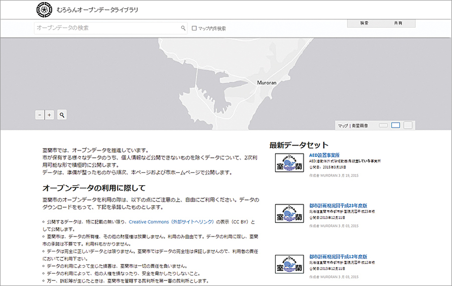
Muroran, Japan, Open Data Library

http://library.muroran.opendata.arcgis.com/?locale=ja
ArcGIS Open Data supports 25 different languages at no additional cost, giving the city of Muroran, Japan, the ability to share its open data with the public in Japanese.


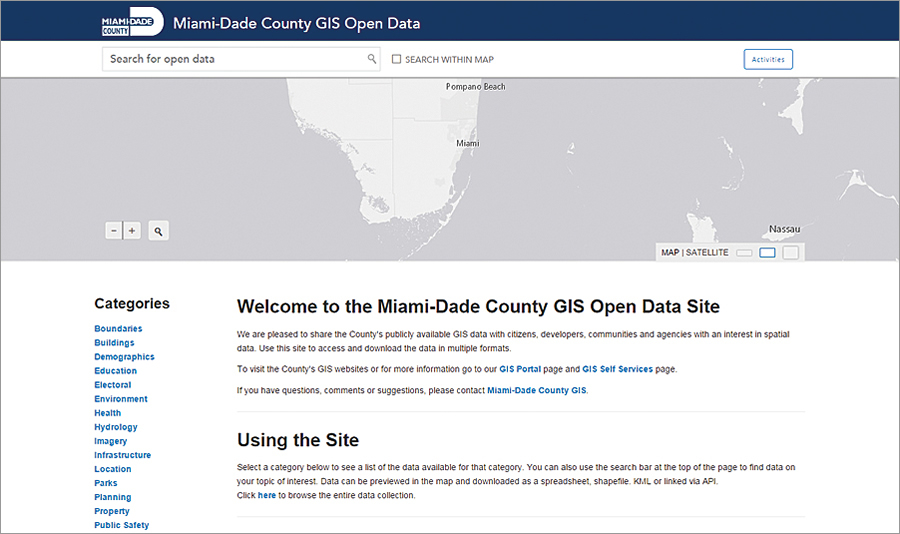
Miami-Dade County, Florida, GIS Open Data

http://gis.mdc.opendata.arcgis.com
Miami-Dade County actively uses its open data site to promote civic engagement. To make this effort sustainable and effective, Miami-Dade connects its data to the local communities that can use it to do great things by, for example, participating in local mapping and geospatial developer organizations such as MaptimeMIA and Code for Miami, the local Code for America brigade.


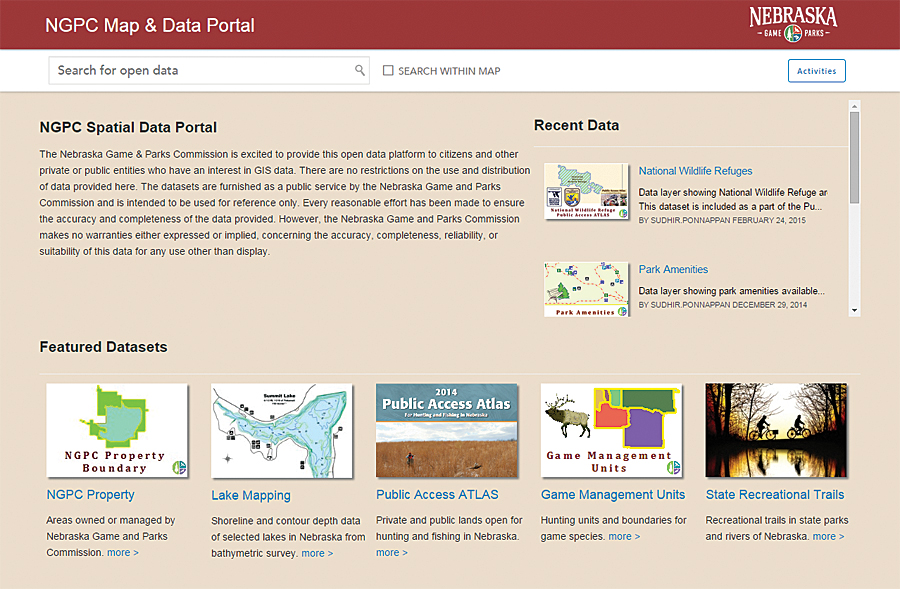
Nebraska Game and Parks Commission Open Data

http://data.outdoornebraska.gov
The Nebraska Game and Parks Commission uses its open data portal to share data about the state's fish, wildlife, park, and outdoor recreation areas. Its datasets are crafted to be authoritative, informative, and user-friendly. This open data site is a great resource for the public to find answers to common questions or to access data for geospatial analysis and application development.

To view other websites powered by ArcGIS Open Data or to create your own, visit esri.com/opendata.


Source: ESRI

Κυριακή 8 Νοεμβρίου 2015

Predictive Analytics Improve Storm Response


Dispatchr, an Esri Emerging partner, is rethinking how organizations manage their field workforces. Companies in the energy industry use the Dispatchr service to automate work processes, optimize personnel, and predict work before disasters occur.


Many energy companies still manage their field staff using printed maps and work order forms to route employees. This manual process is labor-intensive and susceptible to human error. To solve this problem, Dispatchr uses integrated internal, operational, and external data to generate predictive analytics. This information helps energy companies identify, plan, and communicate repairs. Power companies such as the Pacific Gas and Electric Company use Dispatchr with Esri technology to predict storm threats to their infrastructure.

Before a storm hits, a user can predict how the weather system will most likely impact the power grid. Integrating with Esri ArcGIS, Dispatchr searches large volumes of relevant geospatial data including storm trajectory, topography, and vegetation. It shows these features' relation to infrastructure data and predicts where and how badly the grid will be hit. This helps the power company prepare for the storm by pre-positioning equipment and personnel. Once the storm hits, the power company is ready to respond.

Dispatchr is the first service to use predictive analytics to optimize work crew response. The mobile workforce system prioritizes risk and guides field staff to the most critical work first. This improves response time to the areas most affected and to those outages that have the highest priority.

Energy companies continue to use Dispatchr after storms as well to enhance their restoration efforts. Dispatchr fully automates the work order process. Users can follow field crews' location in real time and see the status of their restoration efforts. Utilities say that Dispatchr significantly improves field communication and increases worker productivity by several hours each day. One company reports that it saves about $17 million annually.

Dispatchr improves utility customer service by helping crews quickly get the lights back on. Moreover, customers can use the Dispatchr mobile app to report outages and receive restoration updates.

For more information, visit dispatchr.com.

Source: ESRI

Παρασκευή 6 Νοεμβρίου 2015

Forest Atlas Informs How Woodland Changes Affect Earth


An interactive GIS atlas tells a story about what the world was like in the past, what it's like right now, and what we can ask of it in the future. The US Forest Service (USFS) has one such GIS atlas, the Forest Atlas of the United States.

The Forest Atlas "represents a new strategy and architecture for sharing data, information, and knowledge with policy makers, resource managers, landowners, and constituents," explained project manager and research soil scientist Charles "Hobie" Perry.

Built on Esri technology, the Forest Atlas is a resource for answering questions about how changes in forests affect people and the earth.

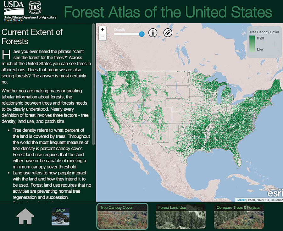
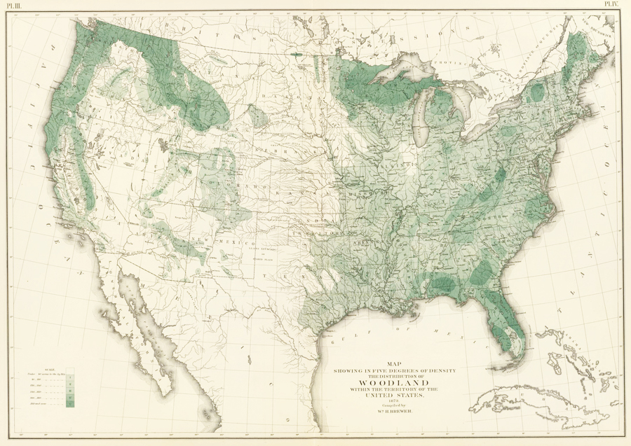
This 30-meter digital data of tree canopy cover has superseded William H. Brewer's map of woodland density from 1873.

This 30-meter digital data of tree canopy cover has superseded William H. Brewer's map of woodland density from 1873.

This 30-meter digital data of tree canopy cover has superseded William H. Brewer's map of woodland density from 1873.

A Bountiful Archive of Forest Maps
Forest maps have a long history in the United States. In 1873, William H. Brewer of the US Census Bureau produced one of the first maps of forests and woodlands. In 1898, George B. Sudworth, a dendrologist in the early Forest Service, published hisCheck List of the Forest Trees of the United States, Their Names and Ranges. From that, he and his team used contour maps of the United States to record where various forest flora could be found. The Forest Service and the US Geological Survey then published these maps in a loose-leaf volume in 1913—the firstForest Atlas of the National Forests of the United States.

But due to all the legwork that went into producing this, only one volume was published.

Forest Inventories Help Track Change
In 1928, the USFS began the Forest Inventory and Analysis (FIA) program, which manages information on forest conditions and reports on sylvan trends. FIA inventories describe the location, health, age, and tree species of forests. Forest managers need this information to write sustainable forest plans; understand the risks of fire, insect, and disease outbreaks; and schedule treatment activities such as harvests—all to maintain forest health.

This information has wider reaching applications as well. Water resource managers use forest data to trace water life cycles. State forest managers use it to track insects, diseases, and invasive species so they can implement effective treatments. Scientists rely on forest measurements to calculate how much carbon dioxide should be captured and stored for carbon sequestration. Natural resource planners also build strategies and design policies using forest changes measured over time.

Reviving the Forest Atlas
Because more forest analysts and scientists are incorporating geospatial analysis into their work, FIA is paying more attention to geospatial technology. Recently, the USFS decided to revive the Forest Atlas project to better organize its tremendous amounts of spatial data, and it used Esri technology to rebuild the resource.

The foundation for the new Forest Atlas is a set of highly accurate forest maps derived from FIA and other research projects. FIA inventories nearly 1,000 different plant species across 12 time zones, from Puerto Rico and the Virgin Islands in the Atlantic Ocean to the Marshall Islands and Palau in the Pacific Ocean. FIA recognizes species according to the US Department of Agriculture's Plants Database to eliminate the inherent biases that can arise when people inventory forests according to their own needs.

In addition to showcasing FIA inventory data, the Forest Atlas features datasets and information from across the agency. This includes the Forest Health Technology Enterprise Team's National Insect and Disease Risk Map, the Monitoring Trends in Burn Severity Program's burn severity and fire perimeter maps, and other researchers' historic tree species migration maps and future range projections.

In the Forest Atlas, this information is combined with other forest attributes to tell a comprehensive story about the forces shaping US forests and the ecosystem services they provide.

"Good data tells a very significant story," said FIA's national program manager Greg Reams. "This helps us demystify reasons why species shift in the forest. Geospatial analyses tell a story of change, [allowing] us to track invasive species and understand how these events are occurring."

The Forest Atlas addresses other related but broad forestry concerns as well, including changes in employment trends, biomass availability, land cover, and land use. It also helps the USFS, firefighters, and other responders better manage wildfires and aids scientists in analyzing carbon sequestration potential.

More Inclusive Fire Management Strategies
Fires are a natural event in any wooded landscape. When strategically managed, they help forests grow stronger and healthier. But native and invasive pests, overcrowded clusters of forest, and drought conditions reduce forests' resilience to fire and increase the likelihood that fires will be catastrophic.

The USFS and its partners need to integrate fire as a critical natural process in land and resource management but control wildfires that pass through properties with various ownership structures, all while implementing the best available science.

The Forest Atlas lets stakeholders and policy makers share essential knowledge for making environmentally sound and cost-effective fire management decisions. Sharing open data on GIS platforms ensures that everyone can understand and participate in these critical decisions.

Forecasting Carbon Sequestration Capabilities
US forests offset about 16 percent of the nation's annual carbon emissions, according to the USFS, making the Forest Atlas invaluable for designing carbon mitigation strategies.

People involved in discussions about climate change and carbon are very interested in forests' past; current; and, most of all, future carbon sequestration rates. These people are particularly keen on seeing various mapped-out scenarios that project carbon storage rates over the next 10 to 30 years.

Using Esri model building tools, researchers can construct simulations of future carbon sequestration based on variables such as population growth, fluctuations in gross domestic product, and changes in forest age and density. Forest Service scientists can also use projected climate scenarios—ranging from warm dry seasons to mild wet seasons—to calculate the effects these different conditions would have on future forest growth, including changing forest areas and carbon sequestration rates over the next 30 years. Analysts can then use these projections to forecast economic development such as housing starts, future lumber demand, and the quantity and quality of water that will be derived from forested ecosystems.

Complex and connected scenarios such as these are easier to understand when presented as geospatial displays. For example, positive and negative carbon storage levels can be represented as a range on a map so the resource community can see areas that need management action and policy makers and city planners can see what the effects will be.
Making the Forest Atlas Accessible

The Forest Atlas is available on the USFS GIS platform and is published in accordance with the Federal Geographic Data Committee's metadata standards. This makes it easy to integrate the information with other open data across government organizations.

"I see us aligning with other agencies, not just in a statistical manner but in a geospatial manner," Reams concluded. "Geographic metadata makes it easier to track monitoring information such as the shifts among land-use and land-cover categories, particularly forests, agriculture, and urban landscapes. The open-source data platform enables data integration among agencies in ways that will prove highly meaningful."


The general public can also access the atlas via ArcGIS Online and through the US government's open-source spatial data website.

Source: ESRI

Δευτέρα 2 Νοεμβρίου 2015

Editing with Feature Templates


By Mike Price, Entrada/San Juan, Inc.


This tutorial is one of a series that demonstrates best  practices for editing in ArcGIS for Desktop. It introduces feature templates and shows how they are created, updated, and applied.

ArcGIS 10.x for Desktop uses feature templates to create and update spatial data. These templates help manage symbology and populate selected attributes efficiently. Feature templates are usually created in or just before an editing session and often apply predefined layer symbology displayed in the map's table of contents (TOC).

Feature templates define information used to create a feature, including the default construction tool, selected attributes, and storage rules. Templates contain a user-defined name, description, and useful tags. Once created, templates are stored in the ArcMap document and in an item's layer file.


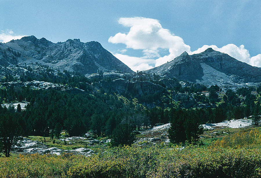
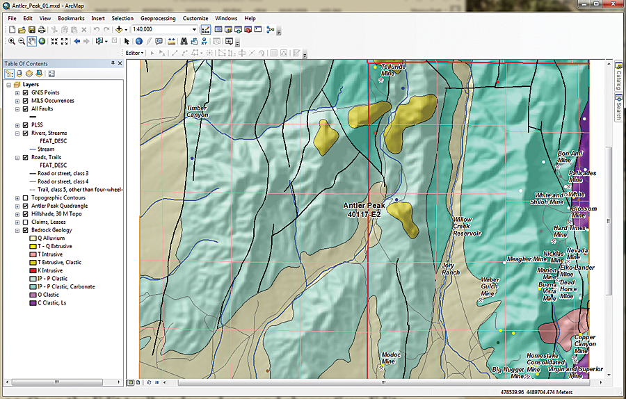
This exercise uses data shown on the US Geological Survey Antler Peak 7.5-minute quadrangle.

Well-Behaved Feature Templates

Users often ask me to explain why feature templates tend to behave badly for them. Carefully constructed and managed feature templates behave quite well, but you need to understand the rules for using them.

The first step when creating a feature template usually involves starting an edit session and loading the Create Features window. Often, the editing layer does not appear in the Create Features window, which creates confusion. A template might not appear because

  • The layer or its group is not visible.
  • The layer's visible scale range is beyond the map's current scale.
  • The layer is a parcel fabric dataset.
  • The layer has a definition query applied, and the default feature template does not match that query. This is the most common reason.

The best way to avoid problems with templates is to create the definition query first, clear any old templates, and create a new template for the queried data.


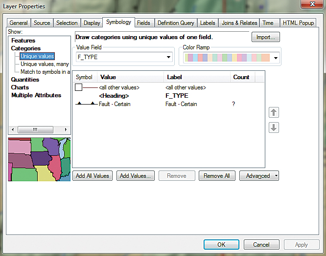
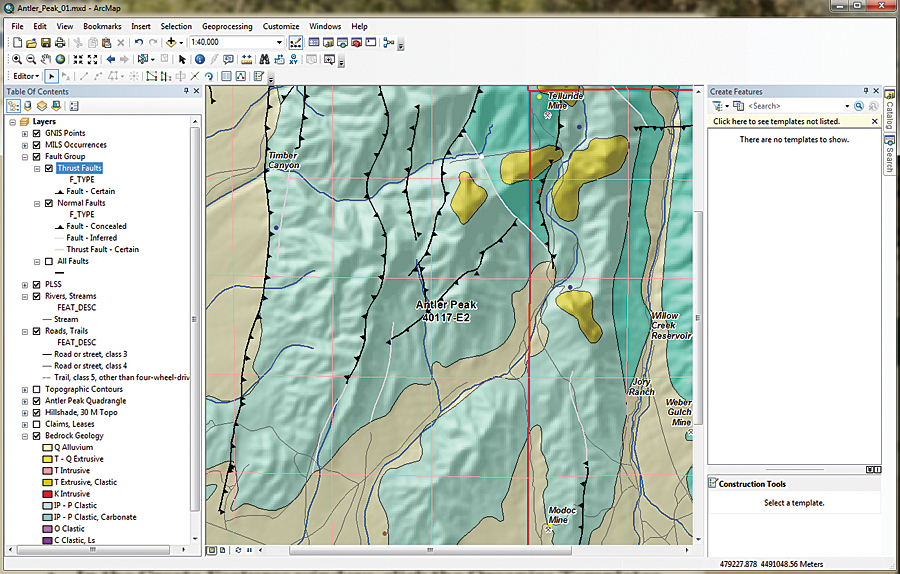
After applying a definition query to select the thrust faults, symbolize this data using the USGS symbol set.

Getting Started
This exercise uses data shown on the US Geological Survey Antler Peak 7.5-minute quadrangle. This is a portion of the Battle Mountain, Nevada, training set that has been used in seven previous exercises. This installment in the series will explain how to create, update, manage, and use feature templates for geological and topographic data including faults, hydrology, mineral occurrences, and bedrock.

To get started, download the sample dataset [ZIP] and unzip it to a local machine.

  1. Start ArcMap, navigate to the \Battle_Mountain08 folder, and open Antler_Peak_01.mxd.
  2. Explore the data layers and look at their attribute tables. Expand all layers and turn them on and off. Check out labeling schemes. Verify that the Maplex label engine is being used by right-clicking the data frame, choosing Properties, and clicking the General tab. Under Label Engine, make sure Maplex is selected. Maplex comes with ArcGIS 10.3 for Desktop.
  3. From the ArcMap standard menu, choose File > Map Document Properties. Complete the descriptive fields, providing a title, summary, and simple description. Include your name as Author and include Antler Peak, Geology as tags. Set paths to relative and set Battle_Mountain08\GDBFiles\Antler Peak.gdb as the default database.


Fault lines showing the direction of faults can be corrected easily in ArcMap using templates.

This file geodatabase contains all the data for this exercise except for one georeferenced image, which is stored in Battle_Mountain08\JPGFiles. Since this is a rather simple editing exercise, it uses only one geodatabase to store all vector data. In an ArcMap editing session, only shapefiles stored in a common folder or feature classes inside a selected geodatabase may be edited.

Sometimes, when I edit in large, complex projects or share editing duties with others, I store edited data in one or more separate geodatabases to minimize the chances that a data management disaster might occur. Once editing is finished, I may copy edited feature classes back to master project geodatabases. However, for this exercise, remember to make only the editing layer selectable.

Preparing Data Layers

  1. Begin by studying all the layers in the map.
  2. Right-click the Bedrock Geology layer and choose Data > View Item Description to view the attribution. It is limited but is a complete attribution.
  3. Open the attribute table for All Faults and sort on the [F_TYPE] field in ascending order. Notice that attributes include Faults - Certain, Faults - Concealed, Faults - Inferred, and Thrust Fault - Certain. Close the All Faults attribute table.
  4. In the TOC, right-click All Faults and select Copy. Right-click the data frame name, Layers, and choose Paste Layers twice. Select all three instances of All Faults and group them, naming the group Faults Group. Rename the first copy "All Faults to Thrust Faults" and the second copy "Normal Faults." Leave the All Faults layer unchanged and turn it off.
  5. Double-click Thrusts, select Properties and click the Definition Query tab. Use the Query Builder to create the expression F_TYPE = 'Thrust Fault-Certain'. Select and copy this query to your clipboard. Then click OK and Apply.
  6. To symbolize the Thrust Faults layer, double-click the layer, choose Properties, and click the Symbology tab. Set Categories to Unique Values and the Value Field to F_TYPE. Click the Get All Values button, uncheck , and double-click the default symbol.
  7. In the search window, type "thrust fault certain," select All Styles, and click Search. Six symbols should appear. Select Thrust Fault, 1st generation-Certain. Click OK twice to apply this symbology. Carefully inspect the symbology.
  8. Save the project.


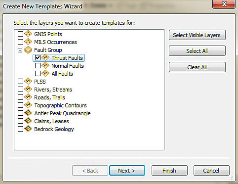
Use the Create New Templates Wizard to create a feature template to edit fault lines.

These symbols are included in the Geology 24K Style. They are carefully created to conform with the geology symbol sets used by the US Geological Survey and other agencies. The full symbol definition can be downloaded from the US Geological Survey as FGDC Document Number FGDC-STD-013-2006.
Check Symbol Direction
Consider what happens when faulted blocks frequently override other blocks at a low angle. Symbolized as triangles (or barbs), these symbols should point in the direction that the overlying rocks came from. The next step is to load a map to see if they are correct.

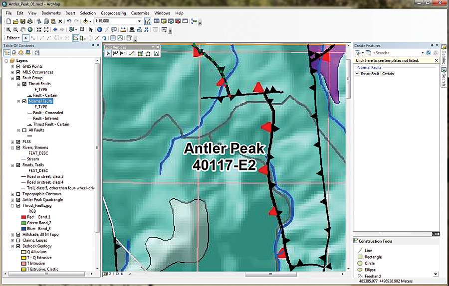
Navigate to \Battle_Mountain08\JPGFiles and load Thrust_Fault.jpg. Zoom in to the northeast corner of the project at a scale of approximately 1:15,000 and inspect the image and the symbolized lines. Notice that the red triangles in the image point west, toward the source of possible compressive forces.

In this case, the Pumpernickel Formation occurs above the Antler sequence, and the thrust barbs must be switched. To do this will require opening an editing session, creating a feature template, selecting the offending fault lines, and flipping them.


The Thrust_Faults.jpg lets you see which fault lines need to be flipped.

Creating Thrust Fault Template
  1. Before opening an edit session, change the TOC display to List By Selection. Make Thrust Faults the only selectable layer. Change the TOC to List By Drawing Order and make sure Thrust Faults is displayed.
  2. In the TOC, right-click the Thrust Faults layer and select Edit Features. The context menu provides three choices: Start Editing, Define New Types of Features, and Organize Feature Templates. The Define New Types of Features option allows symbology editing to be expanded later. Choose Start Editing from the context menu. The Editor toolbar should appear and can be docked above the TOC.
  3. In the Editor toolbar drop-down, choose Editing Windows > Create Features. The Create Features window appears and can be docked on the right side of the workspace.
  4. In the Create Features window, click the Organize Templates button. Inspect the layers listed in the Organize Features Template window. Select Thrust Faults Layer and click the New Template button.
  5. The Create New Templates Wizard opens. Look at the layers in the Faults Group. Check Thrust Faults and make sure all others are unchecked. Click Next. Click Finish and Close.
  6. Double-click the new Thrust Fault - Certain template to look at its properties. Inspect the Template Properties. In this dialog box, you can rename the template, specify an alternate Default Tool, and set field defaults.
  7. Change F_CODE to 5, F_MOVE to D, and EditCode to 0. Now, when a new thrust fault is created using this template, the attributes will be populated using these values. Click OK.
Flipping Faults

  1. Open the Thrust Faults attribute table. Select F_Index = 88, close the table, and look for the highlighted selection in the northeast portion of the map.
  2. Select the Edit Tool in the Edit toolbar. Double left-click the highlighted segment to display its vertices. Notice the single red node that marks the terminus of the fault line. Right-click the northernmost vertex and choose Flip. The barbs on the fault line change direction from east to west. Select the next line (F_Index = 89), and use the same process to flip it. Repeat the edits for F_Index = 96.
  3. Inspect your edits, and if they are correct, open the attribute table and use the Field Calculator to change all EditCodes to 3.
  4. Turn on Bedrock Geology labels and use the Identify tool to check the relationships between upper and lower rocks separated by each Fault. Are there older rocks on top of younger rocks?
  5. Open the Edit toolbar drop-down and choose Save Edits. Close the Thrust Faults attribute table, turn off Thrust_Faults.jpg, zoom to the project extent, and save the project.


After flipping the direction of two Thrust Fault lines, symbolize the three types of Normal Faults after applying a definition query and USGS symbology.

Symbolizing Normal Faults
The same steps used with Thrust Faults will be used to symbolize the Normal Faults layer. The fault lines in Normal Faults will not be edited.
  1. In the TOC, right-click Normal Faults and open Properties. Click the Definition Query tab. Use the Query Builder to form the expression F_TYPE <> 'Thrust Fault - Certain' and apply it.
  2. Click the Symbology tab. Choose Categories > Unique values, choose F_TYPE as the Value Field, and click the Add All Values button.
  3. Use the search function in the Symbol Selector using the layer name to locate the appropriate symbology from the Geology 24K Style Reference. For example, search on fault inferred to find the symbol for the Fault - Inferred layer.
  4. Now create a feature template for Normal Faults. In the Create Features window, click Organize Templates and select Normal Faults. Click New Template, making sure only Normal Faults is checked, click Next then click Finish. Close the Template Organizer.
  5. Save the Thrust Faults and Normal Faults as layer files to capture the associated feature templates. Save the map.

When finished, inspect the fault symbology on the map. Can you determine the difference between a concealed fault and an inferred fault? A concealed fault is hidden by an overlying geologic map unit, water, or ice, even though it may be observed nearby. An inferred fault's location must be inferred by indirect means such as geophysics and remote sensing.

Summary
This exercise showed how to access meaningful geologic symbology and use definition queries when applying symbology. This updated symbology was used when creating several feature templates.

Acknowledgments
Once again, thanks to my Battle Mountain data providers and to my earth sciences followers. Special thanks to my editor, who keeps me always heading in the right direction.


See also the accompanying article, "Building Antler Peak."

Source: ESRI

Τετάρτη 28 Οκτωβρίου 2015

Find Out Where the Water Goes


The Nighttime Flow Analysis solution, a COTS configuration of the ArcGIS platform, helps water utilities identify areas with underground leaks and other sources of nonrevenue water loss.

Nighttime Flow Analysis measures gallons per minute (GPM) of water consumption for an area at night, when households typically use significantly less water. It compares that rate to the expected flow estimated using industry standards for minimum nighttime uses—such as the use of toilets, washing machines, and outdoor irrigators—to determine potential nonrevenue water loss, or water flows that are not reaching a meter.

This solution is a collection of services, maps, and apps supported on ArcGIS 10.3 that helps utilities find and fix underground leaks and other sources of water loss that might go undetected for months. Rapidly identifying and eliminating unnecessary water loss provide better service, more efficient distribution to customers, less wear on treatment equipment, and longer-term value from capital-improvements spending.

Over the long term, Nighttime Flow Analysis can improve utility operations and capital planning by reducing high water loss, preventing service disasters, and reducing the time needed to make repairs from months to weeks or days.

Read the accompanying article in this issue "Tennessee Utility Proactively Stops Water Leaks" and learn how Tennessee's largest water and wastewater utility, White House Utility District (WHUD), uses other ArcGIS for Utilities solutions to manage its 600-square-mile service area.

For more information on Nighttime Flow Analysis, visit solutions.arcgis.com/utilities/water/help/nighttime-flow-analysis/.


Source: ESRI

Παρασκευή 23 Οκτωβρίου 2015

Enrich Public-Facing Maps and Apps


ArcGIS Online subscribers have access to a number of content layers, such as demographics, imagery, elevation, landscape, and historical maps. In some cases, such as demographics, these map layers consume ArcGIS Online credits and would be considered premium content services. In most cases, however, these layers are available at no additional cost to your ArcGIS subscription.


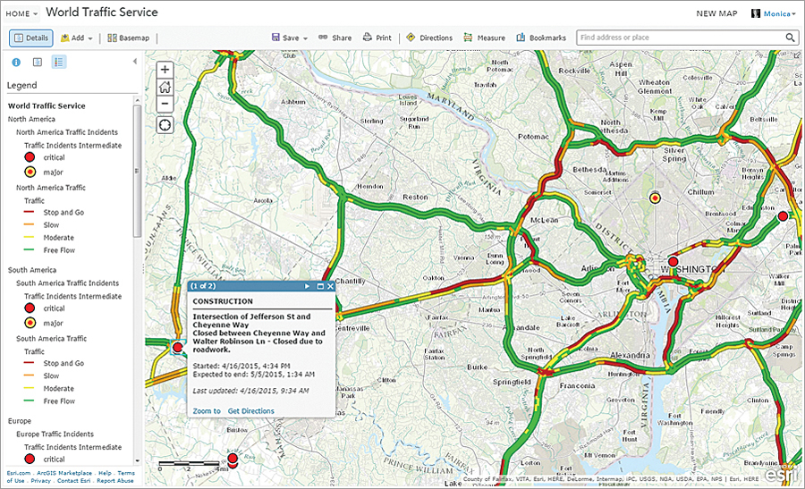
Premium content, such as live traffic feeds, can make local maps more valuable by helping people avoid traffic congestion and construction projects.

These content layers can be used in the maps and apps accessed by named users in an organization and can also be included in public-facing maps and apps.

ArcGIS Online subscribers can also use the content layers in maps and apps that they create and share with external users, such as customers, partners, or the public, who access them anonymously.


Some premium content, such as demographic layers, do use ArcGIS Online credits but provide additional information.

For example, subscribers can take advantage of a dynamic image layer from the National Agriculture Imagery Program (NAIP) or Landsat 8 imagery when working with other agencies or partners that need periodic access to this information but are not ArcGIS users. During a natural disaster, users may want to support response activities by including a reliable and scalable map layer that shows a live feed of the incident alongside other geographic information they are publishing such as open shelters or evacuation routes.

There are tools and workflows available through ArcGIS Online for creating maps and apps that use an organization's accounts to access content layers on behalf of its users. Learn more atgoto.arcgisonline.com/premium/share.

Source: ESRI

Τετάρτη 21 Οκτωβρίου 2015

GIS News: ERDAS Plugin for ArcGIS, New World Map Edition


BY CAITLIN DEMPSEY MORAIS


The latest geospatial industry news includes software announcements from ERDAS, SuperGeo, PCI Geomatics, and Esri. GfK Geomarketing announces new world data, and Geosparc will be hosting technology sessions at FOSS4G.

ERDAS
ERDAS announces the release of new version of ECW Plug-in for ArcGIS Desktop. The ERDAS ECW/JP2 SDK plug-in provides a means for ArcGIS for Desktop users to read files in the ECW and JP2 formats and accept ECWP streams of ECW and JP2 data originating from ERDAS APOLLO.

Esri

The National Land Survey of Iceland (NLSI) is implementing Esri’s ArcGIS for INSPIRE to meet compliance with the European Union’s Infrastructure for Spatial Information in Europe (INSPIRE) Directive. This will ensure that the country’s public data is visible and accessible to institutions, companies, and individuals for improved governance.

Microsoft has selected Esri to participate in the Microsoft Technology Center (MTC) Alliance Partner program. Esri’s flagship ArcGIS software will be demonstrated in MTC Envisioning Centers worldwide as part of the Strategy Briefing offering. These leading-edge geographic information system (GIS) tools will also be available to Microsoft prospects and customers to use during Proof of Concepts workshops.

GfK Geomarketing
GfK GeoMarketing’s new and completely overhauled digital World Map Edition is now available. This global edition includes all map updates of the past several years, including those for Asia, America and Africa. The edition provides comprehensive, detailed coverage of worldwide postal and administrative boundaries as well as topographic information.


SuperGeo

SuperGeo will be releasing SuperGIS Desktop 3.1 which improves the performance in editing, displaying, analyzing and managing spatial data. SuperGIS Desktop 3.1 contains two versions, Standard version and Professional version. In addition to the entire functions of Standard version, Professional version also supports Topology Analysis, reinforces geodatabase management, and provides VBA customization.

ELMF

The European LiDAR Mapping Forum has announced that 60% of exhibitor space has been sold to vendors includingFARO, Optech, Topcon Europe, Ixblue, Leica, Optech, and Esri. The second ELMF is taking place at the Salzburg Congress, Salzburg, Austria from 29 – 30 November 2011. Last year’s inaugural event attracted 613 professionals from the mapping, surveying and GIS industries representing 46 countries.

earthmine

earthmine has announced it is now an Autodesk AEC Industry Partner, along with the immediate availability of its latest addition to the earthmine desktop product suite, earthmine for AutoCAD Map 3D.

CARIS

CARIS’ Bathy DataBASE (BDB) software has provided the last link of a 25 year project enabling the Canadian Hydrographic Service (CHS) to implement their Hydrographic Information Network.

PCI Geomatics
PCI Geomatics has successfully deployed a high speed image production system to the Amazon Cloud in support of Esri’s ArcGIS Online platform, to process and make available high resolution Imagery content.

Geosparc


Geosparc, the company professionally supporting the open source GIS development software Geomajas, today announced that it will be present at Foss4G, the international conference for Free and Open Source Software for Geospatial, in Denver (US) from 12 till 16 September 2011. Geosparc will be hosting the Introduction to Geomajas workshop and the following technology sessions: Mobile GIS through Geomajas, Geomajas, a GIS framework for the web, and Securing GIS data.


Δευτέρα 12 Οκτωβρίου 2015

Esri Publishes Science and Citizen-Driven Land-Use Planning Book


The number of people living in the United States is expected to swell from 321 million today to just over 400 million by 2055, according to the US Census Bureau. Millions of additional acres will be needed for homes, schools, offices, and infrastructure to support the burgeoning population while conserving open space and preserving agriculture. Other countries face similar challenges.

Technology is driving more of the decision making about which areas are suitable for urban development, agriculture, and conservation and how to resolve conflicts over land use. Advanced Land-Use Analysis for Regional Geodesign: Using LUCISplus, a new book published by Esri, teaches readers how to solve real-world land-use issues using geographic information system (GIS) technology from Esri and a land-use analysis process developed at the University of Florida.

LUCIS stands for land-use conflict identification strategy, a process for analyzing land-use suitability and resolving land-use conflicts. The methodology was developed by Paul D. Zwick and Margaret H. Carr of the University of Florida. LUCISplus analysis tools are powered by Esri's geoprocessing framework, ModelBuilder, in particular.


The book teaches concepts and walks readers through how to identify potential land-use conflicts and make smarter land-use decisions using specialized methods and tools that complement Esri's ArcGIS.

The book will help urban planners and GIS analysts who work in land-use planning and students enrolled in advanced GIS courses make well thought out land-use decisions rather than follow a plan as you go method.

The LUCIS strategy places a high priority on input from citizens and incorporates community values into the plans. For example, one of the tools mentioned in the book is the A4 LUCIS Community Values Calculator. "The LUCIS modeling of community values produces various land-use visioning alternatives," the authors wrote. "LUCIS is a process of land-use planning and visioning, not prediction."

Chapters cover many topics, including conflict analysis as a decision-making tool, land-use suitability automation tools, analyzing and mapping residential land-use futures, analyzing and mapping employment land-use futures, analyzing and mapping conservation and agriculture preservation and protection, and analyzing and mapping land use for natural disasters.

Advanced Land-Use Analysis for Regional Geodesign: Using LUCISplus was written by Zwick, former director of the GeoPlan Center and a professor of urban and regional planning at the University of Florida; Iris E. Patten, an assistant professor in the School of Geography and Development at the University of Arizona; and Abdulnaser Arafat, an assistant scientist for the Shimberg Center for Housing Studies at the University of Florida.

The book is a follow-up to the book Smart Land Use Analysis: The LUCIS Model (Esri Press 2007),written by Zwick and Carr, a professor in the Department of Landscape Architecture at the College of Design, Construction, and Planning at the University of Florida.

A video about the book is available to watch.

Advanced Land-Use Analysis for Regional Geodesign: Using LUCISplus is available in print (ISBN: 9781589483897) or as an e-book (ISBN: 9781589484337), 380 pages, $59.99. The book is available at online retailers worldwide, at esri.com/esripress, or by calling 1-800-447-9778. Outside the United States, visit esri.com/esripressorders for complete ordering options, or visit esri.com/distributors to contact your local Esri distributor. Interested retailers can contact Esri book distributor Ingram Publisher Services.

# # #

About Esri Press
Esri Press publishes books on GIS, cartography, and related topics. The complete selection of GIS titles from Esri Press can be found on the web at esri.com/esripress.

About Esri
Since 1969, Esri has been giving customers around the world the power to think and plan geographically. The market leader in GIS, Esri software is used in more than 350,000 organizations worldwide including each of the 200 largest cities in the United States, most national governments, more than two-thirds of Fortune 500 companies, and more than 7,000 colleges and universities. Esri applications, running on more than one million desktops and thousands of Web and enterprise servers, provide the backbone for the world's mapping and spatial analysis. Esri is the only vendor that provides complete technical solutions for desktop, mobile, server, and Internet platforms. Visit us at www.esri.com.

Esri, the Esri globe logo, GIS by Esri, ArcGIS, www.esri.com, and @esri.com are trademarks, registered trademarks, or service marks of Esri in the United States, the European Community, or certain other jurisdictions. Other companies and products mentioned herein may be trademarks or registered trademarks of their respective trademark owners.

Press Information:
Carla Wheeler, Esri
Tel.: 909-793-2853, extension 1-2448
E-mail (press only): Email Contact
General Information: Email Contact

Κυριακή 11 Οκτωβρίου 2015

Supervised and Unsupervised Classification in ArcGIS


Unsupervised Classification Example

Supervised Classification in ArcGIS
We’ve explored digital image classification techniques like unsupervised classification, supervised classification and object-based. We’ve gone into great detail how to do object-based image classification. Now let’s put supervised and unsupervised classification techniques in action.

Supervised Classification Steps:
  • Select training areas
  • Generate signature file
  • Classify

Supervised Classification Diagram

Step 1: Enable Image Analysis Toolbar

Enable the Image Analysis Toolbar (Windows > Image Analysis). The image analysis window will be displayed in ArcMap.


Image Analysis Toolbar


Step 2: Select training areas


Open the training set manager and click the draw polygon icon. Now, you will have to draw polygons where you know the land cover class.

For example, draw a polygon for an urban area. Continue drawing urban areas representative of the entire image, not just a single area. Multi-select all your urban polygons and merge them into a single class. You can rename this training set as urban. Once you’re finished, begin creating training sets for your other classes.


Training Sample Manager

Step 3: Generate signature file
Now we should have training samples for each class. Each class is merged and renamed accordingly. It’s time to create a signature file by clicking the “create a signature file” icon. This can be saved and opened at a later time.


Create Signature File


Step 4: Classify


The ArcGIS image classification toolbar gives several options for classification including: maximum likelihood, iso cluster, class probability and principal components.

Each option has its own advantages and may require extra reading. You will need to input your signature file during this step. This will generate a classified image with the classes you developed in your training set.

You may need to trial and error a bit with the signature files and rerun the classification until you are happy with the image classification result.


Supervised Classification Example

Unsupervised Classification in ArcGIS (iso-clusters)
Unsupervised classification remote sensing does not provide sample classes. The user identifies how many classes to generate and which bands to use. The software then clusters pixels into the set number of classes. The user then identifies the land cover classes.

Unsupervised Classification Steps:
  • Generate clusters
  • Assign classes


Unsupervised Classification Diagram

Step 1: Activate Spatial Analyst Extension
The first step is to activate the spatial analyst extension in ArcGIS (customize>extensions>spatial analyst).
Step 2: Generate clusters

This unsupervised classification example uses the iso-clusters unsupervised classification method (spatial analysis tools>multivariate>iso clusters).

Input: The image you want to be classified.
Number of classes: The number of classes generated during unsupervised classification should be about 10 times the number of bands in your image. For example, if you are working with multispectral red, green, blue and NIR bands, then the number here will be 40 (4 classes x 10).
Minimum class size: This is the number of pixels to make a unique class.

When you click OK, classes will be formed based on your input parameters. But they still need to be identified which land cover classes they are.
Step 3: Assign classes

The next step would be to name and select colors for each class that were generated by the iso-clusters output. What works well here is to select colors for each class. For example, set water as blue for each class. After setting each one of your classes, we can merge the classes by using the reclassify tool.

There will be some manual classification if classes appear in 2 land covers. For example, if vegetation was mistakenly classified as water (perhaps algae in the water), then this would require the user to manually edit the polygon. You can convert the raster to a vector polygon and use the editing toolbar if there is confusion between classes. Polygons can be split and then properly identified.


Unsupervised Classification Example


This sums up what you need to know for unsupervised classification remote sensing. Unknown classes (isodata) were generated using the unsupervised iso clusters approach. The user identifies these land cover classes. Some manual editing may be necessary if there is confusion between classes. Put these steps to practice and generate some land cover of your very own.

How to Create NDVI Maps in ArcGIS


NDVI Maps in ArcGIS


What is NDVI?
Normalized Difference Vegetation Index or NDVI maps are being used in agriculture, forestry, ecology and more. But what is NDVI?

Healthy vegetation (or chlorophyll) reflects more near-infrared (NIR) and green light compared to other wavelengths. It absorbs more red and blue light.

This is why our eyes see vegetation as the color green. This is also why more near-infraredis reflected back into satellite sensors.

NDVI maps use NIR and red channels to measure of healthy vegetation.

NDVI Formula:
NDVI =
NDVI Definition:
NDVI is an index describing vegetation by showing the difference between near-infrared (which is strongly reflected by vegetation) and red light (which is absorbed by vegetation).

You can create NDVI maps with the image analysis toolbar in ArcGIS 10. All you need is imagery with red and NIR bands. Examples are Landsat, Quickbird and Worldview-2.

Related: USGS Earth Explorer: Download Free Landsat Imagery


How to create NDVI maps in ArcMap


The main objective is to classify high and low vegetation. This NDVI tutorial shows you step-by-step how to create NDVI maps in ArcMap.

In this NDVI example, we use Worldview-2 (WV-2). Worldview-2 is multispectral imagery. We say multispectral because it has red, green and blue – and other bands as well. The band configuration for WV-2 is:

Worldview-2 Band Configuration

Band 1: Coastal Band
Band 2: Blue
Band 3: Green
Band 4: Yellow
Band 5: Red
Band 6: Red Edge
Band 7: Near Infrared 1 (NIR-1)
Band 8: Near Infrared 2 (NIR-2)

To display true (visible) color composite, in layer properties – change the “Red” channel to band 5, “Green” channel to band 3 and the “Blue” channel to band 2. We say true colorbecause it is the same as how our eyes see.


True color composite – red, green, blue channels

To display near-infrared (NIR) false color composite, you need band 7 (NIR-1) as the “Red” channel, band 5 (red) as the “Green” channel, and 3 (green) as the “Blue” channel. We say near-infrared false color because this configuration uses NIR in the “Red” channel. The vegetation should already be shouting out at you in bright red!


Near-infrared false color composite – NIR-1, red and green channels

Step 1: Enable Image Analysis Toolbar

Enable the Image Analysis Toolbar (Windows > Image Analysis). The image analysis window will be displayed in ArcMap.


Image Analysis Toolbar

Step 2: Check Scientific Output Properties

Under image analysis options, select the red band and the near infrared band.


Image analysis toolbar options

For Worldview-2 imagery, under the NDVI tab – the red band is “band 5” and the NIR band is “band 7”.


NDVI band selection

Optionally select “Scientific Output” so your values range from -1 to 1.

Step 3: Click NDVI Icon

Highlight your layer by clicking it.


Highlight your image

Under properties, Select the NDVI icon which looks like a leaf.


NDVI button

This will create temporary layer in the table of contents.


NDVI temporary output

Step 4: Export Raster

Highlight the new NDVI layer that you want to export by selecting it in the image analysis toolbar.


Highlight NDVI raster

Right click layer, and export raster to save into memory.


Export raster

High positive NDVI values (green) means high vegetation. Urban and water will have negative NDVI values (yellow and red).

Where is NDVI being used?
NDVI maps have numerous uses and applications across different sectors.
  • Agriculture: Precision farming, crop insurance fraud, biomass and food security
  • Ecology: Animal migration patterns, environment change and population dynamics
  • Forestry: Leaf area index, forest supply and fire danger

Learn more about NDVI and other remote sensing applications: 100 Earth Shattering Remote Sensing Applications & Uses


More information: NASA: Measuring Vegetation (NDVI & EVI)

Using ArcGIS Pro in DaaS Cloud Environments


Technology and IT trends are propelling companies and organizations to virtualize their physical desktops, making it easier for employees to work from anywhere and still be able to access all of their organizations' internal websites and applications.


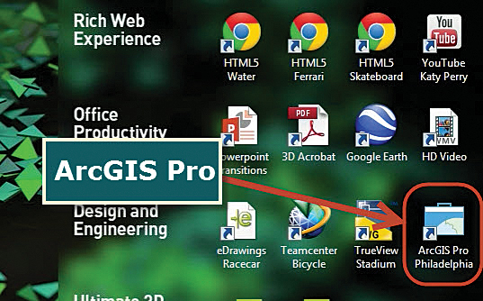
ArcGIS Pro has been preinstalled in several leading Desktop-as-a-Service, or DaaS, deployments, including NVIDIA Test Drive.

ArcGIS Pro, the newest addition to the ArcGIS for Desktop suite, is a modern, 64-bit, multithreaded application that provides integrated 2D and 3D spatial analysis and visualization in one package. As with ArcMap, ArcGIS Pro is expected to be successfully virtualized by countless companies and organizations.

At Esri, ArcGIS Pro has been heavily tested in all major virtual desktop infrastructure (VDI) platforms. This includes VMware Horizon with View, Citrix XenDesktop, and Microsoft's Hyper-V VDIs. Testing has found that in some cases when ArcGIS Pro is used with 2D data, the user experience is fine without a graphics processing unit (GPU). When ArcGIS Pro is used with complex 2D data and any 3D data, however, a GPU is needed.

Delivering that user experience on a physical workstation is relatively easy with common hardware such as a GPU integrated with a computer's central processing unit. Getting that same level of user experience—or perhaps even better—is also possible in a virtualized environment. The major virtualized environments employ shareable GPU technology, such as the NVIDIA GRID cards, to deliver that user experience.
The Next Phase in Cloud-Based VDI—DaaS

Many companies are now considering the next phase of virtualization: cloud-based VDI, where a centralized server hosts desktop operating systems within a number of virtual machines. Desktop-as-a-Service, or DaaS, is a VDI delivered by a cloud computing provider. The provider supplies the hardware, operating system, and management capabilities needed to run the virtual desktops—though operating system licensing does vary among providers.

Companies can then customize the virtual desktop supplied by the DaaS provider. They can add the business, application, and utility software their end users need, including Microsoft Office and ArcGIS for Desktop, and any necessary data.

A DaaS can be used when a small business or consulting firm needs temporary employees for a short-term project or when an organization needs to give some permanent employees short-term access to certain programs such as ArcGIS software. For example, if a project requires 10 additional GIS analysts for six months, instead of purchasing desktop workstations and software licenses for the employees and then installing and configuring the software and maintaining the workstations, the company can give its temporary users a DaaS workstation that is ready to go on day one. The virtual desktop is centrally maintained during such a project and then simply removed from the computers when the assignment is over.


Esri has tested ArcGIS Pro in all major virtual desktop infrastructure (VDI) platforms. The user experience is fine without a graphics processing unit (GPU) when using basic 2D data, though a GPU is needed when using complex 2D data and any 3D data.
ArcGIS Pro in DaaS Now

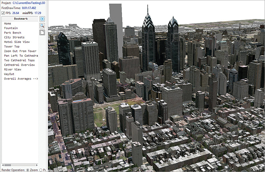
ArcGIS Pro delivers a great interactive experience when working with 2D and 3D data. When users pan and zoom, the smooth animation feels remarkably gamelike. These visualization capabilities are also a way users can measure how well the program works in DaaS.

ArcGIS Pro has been preinstalled in several leading DaaS deployments, including NVIDIA Test Drive. Allocated from multiple data centers around the world, NVIDIA Test Drive furnishes an entire Windows desktop with multiple graphics-intensive applications already installed to demonstrate how graphics-intensive applications can be successfully delivered and provide an impressive user experience.

ArcGIS Pro is one of the installed graphics-intensive applications. Its rendering engine, which uses DirectX or OpenGL libraries to render, drives the program's fluid, highly animated visualization. Those are the same libraries used for gaming software, and when used with GPUs, their capabilities are maximized.

The ArcGIS Pro user experience in the NVIDIA Test Drive DaaS is enhanced because the virtual desktop provided by the DaaS is supported by a shareable GPU. The NVIDIA Test Drive environment uses NVIDIA GRID cards that are specifically designed for virtualization environments.
Putting ArcGIS Pro in DaaS

To successfully deploy ArcGIS Pro in a DaaS, there are a few important considerations to keep in mind.

Using 2D data that is relatively simple and doesn't have symbology does not typically require a DaaS supported by a GPU. For more complex 2D and 3D data, however, it is necessary to use a shareable GPU-supported DaaS.

When a shareable GPU is required, the DaaS provider must be able to support the use of a GPU such as a NVIDIA GRID K2 card in its hypervisor. This can have a dramatic impact on the end users' experience. Although many large DaaS providers do not yet provide shareable GPU support, the ones that do include Europe's Cloudalize and Exponential-e and the United States' NaviSite. Moreover, existing providers are extending their service areas into more geographic regions, and new providers are scheduled to come online.
Where to Go from Here

DaaS is a trend that will only continue to grow as more companies migrate from physical desktops in the office to on-premises VDI environments and cloud-based DaaS. Keeping up with this progression will require confronting myriad challenges, but the evolution will not stop or be redirected.

ArcGIS Pro can be deployed into a DaaS environment and deliver a great user experience. There are many providers and options available to make that happen now. Esri is working with several DaaS providers to determine the levels of user experience they offer through their services so that Esri and these providers can work together to provide best practices, configuration, and guidance to users.

Find more on ArcGIS Pro in DaaS and virtualization environments at blogs.esri.com and pro.arcgis.com.

Πέμπτη 1 Οκτωβρίου 2015

AppStudio for ArcGIS: A New Platform for Building Native Apps


ArcGIS users can now easily build native apps that run on any device using AppStudio for ArcGIS, a groundbreaking tool from Esri.

Build an app once, and it runs on Android, iOS, Windows, OS X, and Linux devices.

Already using ArcGIS? Convert your maps directly into native apps that are ready to use.

These beautiful, simple native GIS apps can be shared with the public through all popular app stores or securely within an enterprise.
Expand Your Reach

Companies and organizations—particularly cities and local governments—need to broaden their reach and engage community members with useful content to promote the good work they do.

What if, for example, there was an easy way for residents to report streetlights that have gone out, share and view popular dining spots, or find mountain biking trail maps? To make these things accessible, organizations need to expand their web presence into the Google Play, Apple, and Microsoft app stores.

This can be challenging in the face of tight timelines, restricted budgets, and scarcity of GIS developer resources.

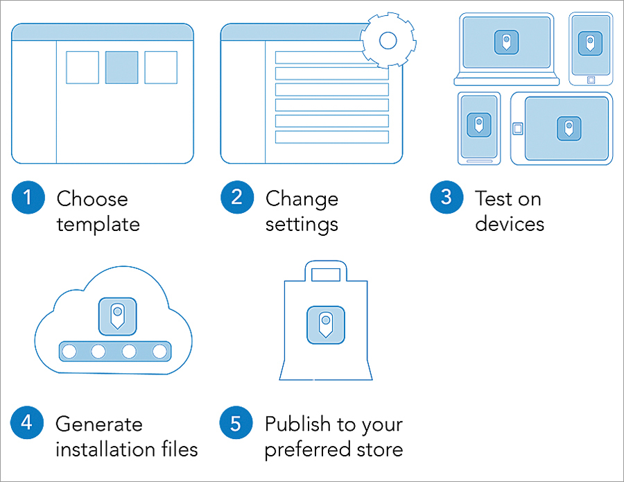
AppStudio provides a cost-effective way to create and distribute apps to the public. Organizations can leverage their existing GIS work and exploit the developer capacities they already have. AppStudio was designed to enable anyone with GIS skills to configure out-of-the-box templates; no coding is required.


After using a step-by-step wizard to build an app, users check a box for each platform they want the app to run on and AppStudio for ArcGIS automatically generates the installation files for all selected platforms.

That said, if an organization wants to take a deeper dive with developer tools to customize apps or build them from scratch, AppStudio comes with an integrated development environment and provides the source code for its templates, which developers can use as a starting point.
Your Apps Everywhere, on Any Device

GIS managers under pressure to deliver GIS apps and data quickly can use AppStudio to let their departments focus on what's important—sharing their work—rather than worrying about app development.

Whereas GIS departments previously had to build a separate app for each platform they supported—one for iOS, one for Android, and one for Windows—they can now build one app for all platforms. After using a step-by-step app building wizard, users check a box for each platform they want the app to run on. AppStudio then automatically generates the installation files for each of the selected platforms.

Organizations also have the option to share apps internally only. While this enables GIS departments to limit app distribution altogether, it is also a way for them to do centralized testing or debugging before sharing new apps more widely.
Great for Developers

AppStudio makes GIS developers much more efficient. Being able to produce apps that function across multiple devices is useful now that more and more organizations are letting employees bring their own devices to the workplace.

Additionally, AppStudio gives developers options for customization. They can either dig into the templates that come with the tool or start coding from scratch. Developers can also include advanced GIS functionality by bringing into play device hardware such as graphics processing units (GPUs), RAM, cameras, microphones, and accelerometers.
Gain Power over Constraints

AppStudio gives power back to GIS organizations. No longer constrained by having to create five separate apps for five different devices, organizations can now build apps as quickly and as customized as they wish and share them as widely—internally or externally—as they want.

By allowing organizations to further leverage their investments in ArcGIS, AppStudio lets even more people benefit from the valuable work being done by GIS departments—on any device.

Learn more about AppStudio for ArcGIS at appstudio.arcgis.com.

Find out all the details about the July ArcGIS Online update at links.esri.com/arcgisnew.

Παρασκευή 18 Σεπτεμβρίου 2015

Esri Photo Survey Speeds Property Surveys


To eliminate blight and revitalize neighborhoods, many local governments use large teams of volunteers to evaluate property conditions and identify structures that may be abandoned or in disrepair. These property surveys may take several months to complete and are hard to maintain over time. To simplify survey data collection, Esri partnered with the City of New Orleans (NOLA) to create an ArcGIS for Local Government solution called Photo Survey, a web application that can be used by local governments to publish street-level photo collections and conduct focused property surveys that may identify blight, damaged structures, or construction activity. Like all ArcGIS for Local Government solutions, Photo Survey is included with an ArcGIS subscription.

"Photo Survey leverages location-enabled photos produced by commercially available cameras and simplifies data processing so that street-level photo collections can be combined with relevant survey questions and used to inventory property conditions," says Chris Buscaglia, Esri local government solutions engineer. "The street-level photo collection can then be published with the Photo Survey application and shared with the general public so property conditions can be crowdsourced from members of the community."

In addition to blight inventories, Photo Survey could also be used to identify structures damaged by a natural or man-made disaster, construction activity that may lead to reappraisal efforts, and/or dilapidated buildings that pose public health and safety concerns to fire service personnel.

"We're excited to crowdsource the property survey process with the Photo Survey application," says Greg Hymel, NOLA enterprise GIS manager. "Enabling New Orleans citizens to conduct surveys for us with this app will effectively remove neighborhood bias so that, when we go live, we can make projections about the entire city instead of pockets of special-interest areas."

Photo Survey can be downloaded now from the ArcGIS for Local Government solution site. To learn how you can deploy Photo Survey in your local government, visit solutions.arcgis.com/local-government/.

# # #


About Esri


Since 1969, Esri has been giving customers around the world the power to think and plan geographically. The market leader in GIS, Esri software is used in more than 350,000 organizations worldwide including each of the 200 largest cities in the United States, most national governments, more than two-thirds of Fortune 500 companies, and more than 7,000 colleges and universities. Esri applications, running on more than one million desktops and thousands of Web and enterprise servers, provide the backbone for the world's mapping and spatial analysis. Esri is the only vendor that provides complete technical solutions for desktop, mobile, server, and Internet platforms. Visit us at www.esri.com.

Esri, the Esri globe logo, GIS by Esri, ArcGIS, www.esri.com, and @esri.com are trademarks, registered trademarks, or service marks of Esri in the United States, the European Community, or certain other jurisdictions. Other companies and products mentioned herein may be trademarks or registered trademarks of their respective trademark owners.

Press Information:Matthew DeMeritt, Esri
Tel.: 909-793-2853, extension 1-2930
E-mail (press only): press@esri.com
General Information: info@esri.com

Τρίτη 4 Αυγούστου 2015

Mobile App Puts Power of Place in People’s Hands


New Featured Maps Deliver Insights into Mankind’s Relationship with the World


Available for iPhone and Android, Field Notes—Earth lets you pick a place (left), pick your profiles (center), and get results about your place.


Smartphone users now have access to Field Notes—Earth, a new mobile app from Esri that employs the power of geography to answer questions about locations throughout the world. Built using Esri’s AppStudio for ArcGIS, the free app allows anyone to discover interesting facts about population, nature, and physical landscapes for any location on Earth.

“Field Notes—Earth leverages the tremendous capabilities of geographic information to describe the world in detail,” said Esri president, Jack Dangermond. “Tools like these update and transform our understanding and expectations in ways that help us be wiser citizens of the planet.”

With an intuitive design available on Android and iOS devices, the app gives users the option to discover answers to questions about their hometown, current residence, or any place of interest. It lets them compare these findings to an additional location.

After selecting an initial place via current location, search, or by dropping a pin on a map, the app reveals geographic insights for three categories—Natural, Physical, and People. Sample questions include: How crowded is it in this location? How close am I to a recent earthquake area? What is the predicted 2050 change in average temperature? And much more.

“Whether you are relocating, are an educator looking for a new teaching resource, or just curious about the world around you, the app reveals insights into the complexity of humanity’s relationship with Earth for everyone to enjoy,” said Sean Breyer, ArcGIS content program manager at Esri.

In addition to exploring 18 questions, users can click on any answer for more details and to learn how the selected locations relate to the rest of the world’s landscape and populations. The app reveals, for example, that the majority of people live in very hot climates and more than 40 percent of the Earth’s soil is poor for most crops.

Field Notes—Earth utilizes maps from Esri’s Living Atlas of the World, including the World Ecological Land Units map that shows the Earth’s complex ecosystems; the new World Seafloor Geomorphology map that reveals the complex role oceans play in Earth systems; and the World Population Estimate map that shows where people live.

Esri’s Content Team created the app using AppStudio for ArcGIS, which lets you build an app once and have it automatically ready for Android, iOS, Windows, OS X, and Linux.

The app is available for free download in the Apple App Store and Google Play.

# # #

Since 1969, Esri has been giving customers around the world the power to think and plan geographically. The market leader in GIS, Esri software is used in more than 350,000 organizations worldwide including each of the 200 largest cities in the United States, most national governments, more than two-thirds of Fortune 500 companies, and more than 7,000 colleges and universities. Esri applications, running on more than one million desktops and thousands of Web and enterprise servers, provide the backbone for the world's mapping and spatial analysis. Esri is the only vendor that provides complete technical solutions for desktop, mobile, server, and Internet platforms. Visit us at www.esri.com.

Esri, the Esri globe logo, GIS by Esri, ArcGIS, www.esri.com, and @esri.com are trademarks, registered trademarks, or service marks of Esri in the United States, the European Community, or certain other jurisdictions. Other companies and products mentioned herein may be trademarks or registered trademarks of their respective trademark owners.

Press Information:
Samantha Mac Donald, Esri
Tel.: 909-793-2853, extension 1-4119
E-mail (press only): Email Contact
General Information: Email Contact